Workshop Plus
ASSISTED ADVANCED: Session 01, 2025
Carolyn (Online Advanced)
WEEK 1: EXERCISE 1Trying to see the wood fibers and the lighter reflection on the edges of the deep cracks.
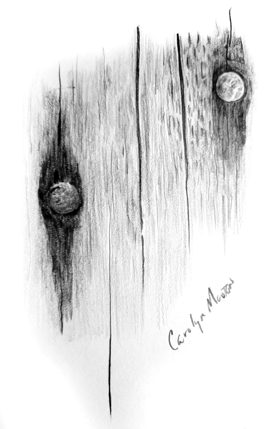
Those little touches of highlight running down the sides of the cracks signal that they can ONLY be cracks. Not marks on the surface. We instinctively understand highlights and shadows, and we KNOW those highlights only occur on an actual three-dimensional edge. And to really cement that they are cracks, your terminal tapers are wonderfully long and sharp - exactly as parting and rejoining woodgrain would be.
The wood is nicely understated but still obviously wood. Possibly with little machine-made digs into the surface by the right-hand nail.
The rust staining is correctly darker-toned woodgrain. Again, not marks on the surface. And the nail heads are superb. Both exhibit the sharp detail of rust. The left-hand head appears to be sunk into the wood. Possibly the right-hand one is too, as suggested by that tiny but all-important highlight on the lower edge of the wood. Again, those are signals we subconsciously see and immediately understand.
WEEK 1: EXERCISE 2
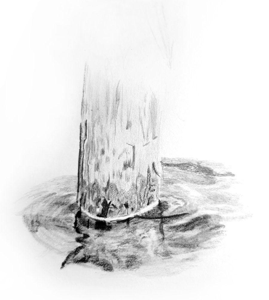
There isn't a lot of post, so I won't comment on that. But it's reflection in the moving water is super. Well, super up to a point...

That reflected and distorted left-hand edge is all that's needed to tell the story, and it does that very well. However - and I might be splitting hairs here - there are signs of radiating ripples to the left, and those ripples must account for the distortion in the reflection. So far, so good. But then the ripples don't continue within the reflection. That said, it sort of works as it is, but actual ripples would have worked even better.
By that I mean the top and fronts of any ripples face US. They cannot "see" the stumps behind. They can see and reflect the sky, which is why they are light and reflect light towards us. If you enjoy a good Who-done-it (not sure that will translate - detective stories) you'll enjoy drawing, because much of time we're searching for the clues that tell us what something is, or why it looks the way it does. In this case, the ripples would cut across the reflection in light bands. Light, as I said, because they reflect the sky towards us and not the post behind. I hope that makes sense?
Another point just occurred to me: your reflection is correctly darker than the post. I'll state right here that if it needs to be lighter for your drawing to succeed, then that's OK. You can (and I often do) bend the truth. It is not physically and logically correct, but the CLUES are there, so it's completely understandable. If necessary, the human brain is quite adept at making excuses for something not quite conforming to what it expects to see.
Reflections are less contrasty than the object itself. The darks might be similar or even darker, but the highlights will always be more muted. The highlights on the object are caused by light direct from the source being reflected back to you. Highlights in the reflection are not direct from the source, and the water itself, being transparent, will absorb some of the light. That's one reason why I favour cutting pure white ripples across a reflection - it works well because they are too white to be a part of it.
Finally, your ring of surface tension around the pile does its job, although I think it's too broad and would have used a lost-and-found band of brighter, thinner highlights to achieve the same goal. Not that yours is wrong, just different... and, of course, it actually couldn't exist in moving water. But that's back to the mind making excuses for something it understands, even though it knows it shouldn't exist.
WEEK 1: EXERCISE 3
Exercise 3, is trying to be a stainless cat food bowl with a blue rubber base. I found I was trying to copy exactly what I was seeing. On the water, I started trying to just draw the water as I felt it should be, rather than copying it. I found I was more successful that way! So I'm working on not copying!
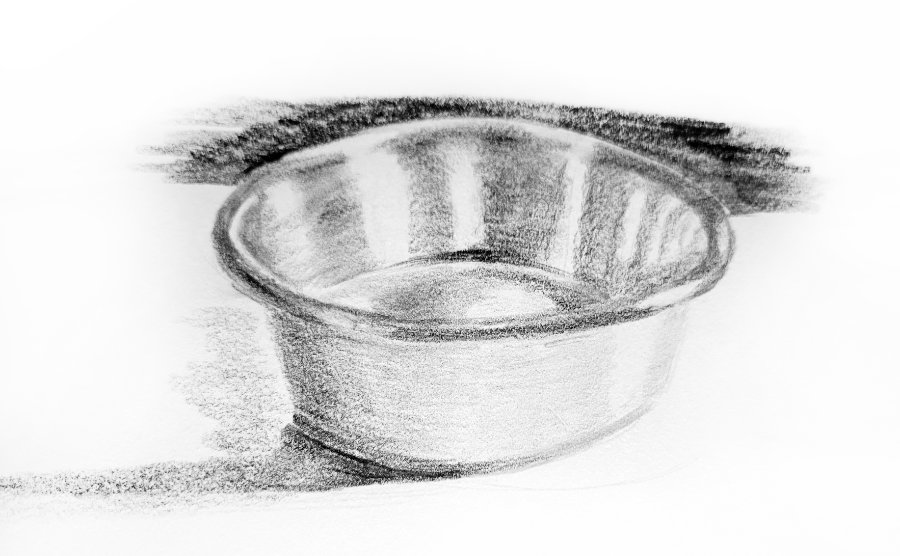
So, initially, I saw a brushed chrome or aluminium bowl - before I read your description. I now know it also has a rubberised band around the bottom... but that's been partly lost in your drawing.
I find the reflections sufficiently dominant to say "smooth and shiny". Then the soft edges of the reflections modify "shiny surface" to "satin". They also tell me a lot about the three-dimensional form of the bowl. Personally, however, I think your choice of pencil grade or paper (or both) are working against the expected texture. The soft grades used are grainy, which doesn't really describe the surface. Harder grades - or hard layered over soft - would have given a smoother appearance.
Finally, I asked my cat Susie what she thought about the bowl and she said there's only one thing wrong with it... it's empty!
Workshops UK
Tutorials
by Mike Sibley