Workshop Plus
WORKSHOPS 2019
UK, USA and Canadian Workshops and Online Course continuations
Ruth (online - Intermediate)
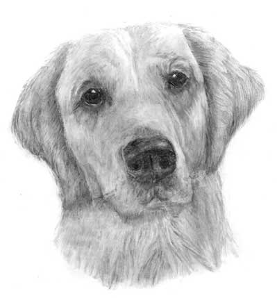
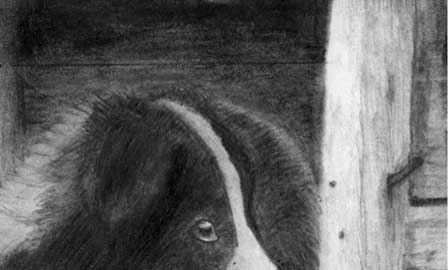
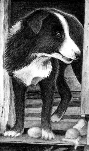
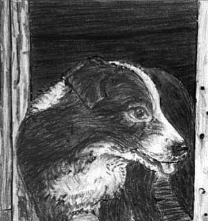
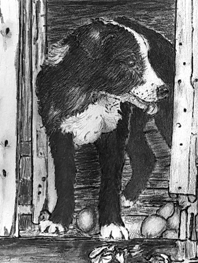
Finally,a dog drawing for you to critique, please. I did think I had managed to get my blacks darker (a past problem) but on looking at it on returning from holiday I realise that I completed it in brilliant Cyprus sunshine whilst wearing sunglasses which made it appear blacker. However, I am quite pleased with it overall.
 I'm very pleased to see your progress. And I understand about sunny Cyprus - my father lived there for a decade. Overall, you should be pleased with it, but - there's always a "but" isn't there
  - this could have been even better.
Your drawing does its job. It's a lovely dog with a sweet and soft expression, which you've captured. On that level, it's looking good.
It's when you look a little deeper that improvements would add more to the experience. Structurally, it's sound. It has body and good three-dimensional form. I particularly like the subtle layers of hair that recede to the back of the head. The eyes are soulful and dark. And the shaping of the muzzle is easily understood.
The neck is looking good too, because it doesn't dominate the head, but it's sufficiently developed. Two common errors are over-detailing everything, so the important parts lose their dominance; and, having completed the interesting head, hurrying through the boring neck. That only serves to drag the rest of the drawing down to its level.
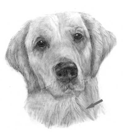
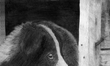
 I'm not suggesting you make any changes to this drawing - it's done and OK - but there are five areas to consider when you next draw. First, the indenting of the whiskers simply didn't work. Either you didn't indent deeply enough, or your paper was too soft to accept it. In any case, subsequent drawing has broken through the edges. Personally, I lightly shade over indents with a soft grade to expose them. Then I can take care not to draw into them.
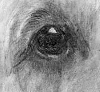 The eyes, while being full of character and emotion, are not particularly well defined. The key highlight and touches of highlight around the bottom lid work very well. They visually darken the eye and to draw attention to it. But the pupil is barely discernible from the iris. And the iris doesn't give any indication of the eye being a curved and glassy surface. A little lightening around the lower half - to form a secondary highlight - would immediately suggest a shadow cast by the brow across the top half. That's not essential but it will raise the level of realism significantly.
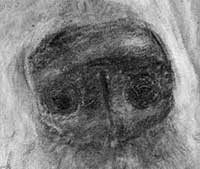 The same applies to the nose. The highlights definitely describe its three-dimensional form - especially the change in plane from the flat top to the vertical front. But any deeper exploration exposes its lack of a detailed description. The nostrils are black but full of light marks, which dilute the intensity of the black you intended. The bottoms of the alar folds almost run unnoticed into the base below. I've been drawing dogs for four decades and it was only last month I discovered the nostril's outer flaps are called alar folds. Still learning! Essentially, this only needs a little more attention to detail and sharper edges. Sharp edges divide planes.
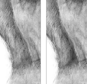 The ears and mouth have a separation problem - or, rather, a lack of separation. It's difficult to understand where the left-hand ear ends, as it runs into the neck. That might not be important to the overall success of the drawing, but making it a little more obvious adds greater realism. And by making the ear stand out from the neck, you add depth.
In the same way, establishing a shadow beneath the lower jaw would throw the mouth forwards of the neck, again creating depth. That whole area is a little vague. The hint of top lips in the centre don't run into the fleshy flews at either side but just stop. And the small area of bottom jaw is almost lost in the neck behind it. Yet that neck is some distance further back. You can see the effect that shadow has - it gives the head much more prominence:
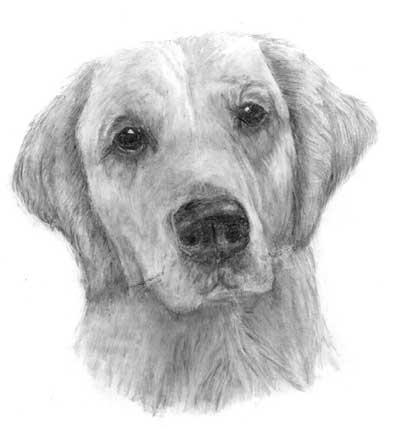
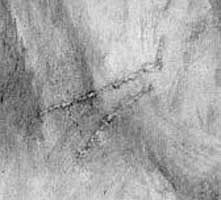
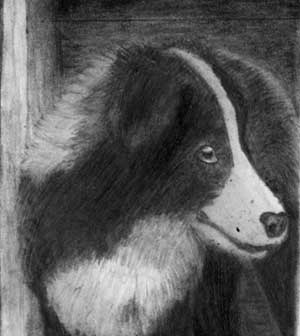
Finally, thanks for the second image with its seemingly minor but important alteration. You did well to spot that potentially annoying optical illusion. That dark line in the neck is indeed very distracting, and you've fixed the problem in an excellent manner.
Thanks for letting me see this, Ruth - and I hope your Cyprus holiday was everything you wished for.
Brian (online - Intermediate)
Thank you for all of your time and effort in putting together this class! I've learned more than I ever expected! Your critiques were detailed, helpful, and constructive. I feel pretty good about my results. It came out better than I anticipated. And much better than anything I could have done 8 weeks ago.
 I'm really pleased you found the course, and my critiques, helpful. And I'm even more pleased to see your progress. Yes, this could be better (what drawing couldn't be!) but it's substantially sound.
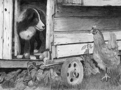
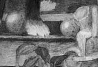
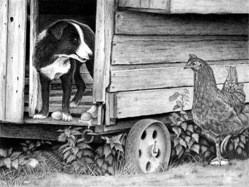
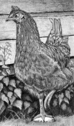
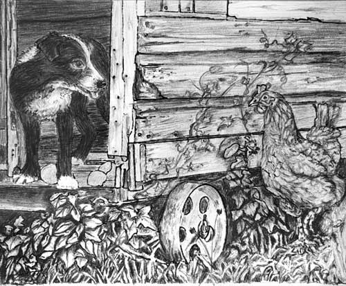
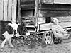
Beginning at the back and working forwards: Personally, I would have made the inside of the henhouse darker, especially behind Robbie's back. I would have used reflected light along his spine, as you have done, to separate him from his background, which would have added depth to this rather shallow composition.
The wood of the henhouse looks old and rustic with just enough detail to satisfy a closer look. However - and this applies to most of the drawing - the edges are very soft. That's really affecting the realism. More importantly, it's affecting the three-dimensional modelling and depth too. Soft edges merge planes together - they appear to "flow" into each other. Sharp edges separate planes. Here I've darkened the background slightly and sharpened both surrounding edges. Now the background wall sits behind the upright timbers.
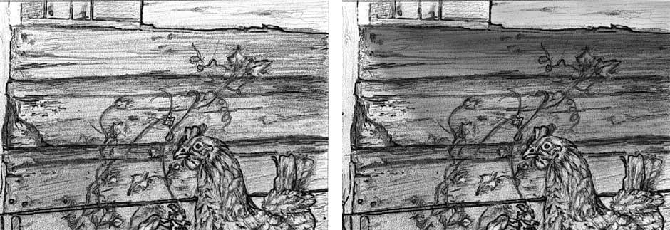
I like the shadow beneath the projecting nestbox that leads the eye to Henrietta's head. It's a good device to employ so Henrietta's head stands out from it. And it would have if you'd included a few well-chosen light values, and sharp edges, with her head.
 Robbie the dog has good three-dimensional form and texture, and the glint in his eye draws my attention to him and sets the scene well. However, I think his black hair would have benefited from more work. His white hair is quite detailed, but his black hair looks rather flat and is devoid of layers. Constructing the hair by using layers of short strokes would have helped you to "sculpt" his form and given the texture that is missing.
Something else you might consider too: don't feel impelled to shade everything. Robbie's front, muzzle, and front paws would have benefited from the inclusion of much more white. That would add contrast, so his black coat would visually darken and the highlights within it would glow. That said, congratulations on making Robbie's rear paw darker than his front paws, because it's inside the dark henhouse. Many other artists have missed that in their version of this drawing. The same applies to his inner thigh (in the shade of his belly) and the floor of the henhouse. His rear leg is just visible in the darkness. Everything in Nature is not always easily seen, so you created a greater sense of realism.
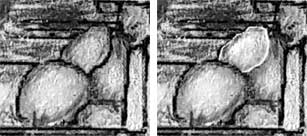
 The eggs look good and have a lovely soft key highlight and sheen. The use of harder H grades would have resulted in a smoother finish - more clay, less graphite, so the finish is physically smoother.
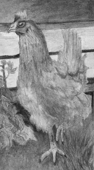 Henrietta the hen, who is looking quite concerned about the situation, could have had rather more three-dimensional form. Her feathering is nicely suggested, but she's suffering from not containing any of the darkest values. That affects her overall prominence in the drawing. She has a lovely dark eye but a carefully drawn, small and intensely white highlight would have drawn attention to her more readily, and much deeper shade beneath her chest would have given her more solidity. She's just looking a little flat and lost in the composition.
This is probably just a personal preference of mine, but her left raised foot is vital to the simple story being told. It's the only movement in the composition and adds a degree of tension. You've concentrated on her static left-hand leg instead, which removed any focus on the right-hand raised one.
What I think doesn't work well is your foreground foliage. It lacks any three-dimensional modelling, and I suspect it overwhelmed you to some extent. First, the area beneath the henhouse is dark but patchy. Patchy darks look like a hanging curtain rather than murky depths. Also, none of your foliage ventures into those depths. That's resulted in all your leaves being a very similar mid-grey. The lack of cast shadows compounds that to leave everything looking very flat and unrealistic. If you had established strong, solid darks beneath the henhouse, you would have had a much broader palette of greys to work with within the foliage.
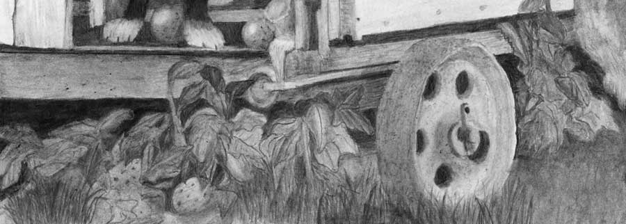
I can see you have correctly designed and outlined the very foreground foliage, and worked hard on some detailing, but you've then omitted to create the midground foliage around them, and the deep shade and cast shadows that gives everything depth. As you work, always keep the direction of the lighting in mind and always ask yourself if the element you are working on would cast a shadow on its surrounding elements. They don't have to be 100% accurate, but if you omit them you completely remove depth.
I think this is a very creditable result, but I feel you lost confidence in the later stages. Be bold! Get those blacks in early and everything around them will balance themselves accordingly. Take a look at Jamie's version of this drawing and I think it will help you to understand the additional steps you could have taken. Work one small element at a time and you'll remove all worry within complex areas, and give yourself time to understand exactly what you're drawing, and consider such things as cast shadows.
Kara (Drawspace online - Intermediate)
I would welcome your feedback whenever you have a chance to get to it...no rush. I like the look of the wood to the left of Robbie, but was perplexed why the wood on the henhouse looked so different until I realized that I was inadvertently smudging it for weeks. The paper that I was using between my hand and the drawing to protect it was in fact moving and causing friction, so I was repeatedly blending all my hard work! Good learning that I need to tape my hand guard down in the future.
 You should be absolutely delighted with this, Kara. Despite your smudging problems, which I fully understand.
Personally, I use a strip of the same paper I'm drawing on for a handguard, and I fix it at its bottom end with two clips, so it cannot move or rotate. But I can still peel it back to see underneath if I need too. And, because it's the same paper type, I can use it for practicing any crucial lines before I commit them to the drawing. Given the smudging you mentioned, you've managed to save that area very well.
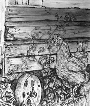
I'll start at the back and work forwards. But first, I must commend you on your wide choice of values. The strength of your darks has added a lot of depth to a composition that didn't possess much. The interior of the old henhouse recedes really well, and the space beneath it is both dark and solid, but I'll return to that later.
 Robbie the dog looks delightfully hairy, and with a good texture. I really believe you were living within the scene as you drew it because you've noticed things that many people miss - such as his back paw being in the shade of the henhouse and Robbie's own shadow.
It might surprise you to learn how many people draw his rear paw as light as his front paws. This is a composite study - neither Robbie nor Henrietta ever saw this henhouse, which I burnt many years ago - and the key to succeeding with such compositions is to always be aware that you have to connect the elements and make them live together harmoniously.
His eye has a bright highlight that immediately attracts me to him. He has very solid and logical form. I can see your understanding of his form as you established the shadows and highlights - all very logical and natural in appearance.
In the same vein, the reflected light along his back serves excellently to separate him from the dark wall behind. As it also does in dividing Robbie's front leg and shoulder from his rear legs that are in deep shade.
As for his egg "toys"... they're very believable, and contrast so well with the softness of his hair. They're smooth and semi-reflective; the broken shell of the right-hand one has an obvious thickness; and I really like the way the egg-white is running over the edge. I believe it's when you're "lost" in a drawing that such features occur to you, so I'm particularly pleased to see that happen.
My goal was to make Henrietta look realistic but she still looks a bit cartoonish to me. Is it the oversized white of her eye? I thought about minimizing the highlight a bit more, but was terrified it would destroy her eye and I'd never be able to return the highlight to pure white, despite Blu-Tack.
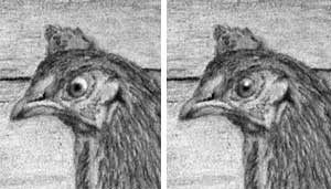 I too feel Henrietta is slightly unnatural. And I agree that it's the highlight in her eye that is the root of the problem. She does need a bright highlight to attract the viewer's attention to her, but that's a highlight on steroids!
I also think you're correct in not trying to alter it. It's a relatively simple task in Photoshop. The highlight I've created is probably all she needs, and it does appear to have removed the "cartoon" look.
Whatever you try, it's unlikely to restore the pristine white of your paper. I succeeded once in a remarque, by using a scalpel to remove the graphite, but that was on coated card, so I only had to dig through the coating.
 Repeated use of Blu-Tack will remove most of the graphite, but the pupil is no doubt firmly embedded deep in the tooth. Nothing is going to shift that. Not even a typewriter eraser - which I once used for restoring a highlight... and I drilled right through the paper! I filled the hole with typewriter correction fluid, which had a greenish hue when dry. But at least that eye now has a highlight :o)
 Your understanding of Henrietta is masterful. She has a wonderful feeling of solid form and, in my opinion, just the right suggestion of feathering. She's obviously feathered but in a way that doesn't distract. Her down-turned mouth transmits her sense of outrage about what she fears is happening to her precious eggs.
My only reservation is that brighter highlights in her raised left foot would have added to the story. She might be running or has paused - we don't know - but it's the only implied movement in the composition. Coupled to that is the rock she's standing on, which attracts attention away from her.
The drawing of the wood, with its subtle texture and suggestions of decay, is very believable. As our the nail heads that are present but not intrusive. It's so easy to over-detail a secondary element such as wood and its features, so you did well to avoid that. The nest box is obviously protruding, and you've made good use of its shadow, and engineered the values of the wood, to award Henrietta the prominence she requires.
I find myself asking myself so many more "Mike's how-do-you-know questions" while drawing :) . Such as, how do you know it's... round, receding, forward, turning, soft, rough, metal, light, dark, etc. Such a simple tactic, but I think it's positively impacting my work, and I feel I've learned so much in a very short time.
That thinking is so clearly evident in your foliage. Your weeds possess excellent depth, especially at the left hand side. The deep shade you established beneath the henhouse gave you the opportunity push some of the weeds far back into it, which created instant depth. There's a definite sharp-edged foreground too, and a midground that nicely connects the two. That weed to the left of the wheel, for instance, is clearly growing from under the henhouse and bending forwards into the light.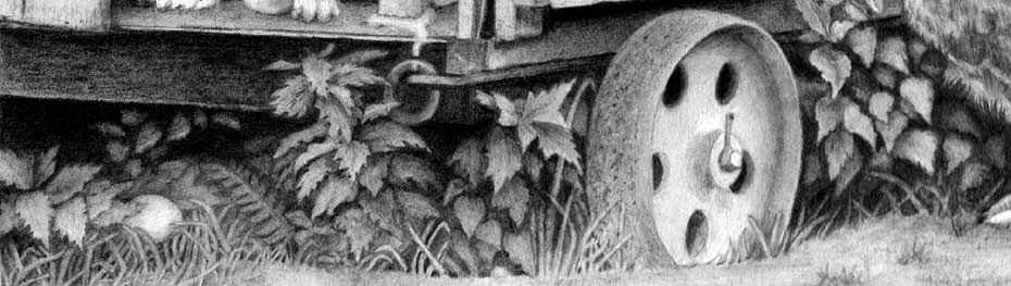 I think a drawing really succeeds if there's something fresh to look at on a second or third visit. The more I look at your weeds the more I discover. For example, even though the fallen egg is clearly visible once it's been found, you did a good job of hiding it in the weeds. It often pays dividends to allow the viewer to find some elements later.
Finally, the foreground: often less is more in a foreground situation, which is why I personally leave that area until last. That allows me to use it to balance the whole and draw the eye in to the composition. There's nothing wrong with your foreground, even though it's rather empty, but there is one suggestion I'd like to offer. To the left of the wheel, either extend parts of the weeds lower, or introduce a couple of extra clumps of grass - similar to those beneath Henrietta. That would break up the rather unnatural, almost mechanical, arc that sweeps between Henrietta and the fallen egg. Even just softening that edge in selected places would help, as you did to the right of the wheel.
I've really enjoyed working with you, Kara, and this is an excellent result.
Ange (Online - Intermediate)
just to show I'm still working on this, but need some help with doing black hair and making the dark stand out from the dark please.
 It's progressing well, and there's a lot of good work in it. There are, however, a few areas that can be improved, and one common error.
I'll begin in the top left, where that error is, and work towards the bottom.
Your darks could be darker or, more accurately, darker and more solid. I think you've kept the interior of the henhouse relatively light in an attempt to make Robbie, the black dog, stand out from it. But the reverse would be a better choice.
A very dark interior would have a different appearance from the dark dog, because it's non-reflective. Conversely, Robbie has a glossy coat, so you can use highlights to bring him forwards. That's particularly true of his back, where you could subtly use reflected light to create a definite division between him and the background. Robbie's rear would be in the shade too, so it wouldn't contain any light values. Darken the interior and Robbie's rear, and then use a little reflected light along his back to create that edge (as shown below). That pushes his rear back and his head forwards.
 Robbie's hair generally follows the direction of growth - but that's as far as it goes. If you look closely at the reference, and ask questions of it, you'll see that we understand Robbie's three-dimensional form because of the highlights on his coat. Consequently, it needs careful drawing to recreate those highlights.
You also need to consider his position in the scene. His rear, as I mentioned, is inside the henhouse where there is little light. His front is in full sunlight. That means, for example, that his rear paw will be in semi-darkness, and his front paws will be brightly lit. This is a composite scene - Robbie never saw this henhouse - so you have to work to tie all the elements together.
Finally, Robbie's eye is almost a classic example of drawing what you think you know rather than drawing what you see. He has everyone's idea of what an eye looks like - it's their stored "eye recognition" image as seen directly - not at an angle - and it's human. That means, from Robbie's viewpoint, his eye is looking sideways and not forwards.
 The wood on the side of the henhouse is full of character! The more I look at it, the more interest I find - yet it's not dominant, which is perfectly pitched. There is, however, something missing - and that something will make Henrietta the hen spring forwards... the cast shadow. You can see from the references that the nestbox in the top right-hand corner protrudes from the wall. It will cast a shadow, and I think you can be quite inventive with it. Here, I've extended it down far enough to allow highlights in the hen's head to shine. That alone will help to make her dominant.
As for Henrietta herself, I think she has a lovely sense of being feathered without the feathers being a distraction. She's a little flat at present, and could do with more three-dimensional shaping, such as shade beneath her chest.
I'll skip the eggs and wheel, because I think you're still working on them, and move on to the foliage. The left-hand end is one area that would definitely improve with solid darks. Any light patches you leave in the shade beneath the floor will be seen as being "foliage" in the shade. But you need solid areas too for that to work.
 The solid black areas tell us this is the extreme background and everything is in front of it. Also. with that black established you now have far more values available for the foliage in that area. You can push some leaves so far back that they're almost lost to sight, but they'll add both depth and realism. Then work forwards towards the light. That way, every layer will already be surrounded by its "background" that you can refer and react to.
Try to not use white in leaves. They don't naturally contain it. Instead, save it for your main highlights - such as a drop of water, or the key highlights in Robbie's and Henrietta's eyes. If they are the only white in the drawing, they will shine like beacons and attract the viewer directly to them.
The same applies to the foreground grass. Establish a few black areas in it, to fix the absolute background, and then create depth as you work forwards towards the lighter foreground blades.
As I said earlier, there's some lovely work in this. It just needs a little more work in some areas.
Update : 02.04.2019
This is about my 4th attempt! Thought I'd get some direction before starting number 5! Not happy with the lines, but not sure how to make it a tad lighter without having spaces, and too much short line rows would look just as bad in a different way.
 Are you referring to Robbie's hair? You've made a huge improvement! He's definitely hairy now; his hair is growing in the correct direction; and his eye is much better.
Previously his eye was looking out of the side of his head. Consider that, at that angle, you would not see a completely round iris. Instead, you'd be looking almost sideways at the eye, which makes a very narrow ellipse of the iris, and the cornea would be bulging forwards - that is, with an obvious curve facing his nose. I don't think your alteration is completely correct, but it's very close to correct, and doesn't "look" wrong. And the eye is now looking in the same direction as his nose, which adds a lot of realism.
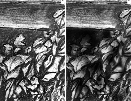
As far as I can see, you made two other major changes - the foliage, and the foreground grass. You've darkened the area beneath the henhouse, which has greatly improved its depth. You could improve it even more by making that shading solid - particularly along its top edge. Any lighter patches lower down would probably be seen as being very dark elements in the deep shade. You've also pushed a few leaves back into the shade, and one leaf at least now transitions from shade to bright sunlight. That neatly joins the two planes.
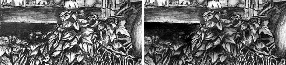 The problem that remains is the lack of midtones. Your values are either very dark, or black, or very light. Leaves aren't white. Try lightly toning down a foreground leaf. That will give you a range of values to work with - from a black background to a light grey foreground. And don't forget about cast shadows. you have established a few, but they're not consistent - which they must be, given that there's only a single light source.
The same problem exists in your grass. There are large black "holes" between blades - so large that we naturally expect to see something in there. That's easily corrected by cutting a few random lines through them with a kneaded eraser or Blu-Tack. Then tone those down to push them into the shade. At present your grass is either foreground or black hole. There's no midground.
 Just a couple of final bits of advice: the broken eggshell to Robbie's right relies heavily on dark outline along the broken edge. Use a thin white line instead, which represents the thickness of the shell.
And don't forget to add shading beneath the overhanging nestbox. That will give you a darker wall behind Henrietta's head and improve the visibility of any highlights you leave in her. That alone will improve her dominance in the drawing.
Workshops UK
Tutorials
by Mike Sibley