Workshop Plus
WORKSHOPS 2011
UK and USA workshop continuations
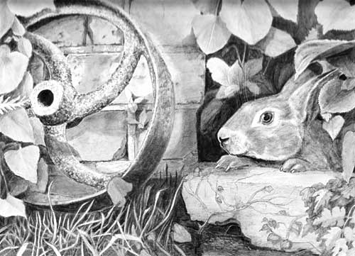
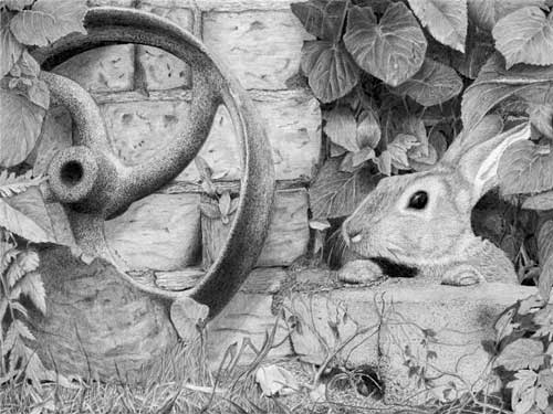
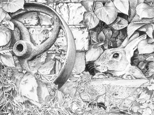
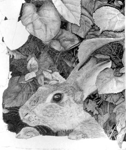
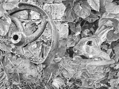
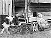
Wendy (Maidstone, Kent, UK - August)
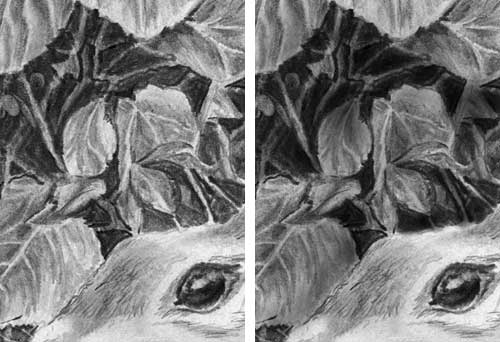
"Dear Mike, Your Maidstone workshop was a long time ago, but you taught me so, so much and I'm still plugging away at the rabbit, and when I get time to concentrate I really enjoy working on the different techniques and seeing things come to fruition. You'll see that I've customised some of the foreground. I've replaced the concrete block in front of the rabbit with what will be an old fence/gate post. At the base of the wheel I'm working on what I thought were dock leaves but have been reliably informed that they're Lords and Ladies? I'd be glad of your help and words of wisdom to get it completed. I feel that the wheel has perhaps lost it's curve at the bottom amongst the foliage, but maybe I've been looking at it for too long. Also the large leaves don't yet leap into the foreground as I would like them to. Is that because I haven't completed them yet or are the tones incorrect? (One in the centre is only lightly sketched in at the moment and barely visible)."
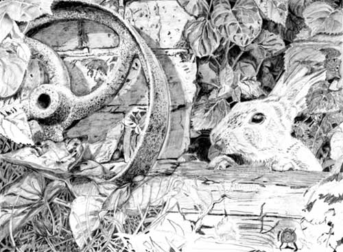 This is progressing really well, but there are two aspects that need addressing - cast shadows and weak midtones.
Let's tackle the midtone problem first. It's the midtones that hold everything together and suggest solidity. For example, your rusty wheel contains a lot of white, as do the bricks, and neither would in real life. They are not reflective surfaces so no bright highlights would be present. The top of your wheel is more realistic and I'm wondering if your bricks became too light which caused you draw the wheel ever lighter so it stood out from them? Try giving the bricks an overall layer of HB. That will flatten the contrast while maintaining the detail. The detail is distracting at present, so it will cure that problem at the same time. Then take another look at the wheel and see if you can layer a midtone over that too.
Your darks are excellent and the details are sharp, but everything is unnaturally high-contrast. Try to play down the secondary elements a bit by making them less contrasty - which almost always is solved by a layer of midtone being applied. HB or 2H is too light to affect the darks but it will remove the white content.
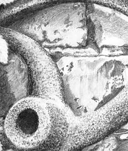
Before I move on to cast shadows, I must say that the shadow cast by the wheel is excellent! It gives a true sense of the wheel leaning back against the wall. Be aware of changes in plane. If the mortar is recessed - further back than the face of a the bricks - your shadow should shift accordingly as it crosses the mortar. It's entirely possible that the mortar is flush with the bricks, so you haven't made an error. However the edges of your cast shadow are very smooth and exactly follow the shape of the wheel, which suggests that the wall is very flat and smooth. Breaking up the edges of the shadow a bit would suggest that the surface is not smooth at all. That's just something to bear in mind for a later drawing.
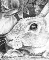
Your leaves, particularly above the rabbit, have a really good sense of three-dimensional form and texture, but again they are high contrast and are mainly lacking cast shadows. I can detect some, but if you are more bold with your shading of the shadows you will instantly create more depth. Sometimes you have to exaggerate in order to quickly describe something to viewers of your drawing. Also some of those leaves are two, three or more layers back but their relative brightness suggests they are further forwards. Try pushing some further back into the shade by building up a layer of HB until you're happy with there new position. A little mystery works wonders - don't attempt to make everything fully understandable - it isn't in Nature so your drawing should reflect that.
The same applies to your bottom left foreground grass. I really like your use of negative drawing and deep shade between the blades. Now some of the blades need to be pushed further back into the shade and the big leaves should be casting their shadows on them too. That will give those leaves the prominence they are lacking.
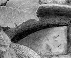
Keep up the good work - you're doing really well. Just stand back occasionally and take a wider view. Then I think you'll see that depth is often lacking within an area and you can correct it before moving on. That said, avoid playing around with it. If you're not certain of something, leave it and move on. Often something will look wrong until you can compare it to a yet undrawn area - once that second area is established the first now looks correct. Which reminds me - you have lost the curve at the bottom of the wheel. It contains an optical illusion where the spoke appears to be a continuation of the rim., which you've followed. Either Blu-Tack the rim to restore the curve... or invent another leaf to cover it!
I really like the changes you have made, especially the leaves and grass that replace the rock. I'm looking forward to seeing this progress further.
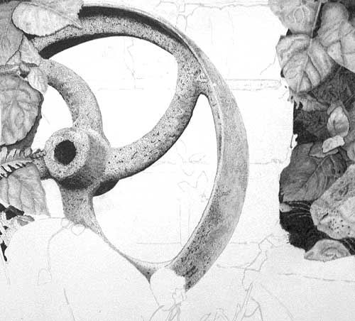
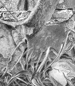
Update: 28.04.12
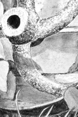
"An update! Still more work to be done on the lower right hand corner - but it's getting there, with all your help. Really enjoying working out the shadows of the grass - and the Lords & Ladies leaves are so much better now. Think I might have improved the lower curve of the wheel by angling the old fence post up to a higher plane which seems to align with the (hidden) bottom of the wheel. Looking forward to your guidance, Mike."
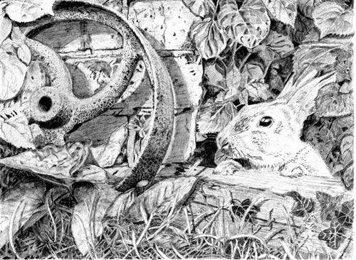 This is coming along so well - keep going! And watching you come across problems and finding solutions is really interesting.
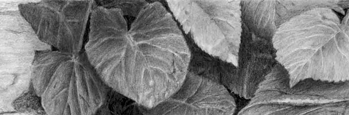
I know the Lords & Ladies leaves very well (known as Cuckoo Pint to me) and you've described their form beautifully. I'm pleased to see you pushing the grass beneath them further back into the shade. That gives a much greater sense of depth and brings the big leaves - sorry, I can't keep typing Lords & Ladies :o) - forward. You've introduced a degree of mystery into that corner, where previously everything was immediately understandable. In fact, all your foreground grasses now possess a heightened sense of realism and depth, and that depth has been increased again by your use of the cast shadow on the lower big leaf's surface, which in turn describes the three-dimensional form of that lower leaf.
The curvature of the wheel at its base is now correct. I think you may have been influenced by an optical illusion in the guidelines that made a spoke look as though it was a part of the rim. And changing the angle of the timber is an equally successful solution. That too give a greater sense of depth and makes more sense of the position of the leaning wheel. Incidentally, I know I've said this before, but your wheel's cast shadow is perfect!
You're doing so well, there's little else for me to say and even less for me to advise on. I think you're drawing this with real understanding and you have a tactile feel for the surfaces you are recreating and that comes shows very clearly.
Keep going - you're doing really well!
Judith (Studio workshop, UK - September)
"Dear Mike - here, at last, is the finished Rabbit from last September's workshop at your studio. Any help to make future drawings better are much appreciated! Many thanks for the course. When I came to draw again I kept hearing your voice saying things like 'any picture is only as good as its worst part', so I have tried to be more patient and not rush."
 WOW - you have put some work into this! It does have one or problems - the timid midtones being the most prominent.
There is some excellent work but you are either completing each element without regarding the whole drawing, or you are stopping short of completely developing it. For example, the top right leaves have an excellent sense of three-dimensional form but they are lighter than I would expect to find in a natural situation. That's not something to worry about - just keep drawing and problems like that will solve themselves in time. I know I advised you to concentrate on one element at a time, but I think you're concentrating on it to the exclusion of everything else... so it's my fault really! :o)
 You've created an excellent dense and dark shadow within the wheel's central boss and I really like your depiction of the rust, but a rusty surface is this not reflective so the white, which should be reserved for highlights, doesn't seem natural. All that's wrong here is that you've stretched the contrast too far. As I said previously, there is a lack of midtones. In this case, those midtones are important to make the wheel look solid and the surface dull. Even just layering the whole wheel with HB would help, because once the white is dulled the wheel will gain a more solid appearance without affecting the rusty look you've created.
The problem is that once you create a high contrast area, such as this one, you also create problems for yourself. From his point onwards everything within the drawing will have to be balanced to this area's tonal range in order to compliment it.
Your bricks and mortar, for example, have to be unnaturally light - any attempt at reproducing the natural tones of bricks would simply make the wheel look too bright and highly reflective. The bricks themselves have a lovely subdued range of textures - well done! The mortar is less gritty than I was expecting but this is your drawing and your mortar and not mine, and it works well for you. I'm wondering if, having produced a texture, surface or three-dimensional shaping that pleases you, you're afraid of returning to it again? That's a very common problem, but sooner or later you'll find that ultimately nothing is finished until it works as an overall drawing. If has to go... well, it has to go, and that can be awfully frustrating sometimes :o)
I won't go on and on about the midtone problem, but it is their minimal use that forced you to continue to over-use white and very light tones.
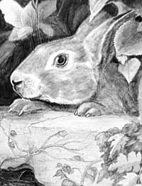 Your rabbit has lots of character, a sharply drawn nose and lovely dark eyes with bright highlights. But because the highlight is just one of many throughout the drawing, it loses the impact it could have has. The three-dimensional shaping of the head is good, although I would have liked to have seen more texture within the hair - especially the dark hairs that flow up the top of the muzzle. Your rabbit works well without those things but it could have looked more realistic with attention paid to them. All that said - I like your rabbit a lot. Incidentally, what were you trying to indent above the rabbit's head? Whatever it was, you now know "once indented, always indented" :o)
The Ivy growing up the stone below the Rabbit would have benefitted from having cast shadows - if only to remove much of the need for outlining. Again, the stone is much lighter than it needed to be, so you were almost forced to use outline around the ivy. And when you reached the grass, you had little option but to leave all the blades white, or lightly toned at best. That's a pity because your negative drawing is excellent. In future drawings, try to use midtones a lot more and reserve your whites for true highlights. This drawing shows a lot of promise, you obviously worked hard on it, and I'm pleased to see that you were often physically experiencing the element you were drawing - I can tell by the inclusion of the little details that lend it an enhanced reality. Try some exercises on scrap paper, so the results don't matter, and draw a few darks and then concentrate on your midtones. Drawing some of your leaves again would be good subjects. If there are any bright highlights present, draw around them to isolate them and, if any is required, don't add tone to them until the rest of the subject is complete. That will help you to stay in control and your highlights will read correctly as bright reflections.
This drawing shows you have real potential. Good work - keep practising!
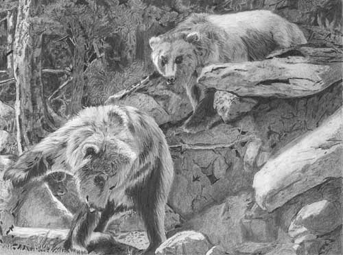
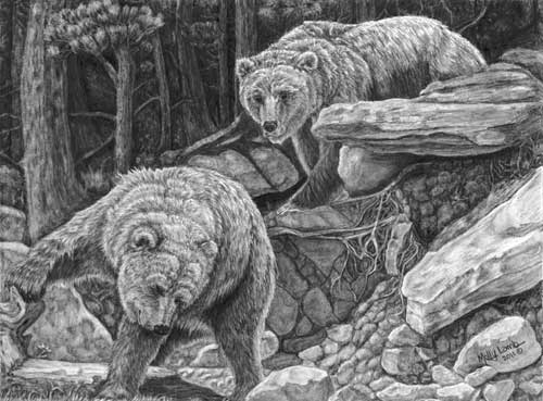
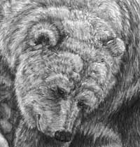
Ken (Yellowstone, MT, USA - June)
"Thanks Mike for the wonderful experience in Yellowstone. It was a great chance to learn from you and to interact with a fantastic group of artists. Attached is my version of the "Grizzlies"."
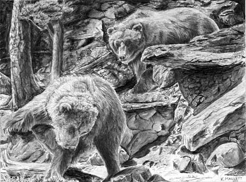 This is a wonderfully strong drawing, Ken - and that's partly its problem too.
From left to right, the bark on the tree is pleasingly realistic and both trees are nicely rounded; the bears have good three-dimensional form and excellent texture; and the rocks too possess a believable variety of textures. But there's no recession and primary/secondary differentiation. In short, everything has received the same careful treatment resulting in every element being equal in importance to all others. That stratagem has resulted in a drawing with no obvious focus and little depth.
Don't worry! I personally believe this is a necessary stage of development. The clown on a highwire has first to be a master of his craft. He must understand everything in detail before he can begin to remove, and adapt some aspects, and push others into the shade so only the highlights he wants you to see remain. He creates an illusion by throwing attention on the main elements.
In the same way, we artists have to learn to study and reproduce everything in detail. Only then can we begin to understand what can be omitted, what can be sharply define and what can be diffused and relegated to secondary background interest.
In this case, your trees could have been slightly less sharp, and the rocks behind them considerably so. The rock face behind the top bear, which requires some sharpness given its midground position, could have been simplified to counteract the present abundance of detail. That would have given you the option of using sharp edges and high contrasts in the rear bear's head, and less sharp drawing in the body. That would throw attention on the head and the softer body would allow the foreground jutting rock to suggest depth. In fact, yours does that quite successfully - almost too successfully, as it dominates the bear. You've made good use of rich darks in the bear's head, but they are overshadowed by the richer darks within the rock. That said, the bear has a great highlight in his eye that, in normal circumstances, should draw the viewers eye directly to it.
The foreground bear is drawn with less confidence. The more muted tones in its head lose out to the darker tones beneath its raised right paw. That's not a bad thing, as that paw is important to the simple story but so is the head, so they should perhaps have had equal attention-catching dominance.
Oddly, I feel that your mental understanding of the three-dimensional nature of each element was progressively less as you worked forward. The background rocks and trees, for example, have their three-dimensional forms well described, but the midground and foreground begin to look a little flat. For example, there's a v-shaped section of rock in the shade of the right-hand jutting rock that doesn't make much sense. Not that it's wrong, simply that its form is indeterminate. Sometimes it pays to exaggerate; to make something clearly obvious to the viewer. In actuality, that shape works well in balancing the composition and pointing attention to the foreground bear. It just doesn't possess a three-dimensional reality. If you can fix shapes and forms and spacial relationships in your mind before you begin a section, you'll find you are shading not a representation of a rock, but shading ON an existing but invisible rock. You will automatically understand where shadows fall and highlights appear; and you will work until that area matches your mental image. As that image has a realism and three-dimensionality in your mind, so too will your drawing.
Taken individually, every element here works well and I congratulate you on a job well done with what is essentially a fairly complex subject.
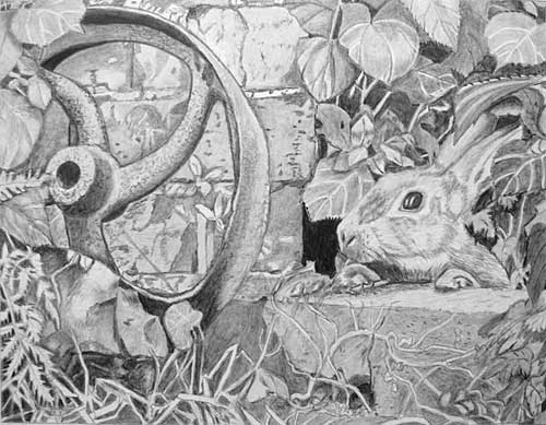
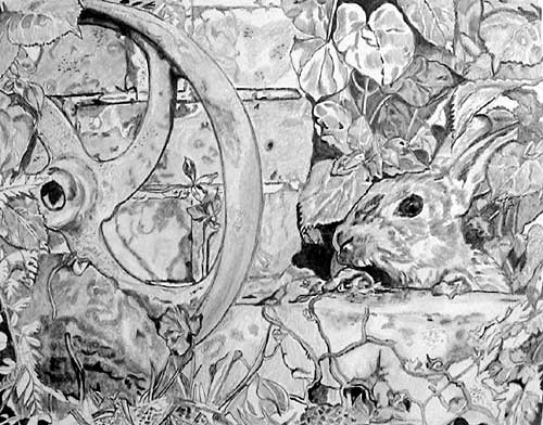
Alex (Maidstone, Kent, UK - August)
"I know its been a while since your workshop in Maidstone, but I have finally finished my piece of work for your comments. I wish your studio were alot closer to Kent, as I would definitely consider another class. Your teaching methods are fantastic and so simple to apply. I had a great time,and I now have a greater understanding of negative drawing. Thank you again:"
 Woo hoo! This is looking good, Alex! You've really taken your time and it shows in the result.
There's some excellent work here and your negative drawing looks good. But what pleases me most is your interpretation of each element. I can see you were drawing your mental picture of each, which is evident by the three-dimensional descriptions. I love the way you've modelled the wheel! Rather than being over-concentrated on the texture, you've used that texture to sculpt the form. It's immediately understandable and possesses a feeling of realism.
The same is true of your leaves. I can almost run my fingers over their surfaces and feel the bumps and valleys. You've made an excellent use of negative drawing in depicting the lighter ribs and veins, and your tonal range is nicely pitched - descriptive of the surface without any one leaf becoming dominant or attracting unwanted attention to itself. And your deep dark shade has created a good feeling of depth while giving you a wide palette of tones available for the leaves.
 I'm less happy with your brickwork, although you've done well to differentiate between the textures of the bricks and mortar. The bricks themselves have too many soft edges, which is not expected in such a material, and your holes and surface flaws are not easy to understand. This, again, is partly due to soft edges - possibly caused by blending. Brick never sheers with a rounded edge, so a hole has to have sharp edges. Often it pays to exaggerate, and this is one of those times. A black hole cannot be displayed by just drawing a black shape, because it will appear to be a black dot on the surface. Instead, exaggerate the lighting - add a tiny light highlight to one edge and make certain all other edges are sharply drawn. That highlight is the only clue the eye needs to understand that it is an edge turning into a hole. You might also have considered making more of the diffused cast shadow of the wheel on the wall. That would have created more depth, emphasised the leaning angle of the wheel and visually connected the two elements.
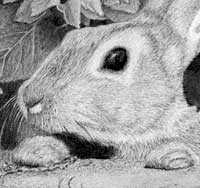 Your rabbit is delightful! It has texture - and whiskers! Good indenting! And it has a strong black eye that draws attention it. You could have increased that attention grabbing factor by maintaining a pristine white highlight, because you'd achieve maximum contrast and, if that white was the only white allowed to remain in the drawing, it would shine out like a beacon. You've made good use of those sharply-drawn dark hairs on top of the muzzle, but overall I think your choice range of tones used for the rabbit are rather light. That results in some loss of three-dimensional modelling, but not too severely.
The negatively drawn grass in the foreground is superb! Quietly understated, with strong key (or status) blades telling the eye how to read those enigmatic ones behind. It works really well.
For what is essentially a problematic study, the result is something you should be very proud of.
Peter (Studio workshop, UK - September)
 A very creditable result, Peter, although you do have one overriding problem - the lack of midtones.
There is some good work in most of the elements but you seem to stop before you completely develop them. I'll just concentrate on a couple of typical areas to see if I can explain what I mean.
 Here in the wheel, the central boss is accurately drawn and it has a sense of three-dimensional reality about it - even the pitted surface is believable - but this is a dark, non-reflecting, heavily-pitted rusty surface where white is quite out of place. Once you permit something like that to happen, you create problems for yourself throughout the rest of the drawing. Because everything will have to be balanced to the tonal range of this wheel, nothing can be at all dark, barring deep shade, without instantly making the wheel appear to be washed out.
The same is true of your bricks and mortar. Again, they are well studied and drawn but the large amount of white content severely dilutes them and gives the appearance of a number of isolated features, rather than a solid mass containing features. Often all that is needed is an overall layer of 2H or similar. That will remove all white and unify the element, increasing its apparent solidity and realism. I'm wondering if, having produced a texture that pleases you, you're wary of touching it again?
Unfortunately, by omitting the half tones and stretching the tonal range to include white, you've forced yourself to continue that convention elsewhere. For example, your leaves have good rounded forms, realistic surface detailing and believable ribs and veins, but white again predominates. That was imposed on you, because if you'd given them a more solid tonal treatment they would have looked alien against the stark wheel, or any other such elements.
 Your rabbit has some excellent work in it. I particularly like the detail within the eye. It's dark, alert, glassy and possesses a lovely bright highlight. But the full effect of that, potentially attention-grabbing, highlight is lost - it's just one white amongst many. The surface detailing of the head is good too, but the missing half tones affect its three-dimensionality and make it look flat, which is a pity because it had the potential to be excellent.
Of course, by the time you reached the grass, you had no option but to leave all the blades white. Again, that's a real shame, because your use of negative drawing and creation of the background stalks within the shade is excellent. All that's needed in future drawings is for you to restrict yourself to a narrower palette of darks and greys within each element, and to preserve your whites for true highlights. You have a good eye for detail and a flair for interpretation. You're very close to achieving quite excellent results - once you learn to "embrace the dark side" :) Try some test exercises where the results don't matter. Establish your darks and then concentrate on your midtones. And if there are any bright highlights present, draw around them and leave their shading, if any is required, until last. That way you'll stay in control and your highlights will read correctly as brilliant points of light.
Each element is well studied and interpreted and overall this has real potential. Good work!
Monica (Maidstone, Kent, UK - August)
"Coming from Holland to be present at one of your workshops and at the same time to be able to enjoy the beauty of Kent, was and still is one of the most inspiring things I ever did. I also would like to thank and greet my "fellow-workshoppers" for their kindness and inspiration. Mike, I hope you can give me some feedback of my work. As you can see I love detail and I want to take all the time I think I need. (I never knew I had this patience....!) Many greetings from Holland."
 It was a delight meeting you, Monica, and you're not the first to join us from Holland - maybe I should consider running a workshop in Holland next year? :o)
This is a truly excellent beginning! I've adjusted your photo (and worked some Photoshop magic on it) to restore and properly reflect the original, that I remember well. Your darkest tones are perfect for this drawing, as they'll give you both depth and provide you with a wide range of tones for the overall drawing.
Your photo was slightly out of focus and overexposed on the left-hand side, but I've resisted the urge to play around with it :o) Keeping that lack of sharpness in mind, you've achieved a lovely feeling of depth within these leaves. That's partly due to the strength of the shadows and because you've worked hard to keep the edges sharp. They give a perfect visual separation. Your wheel too is looking good - chunky rust and an instant recognition of the three-dimensional form.
 I think you've made some good decisions when you began work on the bricks. They offer interest when viewed alone but they don't fight for dominance with the wheel. The mortar contrasts well with the bricks and both are correctly understated, as secondary elements of a drawing should be.
You might consider increasing the strength of the cast shadow of the wheel on the bricks, but I'd leave that until later, when you can more properly assess the need for it.
Your new-found patience is certainly working well for you! Personally, I consider that every drawing demands the time it needs, so I never worry about the length of time any drawing seems to be taking. And, of course, it only needs one hurried area to drag the rest of the drawing down its level, so patience and attention to detail (where it's required) will always produce a good drawing.
I stressed during the workshop that the best results come from picturing and experiencing in your mind the element you are drawing. That will call up all your memories and experiences of that element, which will result in an increased depiction of reality. I feel you've been doing that here. You're doing an excellent job and I'm really looking forward to seeing this progress.
Pauline (Banwell, Somerset, UK - May)
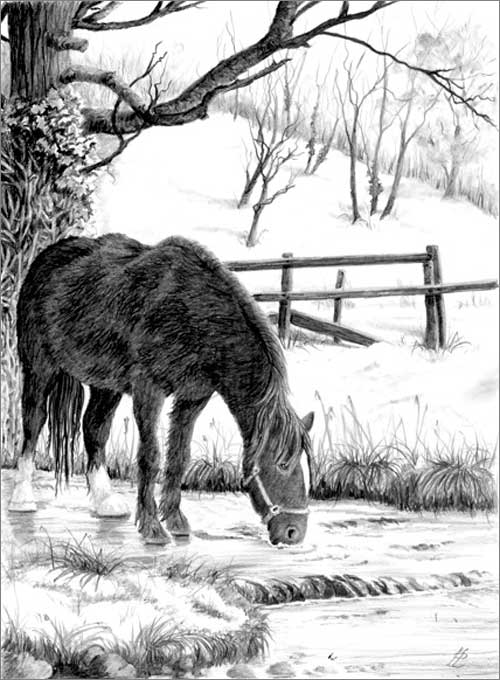
No critique requested but I just had to post this here because of the unique solution to the inherent problems with this study.
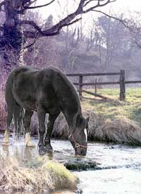
The reference (above) suggests mist but the setting is taken from a very old and degraded photo, so imagination and interpretation is needed in large quantities. Most artists go with the suggestion of mist but here Pauline has decided to interpret the setting as a snow-covered winter scene, which is very apt as the horse, my Tom, has his winter coat.
I really enjoy viewing this. Well done, Pauline!
Tony (Maidstone, Kent, UK - August)
"Thank you so much for the Maidstone workshop. As a complete beginner I far exceeded my own expectations. Additional thanks to Jenny who finally persuaded me to come along! There was a really friendly and helpful group who came along so thanks to them also for making it such a rewarding experience.
Here is my first ever picture since my school days and whilst I'm quite proud of it I know it lacks a certain reality. Whats missing I don't know but I would very much appreciate your comments. Thanks again. Tony"
Here is my first ever picture since my school days and whilst I'm quite proud of it I know it lacks a certain reality. Whats missing I don't know but I would very much appreciate your comments. Thanks again. Tony"
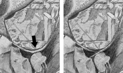
 In my opinion, for a first drawing in many years this is truly remarkable!
My first reaction was that this is full of interesting surfaces and subjects but that it is slightly flat. That is almost entirely due to your initial blacks containing too much light content. Visually combine blacks with light patches and the overall perceived tone is lighter than you intended. You can certainly leave some lighter patches or gaps in your shading, to suggest a hint of detail within the dark areas, but they would realistically be in deep shade and need to be darkened appropriately. Those weakened blacks have restricted your available palette of greys, and that in turn has diminished the visual depth of your drawing.
Here, I've had a go at altering the area above the rabbit. As soon as the blacks (the very deepest shade) are strengthened, you immediately have more grey values at your disposal, which allows you to use darker tones for the leaves and, more important, remove white from them. If you reserve white for true highlights those highlights, being the only true white in the drawing, will shine brilliantly. Here I've also tried to show you that a darker background permits the midground stalks and leaves to be pushed further into the shade, which increases the depth in that area.
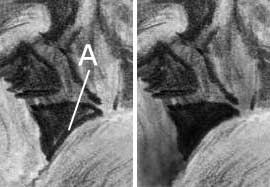 Outlining the areas above the rabbit before you worked in them was a good idea, because it preserves or defines the sharpness of the edges, and it gives you a safety margin that you can work up to. But don't outline in a tone darker than you expect to use for that area. Here ("A") the outline remains in full view and destroys the reality you were trying to achieve.
Matching the tone of that area to the line immediately removes the line from view. And, as I mentioned earlier, removing or darkening the light content allows you to use darker tones for the leaves. That in turn means you can use the leaves to define the edge of the rabbit, negating the need for outline. It also adds depth, because the eye will accept the darker toned areas as being in the shade of the lighter foreground element.
Not only is there excellent negative drawing in the grass but you've successfully removed that rather vague rock and the too-complex leaves at the left-hand edge. And, before I forget to mention it, your rabbit is really good - its soft texture contrasts perfectly with the more harsh textures surrounding it. Well done!
My main advice for future drawings is to establish solid, deep tones, to not be afraid of pushing midground elements further back into the shade (increasing the perceived depth), and to begin introducing cast shadows. The one place you did attempt a cast shadow (the leaf at the top of the edge of the wall) shows how powerful they can be at adding three-dimensionality to you drawing. That shadow pushes your leaf forwards and defines the position in space of both the leaf and the wall.
Overall I think you've produced a remarkable drawing and you are totally justified in being very proud of it.
Suzie (Los Angeles, CA - June)
"Thank you for a great workshop in L.A. and thank you so much for letting me attend even though I couldn't make it for the 3rd day. I learned so much!"
 Well, you may not have been able to join us on the last day but you were definitely listening and taking it all in! :o)
This is excellent, especially considering that you draw it without my support or advice. I pay a lot of attention to my initial reaction and in this case I thought this was admirable but slightly flat. That may be because I've adjusted your photo to something that doesn't properly reflect the original, but I think it has more to do with three-dimensional shading.
Your deepest blacks are excellent but I think you've slightly wasted the opportunity they gave you to use a wide range of tones in the drawing. There's quite a jump from dark to light with not much use of mid to dark tones. For example, the area above the rabbit's head possesses no darks that equal the strength of the area around its nose. That suggests that ALL of that area is further forward, yet I'd expect to see at last a few holes through the foliage where that deepest shade was visible. Those missing spots of black cause a lack of depth in that area. Don't ever be afraid of darkening an area - Blu-Tack can always be used to reverse your decision - and often a leaf, for example, can be pushed back into the shade much further than you expect. In fact the inability to fully understand something visually, because it is deep in the shade, can add both depth and a greater sense of reality.
You've made a good attempt at the rabbit, which has a believable hairy texture and a reasonably dark eye. Possibly that eye is darker than I'm showing it here, but a dark eye is essential because, coupled with the pristine white highlight, it represents the greatest contrast in a single area in the entire drawing. That's guaranteed to attract the viewer's eye to the main focus of the drawing.
 The brick texture works well, but you appear to have missed the opportunity to introduce dark holes and crevices between the mortar and bricks. On the other hand, your lighter approach serves the wheel well, which now definitely takes precedence visually. The wheel itself is very good! It has a solid three-dimensional form and a believable rusty texture.
You've made an error in the bottom sector. There's an optical illusion in that area that suggests the rim curves into the bottom spoke - which it shouldn't do. Don't worry! You're not alone in doing that :o) It's something that needs a fix and sometimes you need to exaggerate - to make it clearly obvious which plane is in front of the other, and this is definitely one of those cases.
There is excellent negative drawing work within the grass and leaves, which themselves are well drawn. And I must congratulate you on your solution for the troublesome bottom half of the left-hand side! You've made a very courageous attempt at depicting those Cow Parsley leaves. Personally, I would have been wanting to plaster a big Dock leaf over that area and saved myself a lot of work :o)
I think you've done an excellent job and you've produced a drawing that you should be justifiably proud of.
Perry (Los Angeles, CA - June)
I cannot thank you enough again for the great workshop in LA. You really did take me to the next level. I have attached a copy of what I have done so far on the work and would love to hear from you about it. Thanks again for everything. Perry
 It was a good workshop and I really enjoyed working with you, Perry. You're doing an excellent job and there's much to be admired about this.
I pay a lot of attention to my first reaction - before analysis sets in - because those thoughts often prove to be the right ones. In this case each element works well and they form a cohesive whole. I really feel that you were experiencing each element in your mind as you worked, and that's always the best approach to producing a sense of reality. Your mind turns two-dimensional references into three-dimensional realities. Once you've achieved that, their three-dimensional form, the way they react to lighting, and their position in space tends to become self-evident.
You've made an excellent attempt at negative drawing within your deep shaded background, It's working very well and provides a good deal of depth. Don't be afraid of pushing some things so far back that they're almost hidden. That's perfectly natural and may give you an additional layer or two of depth. And if you change your mind, Blu-Tack will always pull it back into the light.
The leaves are wonderful! I can instantly understand their rounded forms, and they appear to be natural without being so detailed that they dominate the rabbit. I particularly like the shadow cast on the rabbit's ear, which fixes the spatial relationship of both and gives an instant connection. That shadow in particular is why I believe you were experiencing each element and not just "drawing a leaf" from the reference.
The rabbit is progressing well but I think it could be strengthened a little, especially , the cheek area below the eye and the dark markings on the top of the muzzle. At present I feel there's too sharp an angle between the two - the cheek almost seems to fall away vertically from the bridge of the nose, instead of being a curving sinuous plane. A little more sharp detail in those areas would, I think, restore its dominance in the drawing. There's no need to do that now, as it might make more sense to take another look at it later once the stone beneath its paws and the bricks have been drawn.
I'm really pleased to see so much good work in this drawing. The Rabbit, for example, has a lovely glassy and believable eye. I think this is an excellent drawing and I'm looking forward to seeing progress.
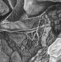
Update: 06.09.2011
 There's not much I can say to help you because you're already well on the way to solving all the potential problems with this.
Your darks are excellent and solid, with a hint of surface texture. The rounded edges of the oval-shaped spokes read exactly as their reality demands. And your rust texture is working well for you.
This is one of those textures that I find cannot be categorised, by which I mean that one technique cannot be called upon at all times. Personally, I find myself drawing rust differently, and using different techniques or variations, each time I draw it.
I think you've drawn this with real understanding. You have a tactile feel for the surface you were recreating and that comes through clearly.
Keep going - you're doing really well!
Brenda L (Yellowstone, MT - June)
Here is my finished drawing of the W. Yellowstone grizzlies. Do you feel I need to make any changes or additions? Your workshop was GREAT and I learned so much! It's no wonder some people are repeat attenders! Keep up the good work, Mike, so we can keep learning it!
 Thanks, Brenda! I really appreciate your kind comments... but they won't interfere with my critique :o)
My first reaction (which I pay a lot of attention too) was this has many good points but overall is rather flat. That's nothing that a broader range of light and dark tones wouldn't fix.
That said, this was not an easy assignment and, unless you're used to dealing with compositions such as this one, it's difficult to keep the overall appearance in your mind as you work on each element. Personally the first thing I do is decide where my very darkest tones are going to be. I establish at least one if possible, but in any case I keep that dark tone in mind as I work, so all other work becomes balanced to it.
You've handled the overall composition very well - that light right-hand rock, for example, has dominance but echoes the angle of the bears, leading the eye back and forth between them. But the area between that rock and the left-hand bear lacks a solid three-dimensional feel. You've used a lot of mid-tones that tend to flatten the area so there's no recession, and no change of plane between the vertical rock face and the more horizontal foreground. The use of a greater tonal range should not of course fight for attention with your important rock, but it could have been more contrasty.
 I really like the wooded left-hand area. The highlight running down the tree acts as a break to stop the eye wandering out of the drawing, leads the eye down to the bear, and it defines the tree's forward prominence. The less detailed work behind it serves admirably to add interest without it ever becoming more than an area of secondary importance. Never a distraction but adding reality.
Your Grizzly Bears possess character and a good attempt at texture. And the foreground one has a definite look of interest on his face, totally engrossed in his search. Again stronger tones (darker darks) would have helped increase their three-dimensionality, especially in the shaded areas of their legs beneath their bodies.
Overall, I think you've done an excellent job with a composition that was not of your choosing. You should be proud of this.
Kathie (San Antonio, TX - June)
Thanks, Mike, for a wonderful and informative class. I really hated doing the ferns and struggled with those, but the rest was fun to do, especially the bricks and rust.
 Well, I did say "make it your own" almost expecting everyone to find an alternative for those dreaded ferns :o)
As I look through this, element by element, I can't find much that I can find fault with. However, overall it fails to hold together. That leads me to believe that you were so intent on drawing everything separately that you lost sight of the overall appearance. Before you begin drawing try to formulate in your mind a good idea of what the completed drawing will look like and what your aims are. I understand that wasn't easy with this composition as it was mine and not yours.
I thinks your bricks, in particular, are excellent! They ooze old brick texture and have a marvellous three-dimensional feeling. The wheel is good too and obviously rusty, but it fails to clearly stand out from the wall. Stronger tones would have assisted with that, as it's a little light. That would also have allowed you to draw the overlapping leaves darker too, which would have given them more foreground prominence. Your ferns, despite your misgivings, are well drawn.
 You've made an excellent attempt at negative drawing within the grass, and your shading has created multiple planes, giving real depth to the area. The same applies to the negative drawing behind the leaves above the rabbit. Here, though, you could have been more bold - created really dense shade and a degree of mystery in that area with enigmatic tendrils and unknown shapes. I like your leaves - I feel you were correctly experiencing them in three-dimensions in your mind as you drew.
There's a lot of good work in this drawing. The Rabbit has a believable texture, a nice glassy eye, and paws that are solidly planted on the stonework. The indented whiskers work well but they would have benefitted from being different lengths and ending in a taper.
I love the texture of the stonework below the rabbit - great texture and a subtle but obvious change of plane as it drops off vertically. The old shreds of ivy clinging to it work very well too. The leaves at that side layer themselves naturally and are very believable. You've also introduced some cast shadows that greatly increase their three-dimensionality.
Other cast shadows are what are missing from this study, and that affects its overall feeling of depth. If your right-hand leaves cast shadows, so should everything else. For example, the wheel would cast its shadow on the wall, and that would both help to make it stand away from it and reinforce the angle that it is leaning at. Cast shadows are also a great help in defining edges in many cases - something to consider if you find it difficult to make one leaf, for example, stand out from another.
I think this is an excellent drawing that just lacks an overall feeling of three-dimensional depth but, taken in isolation, you've done a really good job with every element.
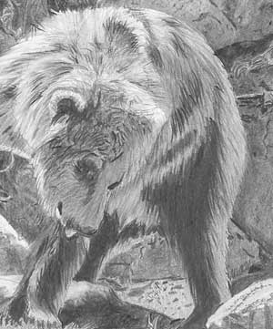
Molly (Yellowstone, MT - June)
Howdy Boss! :) I've finished the bear drawing from the workshop, It's ready for your critique. I've learned so much and my drawing techniques have improved greatly after attending your workshop....but, I know I have much to learn and plenty of room for improvement.
 You've not as much to learn as you might think :o)
This is a splendid drawing! The bears are hairy, the rocks are hard and...rocky, and you've achieved a good feeling of depth. I feel as though I could walk into those trees and explore.
What impresses me most is that I'm certain you were experiencing each element as you drew it - letting it live in your mind so you were reproducing something that existed. The way, for example, you have those twisted roots or vines arranged makes perfect sense, and your larger rocks possess a three-dimensional reality.
Now you need to expand that thinking to encompass the whole composition. Everything works in its own place but doesn't quite work when the drawing is viewed in its entirety.
The main problem is one of light and shade. You could, for example, have been more bold with your use of shade, as some areas appear to be a little flat. You've made good use of the cast shadow beneath the right-hand overhanging rock, but other cast shadows are missing. Your twisted roots would increase their three-dimensional form if they had correctly cast diffused shadows. And remember that if the overhanging rock is casting a shadow of that depth of tone, all other cast shadows should match it. They are receiving the same light so the same conditions apply. That extends to smaller shadows within the rocks themselves. The use of darker shadows in the rocks above the bottom right-hand corner would have benefitted the drawing, as would most of the other small rocks too. The use of deeper shade in those areas would have increased their three-dimensional appearance without them being a distraction.
You've used good strong tones within the trees, giving them depth and a feeling of solidity, but the midground band of rocks loses that sense. Just outlining in a dark tone won't do :o) You need to describe their roundness too, and make the shadows between them mean something.
 I can't fault your Grizzly Bears. They have character, and the foreground one has humour expressed by the subtly turned up corners of the mouth. And their hair texture looks realistic, even to someone who has never seen a Grizzly.
Overall, I think you should be very proud of this. It was not an easy drawing to execute but I think you've done an admirable job.
Beverley (Banwell, Somerset - April)
Here's my hoss. Thanks for pushing me way outside my comfort zone. I hugely enjoyed doing it, and am looking forward to doing more such.....I got the proper pencils and leads, and have been taking loads of landscape ref photos (I already have lots of dogs). I just need to make space to work on them! Your book is great.
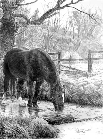 Good job, Beverley!
You've really pulled off that misty, receding background, which is not an easy area to control. Your fence is perfectly pitch in tone to give a good midground that works to push the background further away. And your strong drawing of Tom, and the foreground grasses, makes him the focal point.
There's really not much I'd wanty to see changed here, except for the rather vague tree immediately behind the left-hand midground one. It almost works but falls into the gap between understandable and naturally vague. My mind seems to want to try to make sense of it but can't, and its too defined to dismiss as being beyond understanding.
You've done a superb negative drawing job with the grasses. Those areas tend to overwhelm a lot of people who then resort to sketchiness in the vain hope of success. But you've spent time there and drawn the grassy masses with understanding. Well done!
Tom, in his shaggy winter coat, looks superb. He is realistically planted in the water and the water itself possesses a reality, which is not easy.
Brenda (Banwell, Somerset - April)
Would be interested in your critic of the attached, finished 'bunny' drawing. Loved the course, thank you so much, have learnt a lot.
 You've made a valiant attempt at this, although it might have overwhelmed you a little.
A few points need raising. First, you've made a lot of use of outlining to differentiate between planes and objects. Outline, any line, immediately destroys any reality you were trying to achieve. It has no place in nature and so will always look false.
I like your bricks and mortar. As they are secondary elements they need to suggest texture and not be over-detailed, which your do correctly on both counts. They look weathered and interesting. The wheel is not so good, as it has little texture and, because it is so lightly drawn for a rusty, non-reflective object, you've been forced to use outline to split it away from the bricks. The two similar tonal structures don't work together and, although you have good strong shading at the top, the wheel lacks any three-dimensionality. It's also missing the shadow it would cast on the wall. That shadow alone would help to make it stand away from the wall and to define the edges.
You've made a good attempt at negative drawing in places that work well. But the background behind the leaves above the rabbit could have been much darker. That would give a much better feeling of depth and it would have defined the top of the rabbit's head and muzzle, where you had to use outlining.
The rabbit has a lovely dark and glossy eye and, although it's lacking the texture of hair, it has some semblance of shaping. Well done with that.
Overall, this is too lightly drawn and, by greatly restricting your palette of available greys, you have given yourself many problems. Darker leaves, for example, would have given your drawing more impact and increased its three-dimensional appearance. Take your drawing one step at a time, try to imagine in your mind whatever you are drawing so you recall everything you know about it, and it will possess a reality that may surprise you. Happy drawing - you're well on the way :o)
Kathryn (Banwell, Somerset - April)
Thank you for a great workshop in Banwell over Easter. I really enjoyed it and learned so much, I now feel I could tackle most things. It is so helpful to see how someone does something and to see the various thought and practical processes. So useful. Anyway I have finally finished (I think) the picture. Not one of your easier ones but one that involves most of the techniques that we learned so an excellent exercise. I have called the picture. 'Has Mr McGregor gone?' As a child I loved the Tale of Peter Rabbit. I thought that the picture needed a story line and waiting for Mr McGregor to go so that Peter could feast on the lettuce in his garden seemed like the ideal narrative! Hope you like it.
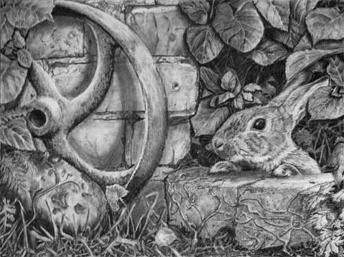 'Has Mr McGregor gone?' is an excellent title and, as I kept mentioning, making the story personal so it lives in your mind is the ideal situation.
The GIF image you sent improved when saved as a JPG and I've repaired the tonal range, but only by using guesswork. If your original is not as contrasty as this... it should be! :o)
There's a lot of good work in this drawing. The leaves are particularly pleasing, as they possess both solidity and good three-dimensional form. The bricks and mortar are drawn well - they have obvious and realistic textures without being a distraction which, as secondary elements, is as they should be. The wheel has an excellent pitted rusty surface and the cast shadow neatly makes it stand proud of the wall
I particularly like the foreground grasses and the shaded stems behind Peter - an excellent use of negative drawing, with sufficient tonal variation in the layers to suggest a good amount of depth. Also the left-hand edge works well where you've solved the problem of those dreaded fern leaves! The solution is both neat and effective.
Finally, Peter possesses character, a very believable fur coat, and his feet are nicely planted on the stonework. Overall, an excellent drawing that should take pride of place on your wall.
Workshops UK
Tutorials
by Mike Sibley