Workshop Plus
WORKSHOPS 2020
UK, USA and Canadian Workshops and Online Course continuations
Susie (online - Beginner)
I can see so many things that don't really work so I am sure you can see a lot more! I even had trouble shading the floorboards in the right direction... Lots of rubbing out hence the specks from not properly removed bits of eraser. Lesson learnt.
 Actually... no. There are faults but you've made good changes too. And some that just need to be refined.
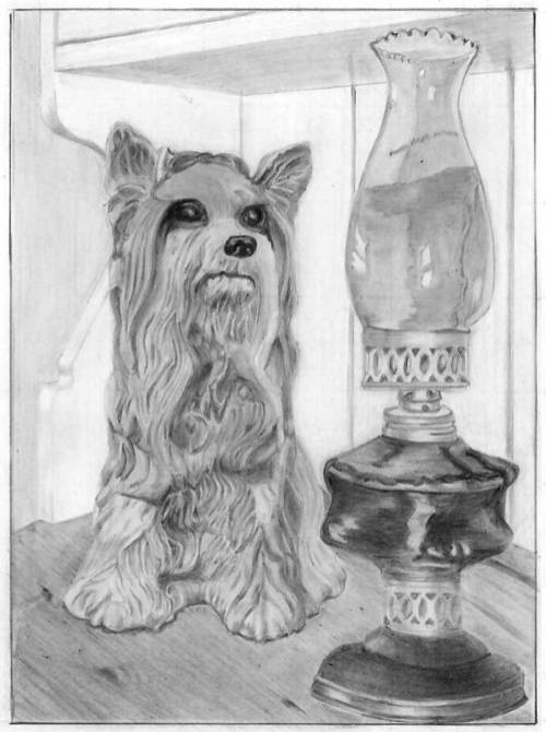
Overall it works really well. If I had to boil down the purpose of a drawing to a single basic, I'd say that it's to relay your story to the viewer, and the clarity of information is the essential ingredient. Here I can instantly understand the three-dimensional form of Kitty and her position in space compared to the lamp. The lamp has a couple of faults but I can tell brass from glass, and I can tell it's her focus of attention.
I'll work from the background forwards...
I like the treatment of the dresser and the way the dresser top runs into the blurred background.
You're correct regarding your treatment of the grain - it looks good but the perspective is far from accurate. That it looks wrong is, I think, mainly due to the short section of moulding at the right-hand side, poking out from behind the lamp.
Above Kitty's head is a line; to her left is another where side meets top; extend both and where they meet is the exact corner behind Kitty. That moulding at the right should be pointing to that corner - and it doesn't.
 Also, this has more of an adverse affect than you might think... the angle of that dark mark "C" suggests the perspective is even more inaccurate than it is. I removed it here at the left, and suddenly the angle of the woodgrain noticeably improves.
Back to the dresser - the top curve of the side is well described, and you've described it without resorting to outline. The same is not true of the sloping section below it. Try whenever possible to use differences in value to describe edges, not outline, which is man-made and completely unnatural.
There is an error at the end of the wood. Angle "A" should be the same as angle "B". Other than that, the rest of the dresser is nicely suggested without it dominating the scene, and I'm glad you decided to include the gaps between the boards. They provide a solidity to the back wall so I instantly understand that I need look no deeper.
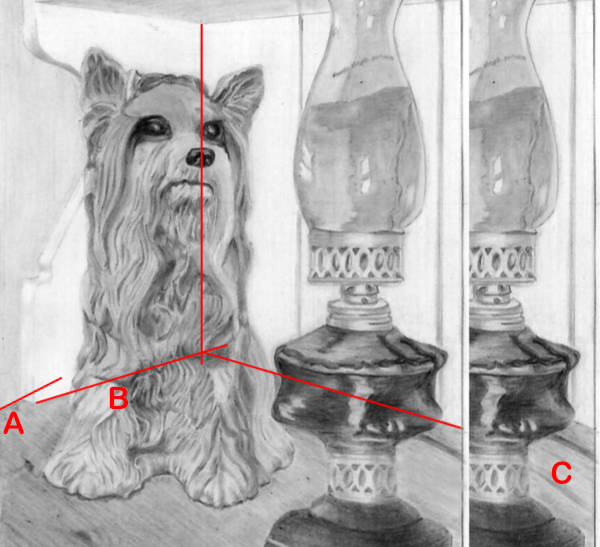
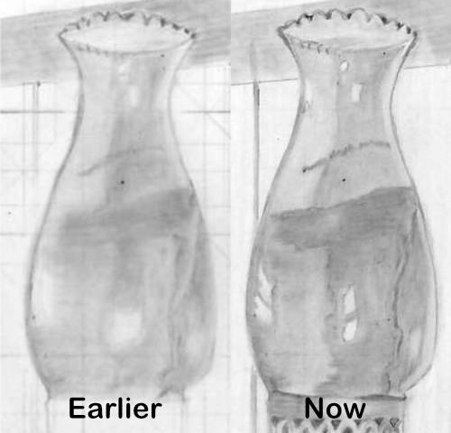
Tried to fix a few things (Kitty's eyes) and made them no better if not worse.
I disagree. Your drawing of Kitty is excellent. I could poke my fingers into her depths and run them over the ridges. Her very dark eyes and nose immediately draw my eye to them. Although your changes to the highlights haven't yet achieved perfection, they're close. Where you earlier had very large, vague highlights (which suggest cataracts!), these are much better. She has focus now. But glassy surfaces (I'll return to this later) have bright, hard-edged highlights, often surrounded by paler reflections.
 The touches of highlights beneath the eyes work very well to increase the contrast in that area and assist in defining and sharpening the eyes and drawing attention to them. That was a good decision. A good nose too! It has form without being over-detailed. The same is true of the highlight and shadow beneath her mouth that accentuate her lips and give her a whimsical and friendly look.
If both Kitty and the lamp had cast shadows on the rear wall, that would have provided a lot of depth and, more importantly, tied the two elements together. If you want to trey to do that, let mew know and I'll give you a few tips first. Although accuracy isn't important, they're easy to get wrong. On the other hand, your contact shadow under the Kitty has helped to balance the dark values of the opposing lamp and connected her to the wooden top. In fact, that's a perfect contact shadow - appearing only where we can directly view that edge.
The lamp looks good and conveys a good sense of reality, but it does contain the greatest number of errors... and some very good work!
The base is not quite accurate because the two sides don't match in shape. And the bottom-most ellipse comes to a point at each side - which ellipses never do. An ellipse is a circle in perspective, so it follows the rules of a circle. There are no sharp angles in a circle. The ellipses throughout the lamp are rarely correct. That's something you should have sorted out in the gridding/guideline stage. For example, the lower pieced collar has a downward-arcing curve, which is good (we're looking down on it) but the top edge is almost flat. The only time an ellipse can be flat is when it is at our level and we're looking directly at it.
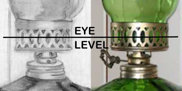 A similar error occurs with the upper pierced collar. You've drawn it with a flat base and a dished top. In fact the eye-level passes directly through this collar. The curves are subtle but they're there. We're looking slightly down on the base and slightly up at the top.
However, both brass collars have well-presented and subtle highlights that suggest their rounded nature, assisted by the recession of the punched holes - and that omitting that recession is a common error.
You've made a good distinction between the brass and glass surfaces, although I think some artistic licence could have been used for the base - lightening it to be closer in tone to the brass above, rather than matching the tones used for the glass reservoir.
 You've made excellent changes there, because the sharp-edged, bright highlights are essentially what you'd expect to see. They alone almost send the "this is glass" message. The viewer expects glass to be transparent, hard, shiny and, above all, smooth and reflective. With the exception of some line being visible in the reservoir, you achieved that look very well.
You can quite correctly use thick outline for the sides, as we are looking through a thickness of glass at that point. The same partially applies to the crinkled top, and you've handled that top in a most excellent way. You've drawn the rear of that top circle correctly lighter than the front as it's being viewed through coloured glass - it's there if the viewer looks for it, and it's quite obvious which half is facing us and which is behind.
Also, your hard-edges reflections contrast very well with the softened edges of the highlights on the brass, so you've contrasted the satin sheen with the highly reflective glass very well.
I thoroughly enjoyed working with you, Susie. Many thanks for joining me and I hope we get to work together again in the future.
Jerry (online - Intermediate)
I appreciated the extra time. I had time to think
about what I wanted to do and how it didn't quite measure up. It did
however force me to try various techniques. I am enjoying reading your
book and studying your videos. Your course PDF files are an excellent
addition to your book and videos. They need to be read/viewed several times and after a few more drawings I am sure they will answer questions I haven't faced as yet.
Your course was a pleasure. It was a point of sanity in an insane world.
Your course was a pleasure. It was a point of sanity in an insane world.
 I'm glad you found not only the course but this final exercise useful. It includes much of what we covered and nothing that we didn't.
It's a very commendable drawing in many ways but, like any drawing, it has room for some improvement. That said, this exercise was designed to stretch you, and you rose to the challenge admirably.
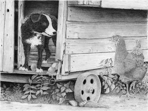
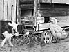
The henhouse is particularly well drawn with wood textures that describe the old weathered surfaces very well without it fighting the primary elements for attention. It's tonally very well judged and has a heavy and solid feel about it. You could have darkened the right-hand wall to help make Henrietta the hen stand forward, but I'll return to that. That Henrietta is a little lost is something many artists on the intermediate course have struggled with.
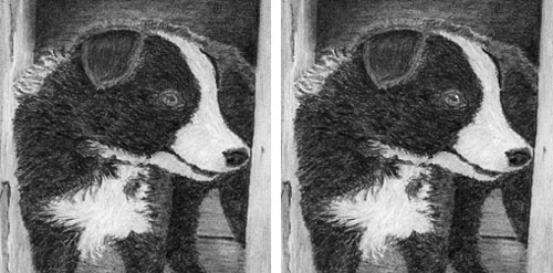 Robbie is looking splendid - very mischievous and wearing a big grin. My only reservation is a seemingly minor quibble but something that makes a huge difference - adding a key highlight to his eye. That places the maximum contrast in the drawing right at that point, and it's almost guaranteed to drew the viewer's eye directly to him.
Unfortunately, it's a feature you need to establish before drawing commences. Draw around that highlight and stay well away from it. Stray graphite can be cleaned from it later, but if you've drawn on the area, it's almost impossible to erase and return it to pristine white.
Apart from that, he has excellent three-dimensionality, a believable hair texture, and a well-studied white chest with realistic wayward hairs. You could have omitted that "halo" around his back and darkened the inside of the henhouse. And then used reflected light on his back to separate him from the background. Indeed you did use reflected light but the impact was lost by the halo. Also - this is a common error - you should have darkened his rear paw. It's inside the dark interior, and probably in Robbie's own shadow too.
Henrietta is rather lost against the wood. Darker values would have solved that. I darkened her once (#2) and then even more (#3) before she achieved prominence. And, like Robbie, I added a key highlight to her eye. However, your edges are sharp, which is essential to achieve separation. She has a subtle suggestion of feathers, which is just about sufficient, and I do get sense of them being there. That said, over-detailing would be worse, because they'd attract attention away from her expression.
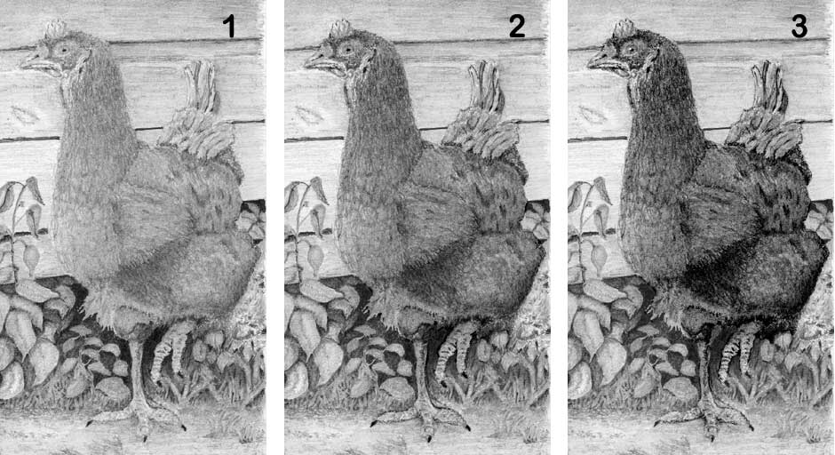 She has got good three-dimensional form. And a lovely dark eye too, but, as I mentioned, if you'd left it with a truly white highlight, that would have attracted our attention to her immediately. You did seek to brighten her raised foot, which was an excellent decision. It's an essential part of the story. We don't know if she's running or has paused but she does add tension, and implies the only movement in the composition.
 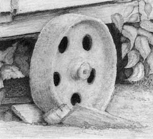 The rusty wheel perhaps looks a little too smooth and pale, but it is very well drawn, with excellent ellipses. And I really do like the broken wood that its standing on. This henhouse no longer exists but we have another similar one in use. When it's not standing on blocks of wood the wheels very slowly sink into the ground... until the floor meets earth and it begins to rot. So, I can definitely relate to your invention :)
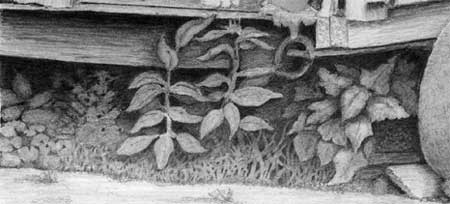
 That brings me to the foreground foliage, which I think is definitely on the right track. Even darker values beneath the henhouse would have offered you even opportunity to create depth. However, you've created a good deal of depth by pushing some leaves far back into the murky darkness beneath the henhouse, which adds realism. Also your edges are sharp, which was essential. It's what the eye expects to see in a foreground element - but also because without them you lose depth. You have to make the layers in the foliage crystal clear.
The foreground weeds are more prominent and nicely varied in shape, but there is not much midground. All your foreground leaves are comparatively similar in value; most don't cast shadows on the others; and there's little to connect foreground to background. Just allowing one background weed to grow forward would create a bridge that helps the viewer's eye to travel between the layers.
I think this is a very creditable drawing and one you should be justifiably pleased with. Thanks for joining me at Drawspace, Jerry, I really enjoyed working with you.
Workshops UK
Tutorials
by Mike Sibley