Workshop Plus
WORKSHOPS 2014
UK, USA and Canadian Workshops and Online Course continuations
Carole (online - Beginner)
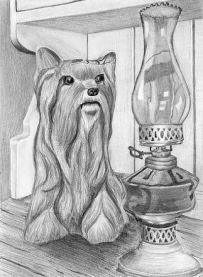
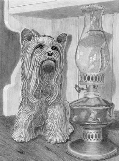
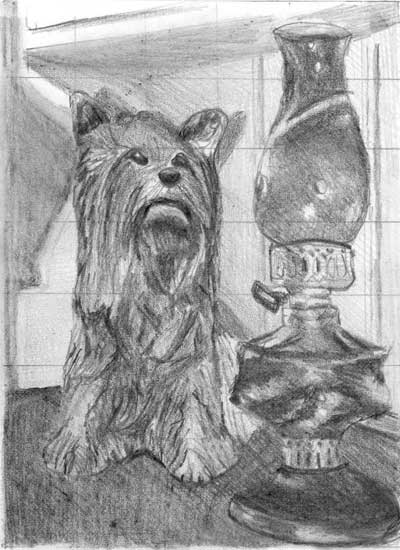
I really enjoyed your workshop and I have learned a lot, especially about seeing my surroundings with other eyes. I am often analyzing objects, animals or nature for how to draw. Here is finally my Kitty and the lamp drawing. The cast shadow is missing because I do not really know where to position it. So I hesitated to ruin my drawing with a wrong applied cast shadow. I am looking forward to your comments.
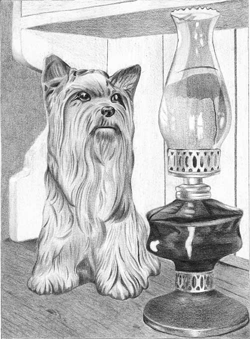 In many respects I really like this, so the wait was definitely worthwhile! It tells the simple story very clearly with a definite connection between Kitty's gaze and the lamp. I like the way the dresser's top runs quietly into the background, and the background itself does its job and is unobtrusive. The rather complex curves on the end of the dresser are well constructed, which is often a problem in this exercise. The dresser itself is nicely suggested without it dominating the scene, and the inclusion of the gaps between the boards means I immediately understand that I need look no deeper. Also, removing, or at least simplifying, the moulding the base of the back was a good idea - it could have proved to be a distraction if left as it was. You've made the scene your own, and that's most of the battle won.
Kitty is very well drawn indeed! Your interpretation of her three-dimensional form is unmistakable, although I feel she is a little bit lightweight. She doesn't possess the solidity and form of the lamp's reservoir. That's not a criticism, just an observation, as is that she appears to have hair rather than glaze, which is perfectly acceptable. Her wonderfully dark eyes and nose immediately draw my eye to them, and it was a good decision to replace the rather strange painted triangular eye highlights with more realistic ones. The curve of her mouth gives her a slightly annoyed look - as though she's wondering what the lamp is - but that's OK, it just adds to her appeal.
 The lamp conveys a full sense of reality. I think it's wonderfully drawn. The soft sheen on the brass contrasts excellently with the harsh reflections from the glass, and the reflections are beautifully crafted. The sharp-edged and bright highlights on the chimney and oil reservoir immediately tells us this can only be highly reflective glass. All of your ellipses are accurate, and both brass collars have subtle, satin highlights that suggest their rounded nature, assisted by the recession of the perforations. And the recession you've created between the front and rear edge of the top leaves no doubt which is which. That's tripped up many a past artist on the this course.
Personally, I think the only "problem" is Kitty's slight lack of prominence compared to the lamp. Stronger values within her shaping would have counterbalanced the darks within the lamp.
Finally, this is so sharp and confidently drawn that I really don't miss the shadows. And you haven't made the error of including some but not all. Without them the inference is that the light is diffuse so their omission goes unnoticed. If you ever do try to construct the shadows, first choose the lighting direction, which should comply with what you have already drawn.
If the light was to the left, Kitty, because she's close to the back, would cast a shadow that almost mirrored herself. However, you also need to know the height of the light source. The higher it is, the shorter will be Kitty's shadow. Then transfer that thinking across to the lamp. But the lamp is further forwards than Kitty, so its shadow will travel back across the top and then climb the back. Even though the shadow would be longer, its height would reflect that of Kitty's shadow - they share the same positioning and height of the light source. If I ever have the pleasure of working with you on the Advanced course, we spend an entire week on the science of shadows - and how to effectively lie by breaking the rules :o)
I think you should be very pleased indeed with drawing. It shows a lot of confidence, attention to details, understanding of what you were drawing, and interpretation of the reference.
Christine (online - Intermediate)
I made some changes to the photograph. Somehow the water appeared, maybe because I'm an Oregonian, and most of the year there are puddles, mud, wet places. It also gives a compositional way into the drawing. I also found all the foliage too much of distraction from the critters, particularly given how not distracting the large area of wood is. In fact, the foliage is my least favorite part of the drawing. I still haven't quite made my peace with making things up as I go along, and how much emphasis to give them. I added some eggs for fun, also a path for the eye to follow.
All the changes were definitely worthwhile but, more importantly, I'm delighted that you undertook them. You made the scene yours!
There's a world of difference between working from a reference and working from your mind. By all means use the reference for detail and positioning but when you can live within your creation... well, that's magic. Everything makes sense to you and things begin to appear from your imagination that are often quite unexpected.
...this is clearly the best drawing I've ever done, thanks to you. I felt very sad when it was finished. I've been living with this place and these critters for many months now, and I will miss them. Now what? I must admit to not having a clue where to go from here. What do you do when you have finished a huge project?
As to "what do you do when you have finished..." - I start on the next one :o) Sometimes my ideas take three or four years to develop in my mind, but I've usually got at least one I'm eager to make a start on. I also find there's a logical order to them, so very often I need lessons learned from the just completed drawing to help me with the next one.
Right, down to the business of critiquing. First, I probably won't be mentioning techniques, because I can't fault them. Everywhere I look I see confident and accurate drawing that conveys your message in an excellent fashion. There are a couple of points to raise but I'll work my round to them.
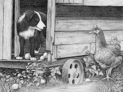
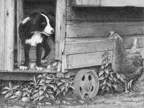
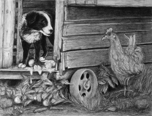
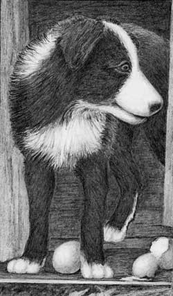 Robbie is undoubtedly the main focus of the drawing and is obviously enjoying his game at Henrietta's expense. And he's probably about to receive the sharp end of Henrietta's beak. His hair texture is beautifully described, as is his three-dimensional form. His eye is alert but a really bright key highlight would have drawn our attention to him more immediately. There is also an error in perception: his rear paw is as white and bright as his front paws are but it's inside the dark henhouse and most probably within Robbie's cast shadow too, so it should be darker. That would also increase the perceived depth. The broken eggs are perfectly judged - silky smooth, and visible but not overpowering Robbie, which is not easy to achieve.
The wood of the henhouse is superb if a little lacking in character. That's not a fault - it's your interpretation to fit your world - I just have a personal liking for the character of old weathered wood. It has a very solid appearance and possesses sufficient interest while remaining a secondary feature. You've also used it very well to visually push Henrietta forwards, and that is a potential problem area in this composition.
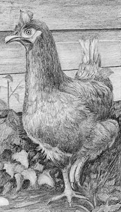 Your drawing of Henrietta ranks with the best I've seen. She has a great sense of three-dimensional solidity, and a very believable covering of feathers with just the right amount of feathery suggestion, especially beneath her breast. That feathery edge clearly let's us know she is covered with feathers, even though very few are individually recognisable. The overall soft suggestion of detail perfectly throws our attention onto her more sharply-drawn head and raised foot. I think highlighting the right-hand foot was essential because, although we can't tell is she's running or has paused, it's a major part of the story and adds implied movement to the composition.
 I know the foliage was your least enjoyable part of the drawing but, where appropriate, it is sharply defined with good form and detail. It even degrades well in the midground and falls back quite naturally into the darkness beneath the henhouse. I think your foreground grass would have benefitted from a similar treatment because it lacks depth, but it's still undeniably grass.
Finally, the foreground: your rusty wheel is well studied and drawn, your ellipses are sufficiently accurate, and the foreground itself is well constructed. You've defined a set path for the viewer to enter the drawing that definitely works. My only advice in that area concerns the water: it's quite possible that I would not have recognised it as water if you hadn't mentioned it. That's because a major visual clue is missing - one of the clues we subconsciously use to identify it - reflections. We expect at least a suggestion of the wheel's reflection and the tufts of grass too. If you add them and find they are too distracting, introduce a slight breeze and ripple the water. It's your world abiding by your rules, so do whatever you need to until it works - apart from breaking the visual clues that it depends on.
I am so appreciative of your amazing class. I can't believe how much I've learned, and I am looking forward to using the techniques elsewhere. I want to take your advanced class, but I'd better bring myself more up to speed on computer skills. So, maybe for another Christmas present.
Basic computer skills in managing images would be helpful but they're not essential. Week 8 (Computer composition) should give you all the tools you need to freely compose your artwork with instant visualisation - especially if you have Photoshop or the much cheaper, but still feature-packed, Photoshop Elements. In any case, the course is designed to equally accommodate those with and without computer skills. I sincerely hope I get to work with you again because I've throughly enjoyed myself and I'm so pleased to see you progress so well.
Ruth (online - Beginners)
I have finally posted a proper attempt at the final exercise. I have attached here my last attempt (far left) and the first (left) - bit of a difference so not a bad exercise. I have tended to make the dog a bit more life-like, although not totally living, for a number of reasons!!
Top marks for perseverance! And the exercise has definitely paid dividends. I can see you drawing with so much more understanding in the second drawing.
It's your drawing, so whatever your reasons, they're perfectly legitimate.
In some ways I would have liked to have seen the two combined. The first is purely tonal and the second almost all line. I won't continue to compare the two but the first has a smoother and less intrusive background - both the physical background behind the dresser and the dresser itself. I find your later linear treatment of the dresser rather distracting. Of course, if you interpreted the painted surface as being bare wood, that's OK... but it's still intrusive :o)
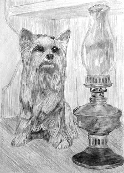
First, Kitty's dark eyes definitely draw me straight into the drawing and directly to her. And the dark base of the lamp balance Kitty's dark values very well.
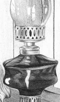
The lamp has solidity and accurate ellipses, which are not easy to achieve. The lower brass collar has a lovely silken sheen and a soft highlight that perfectly describes its round nature, as do the receding cutouts as they disappear around the sides. The upper brass collar is not drawn as well - The cutouts don't narrow so the collar appears to be flat despite its shape, and it's lacking an obvious "curved surface" highlight. The wick mechanism below that collar is wonderfully sharp and drawn with confidence. The oil reservoir below is not obviously glass, but it's also not brass, so it's OK.
The glass chimney is looking good despite the linear shading, which is sufficiently softened to not look unrealistic. Glass is shiny and hard, so visible linear shading rarely works well. However, your highlights are bright and sharp-edged, and it's those sharp edges, coupled with the transparency, that tell us it has to be glass.
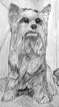 Kitty looks a little displeased :o) That's mainly due to the upward slant of her eye highlights and her downturned mouth. Remember, we humans look for and understand human emotions, not canine ones. She also has a good solid sense of three-dimensional form. She's not, as you mentioned, very "ceramic" but that's your vision and perfectly acceptable. She also has a lot of character, and a sufficient description of three-dimensional form to make her look solid.
 There is, however, one thing missing. Something that would tie all three elements together - cast shadows. If Kitty had a thin contact shadow around her base she would be grounded onto the dresser's wooden top. A shadow spreading out behind her would have signalled the lighting direction and connected her to the back of the dresser, and the same applies to the lamp. Without them you have three elements that are only connected by association. We see shadows every day and they are seemingly unimportant, yet they are extremely powerful tools for an artist. We instinctively understand them and are even willing to "fill in the gaps" if some are missing. But "no shadows" is quite unnatural and will be noticed, if only subconsciously.
Again, well done for having two attempts at this. You certainly did learn a lot from the first that you've carried over to this one. It is not an easy composition to pull off well - it was deliberately designed to move you out of your comfort zone - but I think you can be justifiably proud of this and the advances you've made in your work.
Karen (online - Beginners)
I have completed my final piece of work...the Lady and the Lamp. I want to develop it further as I'm not satisfied with the glass, it doesn't seem to flow well and possibly the hair needs further detail and tone. I began making alterations but I felt I may mess it up completely. Its good to step away from it, then return and realize where mistakes have occurred etc. Any advice will be welcome.
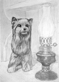
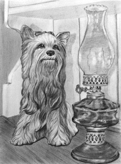 There is some excellent work in this, Karen. The first thing I noticed about this drawing is the superb three-dimensional rendering. Your drawing tells the simple story very well and Kitty is clearly connected to the lamp. The dresser top runs almost unnoticed into the background, and the background itself is nicely muted and devoid of interest, so it correctly appears to be behind the dresser. The dresser's curving end is well constructed, which is something many artists on this course have problems with, and the dresser itself is good too.
The lamp has both solidity and a sense of reality. The silky sheen on the brass collars and their soft highlights perfectly describe their round nature, as do the receding cutouts as they disappear around each side. I think you should have employed some artistic licence with the brass base, because its overall value equals that of the glass reservoir. As a result, it's not clear whether the base is brass or glass. I suggest you progressively lighten it until it's more closely associated with the collar above it than the oil reservoir. The brass collars are definitely not glass and contrast very well with the harsher reflections from the glass. However, they would have done so even more if the reflections in your glass had been really hard edged and the shading smoother.
What I tend to see is the linear shading in both the reservoir and chimney. We expect glass to be very smooth so visible line just creates confusion. The other thing that differentiated glass from brass is the quality of their highlights. The soft highlights on your brass work well, but glass is highly reflective, so we expect to see brilliant highlights with hard and sharp edges. I think you might have formed your highlights by stopping at their edges, but the point where you stopped varies a little with each line, and that's resulted in an edge that appears to be soft. You should interpret a highlight as being sharp edged even if that is not particularly evident in a reference, because that edge is one of the visual clues we subconsciously use to recognise a glass (or very shiny) surface.
 Kitty has bags of character, wonderful three-dimensional form, and she's decidedly ceramic and not hairy. In fact I think you've achieved just the right balance to state both "hair" and "ceramic" at the same time. Her rich dark nose and her eyes with their bright highlights draw my attention to her immediately. The thin highlights under her eyes are a great device for defining their shape and adding extra contrast. The slight upward curve at the corners of her mouth, coupled with the bright eyes, give her a very warm and friendly appearance, and her attention is obviously focussed on the lamp.
 I must mention your shadows. Kitty has a clear shadow that is equal to her in height, so we can assume the light is shining directly at her and is at her level - lets say at the height of her chin. If the light was higher her shadow would be shorter. The lamp also has a shadow that conforms to the same lighting source height but... the shadow has been cast from its base to its top as though the entire background is flat. In reality the shadow would travel back across the top and then up the wall further away from the lamp and to its right (because the light is to its left). Usually, because the lamp is further forwards than Kitty is, the top of its shadow would be rather lower - but in this case, as we know the light is low, it's sufficiently correct.
 Finally, there's one small problem area - the very top of the chimney is confusing. Your shading suggests the lower curve is the foreground one, but the top curve is the one in front because it's an ellipse and we are looking up at it. I suggest you continue your shading right up to the top and then make certain the lower curve is weaker so it reads as being behind the glass.
Don't be dismayed by any of this. The exercise was designed to stretch you - to move you right out of your comfort zone. Your work on Kitty is superb! The lamp is good too and just needs a little extra work. Looking over my notes from the course, I think you've done exceedingly well!
Lyndel (Toronto, ON - July)
I am at last sending this to you for a critique. The work shop was great fun. I hope I haven't done too bad of a job for a first try.
 I'm glad you enjoyed it, Lyndel - I did too! I've done the best I can with restoring your photo to, I hope, something that resembles your original.
It lacks a little depth but that might be due to my Photoshop skills. I'm reluctant to change it more in case I drift further way from its actual appearance.
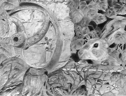
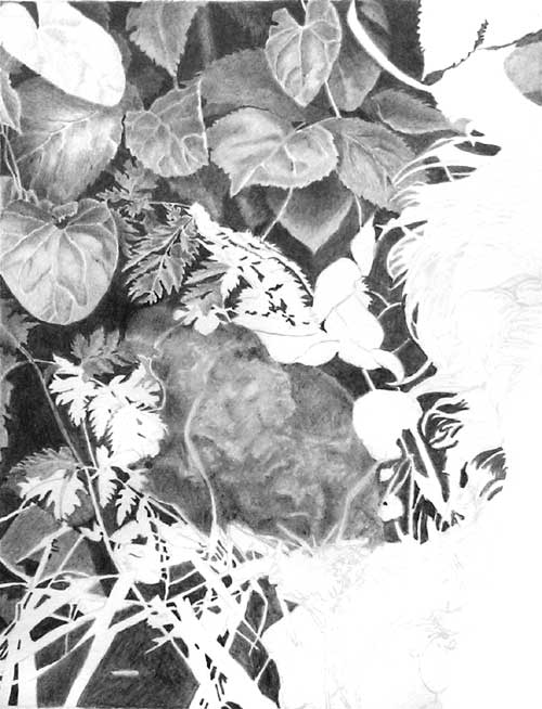
From left to right: Your rusty wheel has good shaping and is definitely rusty. It could possibly have benefitted from casting a shadow, however diffuse, on the wall to better connect the two. And you've made a common error - you've seen the base of the ellipse as swinging up the bottom spoke. I knew that optical illusion existed but - just the devil in me - I decided to leave it as a dastardly trap :o) The bricks are underplayed as befits a secondary element, although I would have liked to have seem a little more strength of tone in them. They are slightly washed out compared to the adjacent leaves on the right, although darkening them as they disappear behind the wheel would probably be sufficient to fix that.
It's good to see you finding a solution for the awkward midground rock, although your photo is too small for me to really understand what I'm looking at. It reminds me of seaweed but I'm sure it can't be :o)
The leaves above the rabbit have excellent three-dimensional form, and background behind them is dense and dark. Because it is so dark, which gives a lot of depth to your drawing, I feel you could have pushed some of the midground foliage in that area further back. That would have created even more depth as it drew my eye in. Never be afraid of really pushing some elements right back into the shade. It creates a sense of mystery that is entirely natural. Take a look into a mass of foliage and you'll quickly realise that you can understand the foreground layer, maybe the layer behind that too, but any deeper and you're just guessing. That lack of understanding is what conveys a sense of realism to the viewers of your drawing.
Your rabbit is alert and lively! And definitely the focal point of your drawing. It has a good hairy texture that suggests coarseness in places and a softness in others. The eye is super, as is your use of lighter values around it, which attracts my eye directly to it. Your contact shadows beneath the paws firmly place them in contact with the stone and increase their presence.
Overall, I think this just needs the balance restoring with darker values introduced into the left-hand side. For a first try, and especially with a fairly complex composition, you've done exceedingly well!
Linda (Eau Claire, WI - June)
Here is my completed final exercise from our Eau Claire workshop at the end of June. Loved the workshop and feel as though I've learned how to tackle a variety of textures. I am looking forward to your critique of this piece.
 Thank you, Linda! I'm so pleased you found the workshop helpful - and please do accept my apologies for this late critique.
My first impression was that I like this a lot! It lacks a little depth in places, but it is very well drawn.
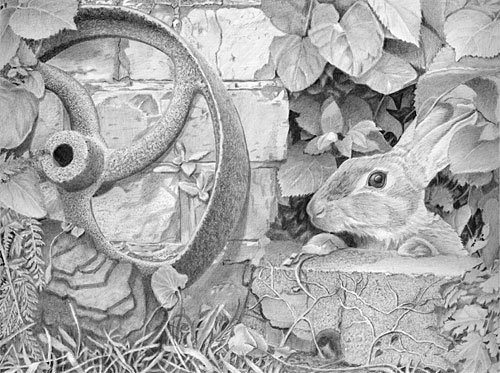
Working left to right, Your rusty wheel is definitely rusty. It couldn't be mistaken for any other surface - well done. My only criticism is that it's rather pale, especially compared to the intense dark inside the central hole. The bricks are nicely underplayed with sufficient interest for close inspection but not vying for attention. In fact, I find them quite delightful as I inspect them closer, and you've nicely differentiated between the smoother bricks and grittier mortar. You've even established the shadow cast by the wheel on the wall, which is something many artists miss. It helps to tie the two together, reinforce the leaning angle of the wheel, and removes the need for any outlining of the wheel. My only observation is that, again, both the wheel and bricks could have been darker, which would have better contrasted your bricks and mortar, and balanced the composition tonally.
I like your solution to the insipid rock problem. You were brave to retain the complex Cow Parsley leaves! I would have chickened out and stuck a big leaf over them :o) Your negatively drawn grass at the base works really well too - plenty of depth and an element of mystery built into it.
 Moving right - the leaves above the rabbit have wonderfully believable body and three-dimensional form. I could literally run my finger over them and feel each undulation. Your background behind the leaves is rich and dark so you could have broadened your range of values quite successfully. Never be afraid of really pushing some elements right back into the shade, which can be very deep because you've created intense darks as the absolute deepest shade. Don't forget you can always change your mind and use Blu-Tack to pull anything forward again. The extreme right-hand leaves don't contain as much contrast as the others. You've lost depth there. But they are acceptable and the lighter values do prevent them from taking attention away from the rabbit.
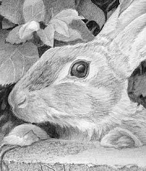 Your rabbit is lovely! it has a believable hairy texture that correctly varies between coarse on top and softer down the side of the head. The eye is superb - the intense black contrasts well with the highlight, although the inclusion of a small brilliant white key highlight might have drawn even more attention to the rabbit. A touch of contact shadow beneath the right-hand paw would have helped to ground it, but well done for noticing I'd copied the right-hand paw to be its left-hand paw! Your alterations have definitely made each unique.
The stone block beneath the rabbit's paws has a really lovely texture, and the detailed work in the leaves at its right-hand end are well-studied too. Element by element, this is excellent - it just needs the left-hand side to be strengthened to restore balance. I think you should be justifiably proud of this drawing. Good work, Linda!
Maggie (online - Advanced)
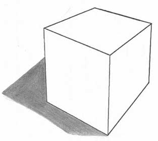 Week 7 - EXERCISE 1
As you haven't included the ground plane or light ray lines I'll have to figure it :o)
As far as I can see your light source is high up on the right-hand side and above the front corner of the box. If that's correct, you've chosen the right three corners to project the rays through (including the one we can't see) with a perfect result!
 Week 7 - EXERCISE 2
Starting at the top: the interior shading is really good, and the exterior shading is pretty good too, although I think you could have exaggerated the curve of the body as it curves underneath to the stem. And the same on the base where the shadow should curl around the thickness before spreading out onto the table.
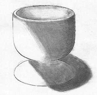
Week 7 - EXERCISE 2
Starting at the top: the interior shading is really good, and the exterior shading is pretty good too, although I think you could have exaggerated the curve of the body as it curves underneath to the stem. And the same on the base where the shadow should curl around the thickness before spreading out onto the table.Overall though, this is a good result that could have been slightly more descriptive - clarity through a little exaggeration never does any harm.
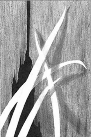 Week 7 - EXERCISE 3
A good result, Maggie, although you have made a common error.
The position of every leaf is very well described in relation to the others. The cast shadows on the wall instantly describe the way they bend, and their distance from the wall at any point. However, each shadow, where it crosses other leaves behind the one casting it, should step forwards, because the surface receiving the shadow is closer to the leaf casting it.
This is what I mean:
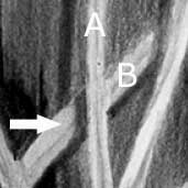 Here Leaf A is casting the shadow on leaf B and the wall, but leaf B is closer to leaf A than the wall is.
 So the shadow will be cast closer to leaf A at that point (arrowed). In this case, of course, the light is shining from the right and not the left as in your drawing.
Liz (Toronto, ON - July)
This is the first "go"... I don't work like you, and get it right the first time, I like to work on my over-all work and get some idea of balance with the darks and lights, then come back in and tighten the edges and finer details later. Pointers from you, gratefully appreciated.
 It looking great, Liz! What... you wanted more? :o)
 My first impression, which I pay a lot of attention to, is that this has good depth, superb textures, and really doesn't require much more work - if any. I have adjusted your scan slightly so it may look slighty darker here. If that's the case then your darks probably could do with strengthening by a degree or two.
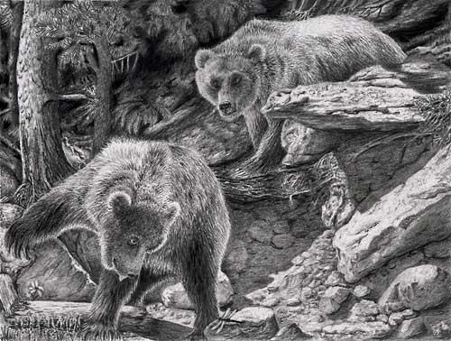
I can understand your preference for building this up and then, once balance has been achieved, to return for a final polish. It wasn't an easy assignment and, unless you're used to dealing with compositions such as this one, it's difficult to keep the overall appearance in your mind as you work on each element. Personally the first thing I do is decide where my focus is going to be - in this case it's the bears, and then everything else needs to be less sharp or contrasty so it doesn't attract too much attention. I also like to get one instance of the darkest value established first so I have something I can balance everything else against. The background foliage is ideal for that.
You've handled the overall composition very well - those right-hand rocks, for example, have dominance because of their sharpness and high contrast, and they echo the angles of the two bears (the human mind loves patterns!), leading the eye back and forth between them. The textures you've created in those rocks as entirely believable! The area between them and the left-hand bear is nicely judged - they suggest rock-like texture without being over-detailed or too sharp. The removal of bright highlights has helped too. You've created good recession in that area, with an obvious change of plane between that vertical rock face and the sharply defined right-hand rocks and foreground.
I really like the wooded background. The highlight running down the tree acts as a break to stop the eye wandering out of the drawing; it leads the eye down to the bear; and it defines the tree's forward prominence. And the way the detailing of the bark diminishes with height prevents my eye from wanting to wander upwards and out. The same applies to the soft suggestion of foliage to the tree's right and the trees within the deep shade. The softening of detail, as that area progresses right, superbly defines the right-hand bears back and creates a great deal of depth.
The sharp detail and high contrast you've used for the left-hand bear really give it prominence. The texture is superb. His head is sharply defined and his body less sharp with distance, throwing our attention onto the head. You've made good use too of rich darks in the bear's head and the visible white of his eye.
Both your Grizzly Bears possess character and believable textures. The left-hand one has a definite look of interest on his face, totally engrossed in his search. The other is more relaxed and just looking on. And I like the way you've extended the drawing down slightly to include the right-hand claws.
As an overall scene I find the background to be perfectly pitched so it displays the bears as being the primary elements. In fact every element works very well and I congratulate you on a job well done. Which is another way of saying... I think it's finished!
Ramona (online - Beginner)
Here is my finished Kitty - finally! I definitely ran into a lot of problems, but learned a lot. Thank you so much. This was an excellent introduction to learning about these materials and techniques.
 Problems result in solutions :o) I try to design the courses to stretch you - just enough to lift you out of your comfort zone. Sometimes I even build things into an exercise knowing that errors will probably result. But making errors is how we learn. And correcting errors is how we learn to do the things the correct way - and, more importantly, why. So, I'm very pleased that you found the course helpful. And hopefully this critique might add even more knowledge that you can use in your future drawings.
The first thing I noticed about this drawing is that you find working to hard edges far easier than softly curved ones. That's entirely natural. Again, it's the way we learn - and why, for example, children rarely include noses on faces. Eyes and mouths have defined shapes - hard edges - but noses don't, so children usually just draw the nostrils, which also have defined edges. So, I'm going to tackle the dresser and then the lamp, and I'll leave the drawing of Kitty to the end.
Your drawing tells the simple story very well and Kitty is clearly connected to the lamp. The dresser top runs almost unnoticed into the background, and the background itself is nicely muted and devoid of interest, so it correctly appears to be behind the dresser. The dresser's curving end is particularly well constructed, which is something many artists who take this course have problems with. You've tackled those curves with a lot of confidence and accuracy. The dresser itself is well drawn too, and I really like the highlights you've left down one side of each gap between the rear boards. That's an excellent device for telling us they are grooves and not dark lines on the surface.
The lamp exudes a good sense of reality. The silky sheen on the brass collars and their soft highlights perfectly describe their round nature, as do the receding cutouts as they disappear around each side. The collars also contrast very well with the harsh reflections from the glass, which are crafted very well. I especially like the bright highlights on the chimney that tell us this can only be highly reflective glass.
Your ellipses are mainly accurate, and the strong darks you've incorporated into the glass oil reservoir counterbalance the darks within Kitty, and help to connect Kitty to the lamp. Without them, Kitty would dominate the scene even though the lamp is in the foreground.
Kitty has character and suggestions of three-dimensional form, but she's lacking any indication that she's has a ceramic surface. I think you probably let her overwhelm you, and that's entirely understandable. Drawing multiple curved surfaces is definitely not easy. But it becomes a lot easier if you break her down into individual curves. Now you only need to think about that one curve, the way it is formed, how the light reflects from its surface, and its surface texture. In this case, she appears to have hair rather than a ceramic glaze. That's perfectly acceptable if that was your intention, but she's missing three-dimensional shading - she's the same average value on both sides. When you drew the collars around the lamp, you showed us how the area facing us was reflecting light and how that light dulled as it approached each side. If you'd done the same with Kitty she would look a lot more rounded and solid.
Kitty does have wonderfully dark eyes and her nose is drawn very well. They, and the highlights in her eyes, immediately draw my attention to them. The flattened curve of her mouth, coupled with the wide open eyes, give her a rather annoyed appearance, but not in a malicious way - more a sense that's she's fed up waiting for the lamp to do something :o)
Finally, I must mention your shadows - or lack of them, depending on how you look at it. Kitty has a shadow spreading out in front of her, which suggests the light is coming from behind her. That's not impossible because it could be reflected light shining from the back of the dresser. The lamp has no shadow at all. That might be a problem but in this case, if we accept the reflected back light theory, it makes sense, because it's shadow would also be angled towards us but is hidden by the drawing ceasing at that point.
OK... so the lamp's shadow is missing. I'm just trying to give you a valid excuse for that :o) I think you had a really good attempt at this drawing and, with the exception of Kitty's form, you've done exceedingly well!
Margaret (My studio, March — Intermediate)
I have signed up for your Drawspace Advanced course and very excited about it. I am still working on the drawing from the intermediate course at your studio. I have attached the progress so far, bit slow but I am learning a lot as I go along.
 There's nothing wrong with "slow"! :o) I usually have a rough idea of how long a drawing might take, but it gets as much time as it needs. Rushing even a part of a drawing produces substandard results and simply drags everything else down to that level. So take your time and when it's finished it's finished and not before.
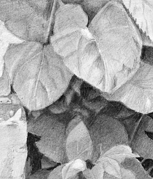
I think this is progressing wonderfully well. Coupling deep, dark depths with sharp-edged foreground elements creates a lot of depth. Each of your leaves is so well studied and drawn with much skill. You obviously have the lighting direction firmly fixed in your mind, which makes understanding the three-dimensional properties of every surface extremely easy to understand.
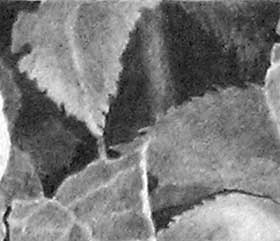 There is one technique that I'd like to remind you of, because I think it would be useful in this and similar areas. On the left-hand side of this extract you have a partial leaf shape in deep shade, which adds depth and a natural element of mystery. I feel a similar strategy would work very well in the areas either side of the stem. Those holes are quite large and I feel sure I'd naturally see something in there. The same applies to other large areas of shady depth elsewhere, and within the grass at the base.
 The work in the foreground is stunning - just don't concentrate on that to the detriment of the background. See you in the online Advanced course and I'm looking forward to working with you again.
Anna (online - Intermediate)
I am not terribly pleased with this but is was time to let it go. I also need to figure out how to adjust my scans. Now that Henrietta is finished when is your ADVANCED COURSE available. I can hardly wait!!!
 Given that I'm trying to catch up with these critiques - welcome to the second session of the online Advanced course :o) I know I'm going to enjoy working with you again.
As for your drawing - letting it go was a wise decision but it's way better than you appear to believe it is.
Robbie is definitely the main player. He's obviously been enjoying his game with Henrietta's eggs, and probably about to receive what's coming to him. His left-hand front paw is rather too large, but his rear paw is correctly in the shade, and he has good overall texture, strong values and presence. The broken eggs are perfectly judged - visible but not overpowering Robbie, and that's not easy to achieve.
The wood of the henhouse is superb! If it wasn't for fear of splinters, I could run my hands over the boards and feel their aged and weather-worn surfaces. Each has its own character and collection of splits, knocks and nail heads. Combined, they have a very solid appearance and possess a lot of interest while remaining secondary features. You've also used it very well to visually divide it from Henrietta - which was a potential problem area in this composition.
Henrietta the hen has a very believable covering of feathers, and I think you've provided just the right amount of feathery suggestion - clearly feathers yet none are individually recognisable. That blandness is perfect for throwing our attention onto her head and raised foot. In my opinion, highlighting the right-hand foot was a necessity. Although we can't tell is she is running or has stopped, it is a major part of the story and adds the only implied movement in the composition.
The foliage is sharply defined with good form and detail. However, it is perhaps a little too clean and well defined to be entirely natural. It has deep shade but you haven't taken the opportunity to push many leaves back into it - they are all either foreground or midground. The exception is the grass beneath the henhouse at the left-hand side. If you had incorporated similar work into the nettles, I think you would have created a lot more depth.
Finally, the rusty wheel is very well studied and drawn, if a little too sharply detailed. And your foreground is well constructed - it leads the eye in and grounds the hen without it taking attention away from the two characters. Despite your misgivings, I think you should be very pleased with this drawing.
June (My studio, March — Intermediate)
My submission from your workshop. Sorry it's not a very good copy as it was taken with my mobile. I can't get my scanner to work.
 I assumed it was a photo and I've attempted to correct it. I split it into three and then adjusted the middle and top segments based on the contrast in the bottom one. Then I added a little judicious manual darkening of the shadows in the top left area. I hope it's closer in appearance to your original. It's this adjusted copy that I'm critiquing.
It's finished and I learned a lot doing it. Mostly that I need to think more about my drawings before putting pencil to paper, in particular the light source and where the shadows would fall. I think this is where your advanced course will help, so am looking forward to that. A long way to go, but bit by bit getting there with your help. Thanks again for a great workshop!
I don't think you've as far to go as you think you have! I can see the thought that went into this, and your direct connection with the scene. There is so much to enjoy that I'll try not to critique it leaf by leaf :o) You have every right to be very proud of this drawing, and there's nothing I'd want to see drawn differently. Every leaf, every element, has been so carefully studied and drawn with understanding - which is a million miles away from "copying". Nor have you fallen into the "detail" trap of concentrating on it so heavily that the overall image lacks unity. Here, everything is as it should be and all combine to give a sense of reality.
 You've made good use of those enigmatic leaf shapes deep in the shadows that impart depth to the piece, and increase its reality by making the brain work. Everything in Nature is not obvious and those half-glimpsed, half-understood elements play their part very well. The foreground foliage is exceptionally well crafted. You obviously had a very clear sense of the lighting direction, which has greatly assisted you as you bent and twisted individual leaves, and described the three-dimensional form of others. I particularly admire the way you've used tonal variations - crafting each leaf to best display those around it - and using tiny touches of highlight to perfectly describe edges between tonally similar leaves. The overall result is a great sense of three-dimensional reality.
Before I move on to the foreground I have to mention your inventive use of the wooden fence. That so simply and perfectly solves the problem of the detailed-challenged rock and most of the awkwardly intricate Cow Parsley leaves. It's an excellent device!
 That said, the Cow Parsley you have included is drawn with real three-dimensional understanding and is super sharp. The same applies to the grass - wonderful, sharp foreground edges that instantly provide division from the midground and background elements.
Your use of intense darks within this area has permitted you to create a great deal of depth. The grass at the left contains midground blades that exhibit subtle highlights and behind those are shadowy parts of leaves that add so much to both the depth and reality. And the area to the right contains enigmatic shapes that posses a sense of entirely natural mystery. We accept them as being parts of plants in deep shade without the need to identify them.
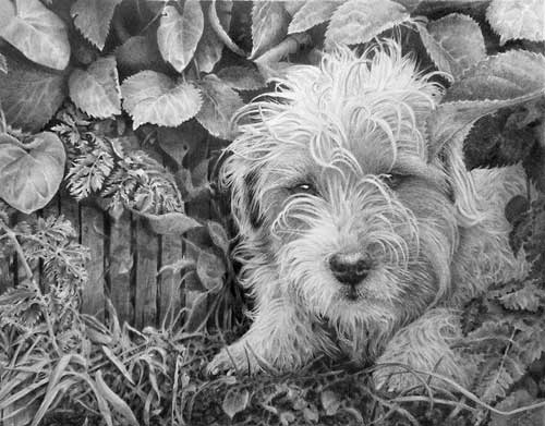
 As Buster is my own dog I know him very well - and this is Buster! His brilliant white eye highlights immediately draw my attention to him; he's undeniably connected to the scene (he was on a table when I photographed him); I'm being drawn into the study because he's looking directly at me; and your attention to detail and control of values presents him as a truly three-dimensional character.
Above all else, and this is worth repeating, he's drawn with understanding. I have no problems at all in instantly comprehending the locks that fall forwards and how they are layered one in front of another; that his brows jut forwards over his bright eyes; how the hairs on his tousled head clump together and form locks that fall in all directions; and the smoother texture of the hair on his face. Even that he is white and light tan is clearly shown.
Overall, this drawing displays a high degree of artistic skill. It is so obviously the creation of your mental interpretation - which means you were experiencing it as if in real life - rather than a copy of one or more references.
Both Buster and I are extremely pleased with this drawing. Well done!
Jen (online - Intermediate)
I have finally finished Robbie and Henrietta. I really enjoyed your course and this last drawing. Thanks!
 That you enjoyed it shows in the result. It's delightful - and full of both mischief and impending doom for Robbie! :o)
 It's a very strong drawing, and I hope I adjusted your photo correctly. Three-quarters works very well indeed, so I'll tackle that first and then the other quarter.
The henhouse is particularly well drawn with wood textures that describe the old weathered surfaces very well without any of it fighting the primary elements for attention. It's tonally very well judged and has a heavy and solid feel about it. You've also used it well to make the hen to stand forward of it, which many artists on the intermediate course have struggled with.
Robbie is looking splendid - very mischievous and wearing a big grin. He has excellent three-dimensionality and very believable hair, especially his white ruff. The strong darks you've used really give him lots of presence and, despite the pleasingly dark values inside the henhouse (which give a lot depth), he succeeds in dominating them. Those dark interior values also help to display the fallen eggs - and I love the added touches of the egg white running over the front of the floor! The only change I'd suggest is to darken his rear paw. It's as bright as his front paws yet it is inside the dark interior and probably in Robbie's own shadow too.
Henrietta has a subtle suggestion of feathers that can't be mistaken for anything else while not being over-detailed. She has good three-dimensional form too, and her lovely dark eye and its bright highlight help to attract our attention to her. I think her raised foot should have been highlighted, because it is an essential part of the story. We don't know if she's running or has paused but she does add tension and implies the only movement in the composition.
The rusty wheel perhaps looks a little too smooth and clean but it is very well drawn, and I like the way the base disappears into the surrounding grass. That brings me to the foreground foliage, which I think is the weakest area. Sharp edges are required - it's what the eye expects to see in a foreground element - but also because without them you lose depth. You have to make the layers in the foliage crystal clear. It also needs more depth, which you achieve by increasing the intensity of the internal darks and pushing some leaves further back into the shade. Your darks are already quite strong but there is no midground - all your leaves are comparatively similar in value. The grass on the right-hand side does its job but it would have been far more realistic if you had used negative drawing to establish a few key blades instead of drawing grass-like lines, and possibly erasing some too.
But overall I think this is a very creditable drawing and one you should be justifiably proud of.
Kathie (online - Advanced)
This is my last drawing exercise from the advanced class...
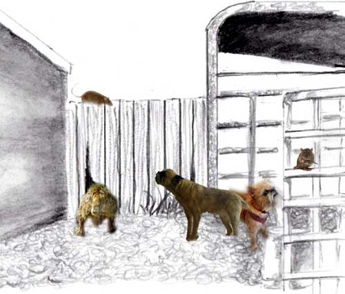 Well... there's a Griffon in there, maybe two, possibly a Border Terrier... and two rats.
Substitute the dogs with Parson Russell Terriers and this could be my own farm :o) I'm so used to the rats they all have names - actually they're all called "Ratty" - but I feel at home with this scene.
As a composition, it works for me. The shed at the left sends my eye back. I investigate the dog looking through the hole in the fence, and then travel up to the rat above. As it's looking towards the Terrier, I follow its gaze. The Griffon and the second, cheekily chewing, rat are like an unconnected side story, but that gives me time to stop before returning back the other way via the terrier.
My only reservation concerns the relative sizes of the dogs, but you'll know them better than I do.
Carol (online - Intermediate)
Finally, this is my corrected "henhouse" assignment. I left Robbie and the henhouse itself alone, because I am very happy with them. What do you think?
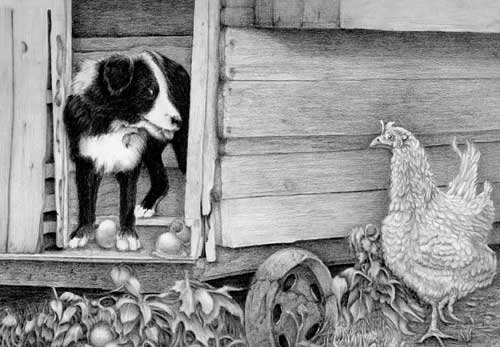 If you feel this is done then it's done, and I applaud you for not wanting to fiddle with it. Fiddling almost always results in a muddied drawing, so it's best to leave it and carry lessons learned with you to the next project.
Robbie the dog is looking particularly wonderful - alert and happy with his mischief-making, and he has a solid sense of three-dimensionality and texture. The intense darks you've used really draw attention to him - as befits the star of the story :o) One broken egg is perhaps a little lost, although it could be a little gem to find later. Personally, I think a darker interior to the henhouse would have added depth to the drawing and contrasted with the eggs, making them more visible by emphasising their highlights. But you've seen the interior as being a wall close behind him, which it wasn't, but your vision is entirely acceptable. I also think his rear paw needs to be darkened because it's inside the henhouse and receiving less light. Finally, his bright eye highlight really demands attention.
The wood of the henhouse is tonally very well judged. It has a solid feel about it and an excellent sense of old weathered wood without it being a distraction. You've also used it well to allow the hen to stand forward of it, which was one of the major problem areas in this composition.
I went over Henrietta with 4H to give her more color and subtly add more dimension.
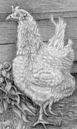 Henrietta the hen has a very believable covering of feathers and good three-dimensional form, and I think your 4H has definitely helped to bind all her parts together. She has a lovely dark eye, although the highlight could have been brighter, and I think her raised foot could have been highlighted more. That foot is an essential part of the story and adds a hint of tension. We don't know if she's paused or is running, but she does represent the only implied movement in the piece. Overall, she's drawn well but I still feel she needs more three-dimensional shaping. Even if she was a white hen, she'd have more shade beneath her chest and behind her wings. But don't worry, she looks good as she is - no fiddling allowed! :o)
For the wheels, I totally agree that having only four holes focused your attention on them, not on the animals. I tried to rectify this several times, but couldn't get the ovals equal or looking like they belong. So I added cracks to make the wheel look like it was made out of stone or concrete. That makes it look damaged and, therefore, the holes are not perfectly spaced.
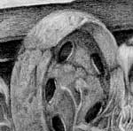 Well, I confess I've seen concrete garden rollers but never wheels before! But this is your world you are creating so your rules apply. Actually, I think it looks like a cracked cast iron wheel, which is exactly what it was (without the cracks), so it works for me. In any case I don't think the ovals look wrong, and five definitely works much better than four. Whether stone or iron, I like the broken tones of the old wheel. They add character and texture, and overall it reads well, and that's what really matters.
 I tried to sharpen the edges of the leaves under Robbie, but I think I may have overdone the original 2B. It still looks kind of blurred to me. I also highlighted their tops a bit.
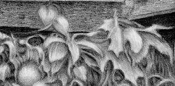 Not blurred but also not as sharp-edged as they could have been. Sharp edges are what aid the eye in recognising foreground elements, so being unsharp causes a little confusion. I think you could have created more depth by increasing the intensity of the darks within the weeds and pushing some leaves further back into the shade. That would help to better display the fallen egg, which is looking rather lost. But there are some lovely shapes within this foliage - curling and twisting leaves - so I feel you were really living within them as you worked.
 I feel you should be extremely pleased with this result!
LaDawn (online - Beginner)
Thanks for being a dedicated instructor. I finally finished Kitty and the Lamp. I ended up starting over, the dark background and the lack of clues I left myself in Kitty were too great to overcome. Which means I attempted to fix the lamp's shadow, or at the very least, not repeat the same mistake.
 Your drawing relays the simple story very clearly with a definite connection between Kitty's gaze and the lamp. I like the way the dresser top runs unnoticed into the background, although the stark contrast between the background and curving ends of the dresser does catch my eye and cause some distraction. Those curves however are well constructed, which is often problem in this exercise to other artists. The dresser is nicely suggested without it dominating the scene, and the inclusion of the gaps between the boards means I immediately understand that I need look no deeper.
 Kitty is very well drawn indeed! Your interpretation of her three-dimensional form is unmistakable, although the ceramic surface is less apparent. That's not a criticism, just an observation - she appears to have hair rather than glaze, which is perfectly acceptable. Her wonderfully dark eyes and nose immediately draw my eye to them, and it was a good decision to replace her rather odd painted triangular eye highlights with more realistic ones. The curve of her mouth gives her a rather quizzical look - as though she's wondering what happens at the top of the lamp, which just adds to her appeal.
The lamp conveys a full sense of reality. The soft sheen on the brass contrasts excellently with the harsh reflections from the glass, and the reflections are wonderfully crafted. I especially like the bright, sharp-edged highlights on the chimney that tells us this can only be highly reflective glass.
All of your ellipses are accurate, and both brass collars have subtle, satin highlights that suggest their rounded nature, assisted by the recession of the perforations.
Personally, I think there's one thing missing that is causing a degree of imbalance. If you had incorporated strong darks into the glass oil reservoir they would have counterbalanced the darks within Kitty, and more effectively connected Kitty to the lamp. Without them, Kitty dominates the scene rather excessively even though the lamp is in the foreground.
Finally, I think you've almost nailed those shadows! Just the height of the lamp's shadow is wrong - or Kitty's is :o) The light, according to Kitty's shadow, is shining almost directly at the scene - maybe just above the height of the shelf above her. In that case, as everything is receiving the same light, the lamp's shadow should conform to Kitty's. Drawing a line connecting the top of Kitty's right-hand ear to the top of her shadow gives us the angle of the light. Transfer that angle across to the lamp and you find that the shadow is far too low. However, both shadows send there intended message and the error isn't too unsettling. If I had the change one or the other, I'd choose to alter Kitty's because the lamp's shadow just looks "right".
As a complete drawing I think you should be very pleased with this, and I congratulate you for having the patience and tenacity to start this again.
Mary (online - Beginner)
I am very sorry for the very late finished piece from the beginners course. Life in general overtook me and unfortunately drawing suffered. I hope that I am now on the road again and hope that you can spend a few minutes appraising my attempt.
 Late is never a problem, Mary - and you were relatively speedy. The current record is four years! :o)
 First, this is your vision and not mine, and I can only really comment on how I might have done things differently, so please bear that in mind. Gridding it was a good idea - it allows you to concentrate on edges without having to worry about drawing within them. But subsequently I think you did worry and allowed this to overwhelm you a bit. That has resulted in a decent drawing but with less of a sense of reality than it might have had.
I'll begin at the bottom and work my way around. The top of the dresser is shaded in all directions so it doesn't resemble wood, which is surprising because your Week 6 Barn Wall wood was excellent. Not looking like wood isn't so much a problem but it's also the same value throughout so it has no recession. Drawing the woodgrain would have shown us the plane of the surface - in this case, horizontal and receding. Yours could be seen as being vertical just as easily as horizontal.
Likewise, the shading of the wall behind the dresser at the left-hand side is both patchy and sharp. Patchy would have worked, but the sharp lines suggest foreground and not background, so it tends to look like an extension to the side of the dresser. If you smooth and then blend that area it will suggest much more depth. Line - or rather inappropriate directions of line - are a recurring problem in this, For example, diagonal lines above Kitty's head appear to extend right across the internal corner, which is a physical impossibility. Remove those lines, use vertical shading to mimic the wood, and any lines remaining visible will suit the situation.
Kitty has definite three-dimensional form! Well done! I can clearly see which parts of her protrude and which recede. She does not, of course, appear to be a ceramic dog but that's OK. As I said, this is your vision and if you saw her as being hairy rather than hard and reflective, that's not something I'm going to argue against. Her expression though, I will comment on. Remember that humans look for human emotions in everything. Here, Kitty has an exaggerated downturned mouth and eyes that suggest displeasure or even contempt. She is definitely not happy! :o) The easiest way to learn how to control and correct that is to look into a mirror and pull faces. Look to see which muscles move and how they alter your expression, then transfer that to your animal portraits.
The lamp conveys a good sense of reality. You've found different ways of shading the brass and glass so it's quite obvious which is which. The soft sheen on the brass contrasts very well with the sharp-edged and brighter reflections on the glass. Unfortunately, what spoils it for me is your hatching or diagonal shading of the glass chimney. The lines are quite visible and they damage the reality of the surface you were trying to achieve. Glass simply doers not contain lines - it's hard, reflective and incredibly smooth.
Your lamp's ellipses are good, except for the base which is distorted - dragged down at the right-hand side. And you've misread the very top of the chimney. Your shading suggests the lower curve is the front one, but the top curve is the foreground one, because it's an ellipse and we are looking up at it.
Don't be dismayed by any of this. The exercise was designed to stretch you - to move you right out of your comfort zone - so all that matters is that you personally saw an improvement in your work. Looking over my notes from the course, I think you've done really well.
Workshops UK
Tutorials
by Mike Sibley