Workshop Plus
WORKSHOPS 2022
UK, USA and Canadian Workshops and Online Course continuations
Tanya (Drawspace online - Beginner)
First thank you so much for taking me in your amazing art world,so much useful information, it was incredible journey. Even with my failing so many times, the final work was very interesting and of course I made a mess as usual - sorry for this.
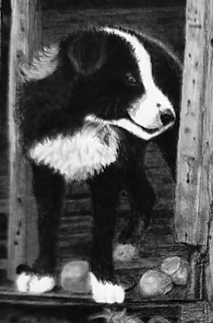
 Sorry? Why? There is so much good work in this. Well, there are some parts that could be improved but, overall, it's a very creditable drawing.
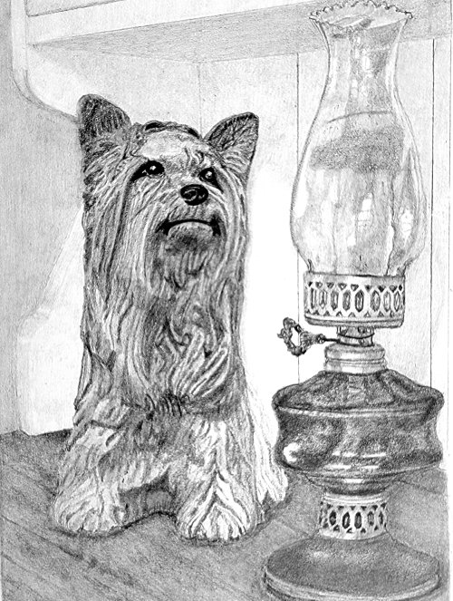
It tells the story very clearly with a definite connection between Kitty's gaze and the lamp. I like the way the dresser's top runs quietly into the background, and the background itself unobtrusively does its job. That said, I think the background could have been darker, to better expose the curves of the end of the dresser, and blended to remove the lines. The blurring from the blending would push the background further back.
The rather complex curves on the end of the dresser are well constructed, which is often a problem in this exercise. The bottom one is looking a bit flat, but there's no reason why it should echo the reference. The dresser itself is nicely suggested without it dominating the scene, and the inclusion of the gaps between the boards means I immediately understand that I need look no deeper. The left-hand gap appears to have a very subtle highlight running down its length. If that was deliberate (of course it was!) then that perfectly describes a gap. Without that highlight, a gap could appear to be a dark mark on the surface.
Removing, or at least simplifying, the moulding the base of the back was a good idea - it could have proved to be a distraction if left as it was. However, it doesn't follow through. It disappears behind the lamp and should continue behind Kitty. But you've made the scene your own, and that's most of the battle won.
Kitty is very well drawn indeed! Your interpretation of her three-dimensional form is unmistakable - "hairy" yet still ceramic. Her lovely dark eyes and nose immediately draw my eye to them, and it was a good decision to replace the rather strange painted triangular eye highlights with more realistic ones. The curve of her mouth gives her a slightly bemused look - as though she's wondering how the lamp works - but that's OK, it just adds to her appeal.
 The lamp conveys a full sense of reality, although darker values in the oil reservoir would have balanced the darks in Kitty's face, and given the lamp equal prominence. The soft sheen on the brass contrasts well with the harsh reflections from the glass. That would have worked even better if the shading of the glass had been smooth and devoid of holes. The expected properties of glass are that it's hard, smooth to the touch, and reflects light with hard-edged highlights. The holes in your shading suggest a soft surface. And those holes lighten your shading and soften the edges of the reflections, which now don't look as bright as they would in solid shading. A layer of 2H over the glass might have been all that was needed to fill those holes.
However, your reflections on the chimney and oil reservoir are relatively sharp-edged, so they tell us this can only be a shiny surface, such as glass. All of your ellipses are sufficiently accurate, and both brass collars have subtle, satin highlights that suggest their rounded nature, assisted by the recession of the perforations. And the recession you've created between the front and rear edge of the glass chimney's top leaves no doubt which is which. That's tripped up many an artist on this course in the past.
Finally, this is so sharp and confidently drawn that I really don't miss the shadows. And you haven't made the error of including some but not all. Without them the inference is that the light is diffuse so their omission goes unnoticed. If you ever do try to construct the shadows, first choose the lighting direction, which should comply with what you have already drawn.
You already know the angle of the light - see the edge above Kitty's left-hand ear. So you can use that angle everywhere else to determine the height of each shadow. And, in this case, cast shadows would probably have tied both Kitty and lamp to the background scene. Kitty, because she's close to the back, would cast a shadow that almost mirrored herself. And the shadow of the lamp would travel back along the top of the dresser before climbing the rear wall. Even though the shadow would be longer, its height would reflect that of Kitty's shadow - they share the same positioning and height of the light source. If you decide to take the Advanced course next year, we spend an entire week on the science of shadows - and how to effectively break the rules!
I think you should be very pleased indeed with drawing, Tanya. It shows a lot of confidence, attention to details, understanding of what you were drawing, and a sound interpretation of the reference. Absolutely no "mess" detected!

Tanya (Drawspace online - Intermediate)
I had to stop before I destroy my hard work. I know this drawing has so many mistakes, but I will learn how to avoid the most. Thank you so much in believing in me. At first, when I look at the other artists drawing I told myself no way, I know nothing. Then I said wait a minute you just spend 8 weeks on learning - this was more about putting Tanya together. Mike you are the best teacher. You did not let me drown. Two month ago I did not even know where to start - now I see the dim light in the tunnel.
 Looking at this drawing, it's really really difficult to believe you've been drawing for such a short time. But what impressed me the most was that you quickly understood what I was trying to teach you. That you're telling a story; not faithfully reproducing something.
There's so much imagination invested in this that you should be absolutely delighted with it.
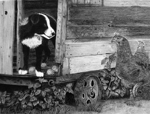
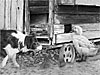
Mistakes? Very few, and nothing that experience won't fix. I'll start at the left and work right. But, before I do, I must congratulate you for producing such a wide choice of values. The strength of your darks has added a lot of depth to a composition that didn't possess much. The interior of the old henhouse recedes really well, and the space beneath it is both dark and solid.
 Robbie the Collie pup looks delightfully and believably hairy. I'm convinced you were living within the scene as you drew it, because you've noticed things that many people don't, such as his rear paw being in the shade of the henhouse, and his own shadow. You might be surprised at how many people draw his rear paw as light as his front paws. This is a composite study - neither Robbie nor Henrietta ever saw this henhouse - and the key to succeeding with composites is to be aware that you have to connect the elements and make them live together harmoniously. You've most certainly achieved that.
His bright eye has a highlight that immediately attracts me to him. And I can see you understood his three-dimensional form as you created the shadows and highlights. Very logically approached, and quite natural in appearance.
The reflected light along his back serves excellently to separate him from the dark wall behind. I think you were very brave in this area - especially his rear legs that are in deep shade. So many artists fight shy of using strong darks, but you've been bold and the result is so much better for it.
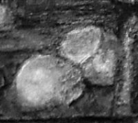
The eggs that Robbie has disturbed are believable, and the smoothness and semi-reflective quality of their shells contrasts well with the softness of his hair. Do try to not rely on outline. You noticeably haven't in the rest of the drawing, but the broken shell at the right has an obvious dark thickness.... No! I owe you an apology! I can see you did indeed represent it as being white. Possibly, darker shading inside the eggshell would have made that more obvious; and a lighter band to the right (that I initially saw as outline), because I'm not sure what that represents.
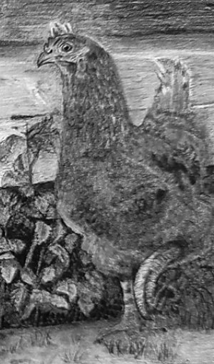 Henrietta is almost always a problem - that's why I included her! You were right to stop when you did, because I don't think there's much more you can do to improve her. She needs, I think, stronger three-dimensional form and associated contrast. And a couple of well-placed and solid blacks strategically placed under the henhouse, adjacent to her chest, might have pushed her forwards.
I think you have her feathering about right - obviously feathered but in a way that doesn't attract attention. Although it appears to be overworked. Her raised left foot adds nicely to the story. We don't know if she's running or has paused, but it's the only implied movement in the composition.
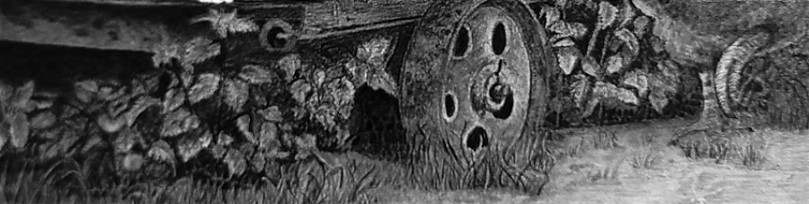
Going back to the wood behind Henrietta, and the rest of the henhouse: It appears to me that you were "lost in the drawing" at that stage, and that state shows in the result. The wood contains subtle textures throughout, and quiet suggestions of decay. Is very believable, as are the nail heads that are present but not intrusive. It's so easy to over-detail a secondary element such as wood and its features, so you did well to avoid that. But your additions of reality are wonderfully subtle, such as the end grain on the bottom board, and the split in the board above it. Little extras to be found, which holds onto the viewer and pulls them in.
Your weeds possess good depth (I appreciate that it's out of focus at the left-hand side, so I'm ignoring that). The deep shade you established beneath the henhouse gave you the opportunity push some of the weeds far back into it, which created instant depth. But, I think you could have been even more adventurous. Many of the leaves are fairly similar in value, and, with a single exception, I can't see any casting their shadows on the leaves below them. And when you're drawing an element, always try to keep in mind where it is in space. There are leaves directly behind the wheel that must be under the floor, yet they are lighter than the dull rusty wheel. By all means use artistic licence... but you can only stretch that so far. :)
 Finally, the foreground. Personally, I leave that area until last, so I can use it to balance the whole and draw the eye into the composition. There's nothing I'd want to alter there. It does its job well.
 I've really enjoyed working with you, Tanya, and this is an excellent result.
Lucy (STUDIO, October - Foundation)
I don't think I quite reached the record for longest time to complete your homework but probably not far off. I got there in the end!
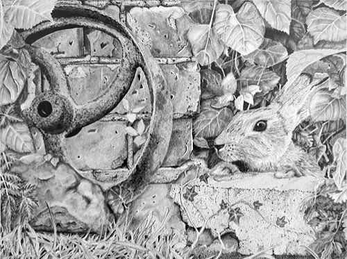 Well, you're three years too early to beat the record, but the result was well worth the time you spent on it :)
 I've adjusted your photo to what, I hope, looks like your original. I felt the left-hand side was under-exposed, so I altered it to match the right-hand half.
My first thought is that it lacks a little depth. Your blacks are dark and solid, and there's good contrast, but your mid values tend to dominate the scene. That's not unusual when working with a composite composition, and when you're not used to this complexity. That's because you're almost certainly going to concentrate exclusively on a single area, without thinking about how you might treat those around it. Don't worry - the more you draw, the quicker that will naturally improve.
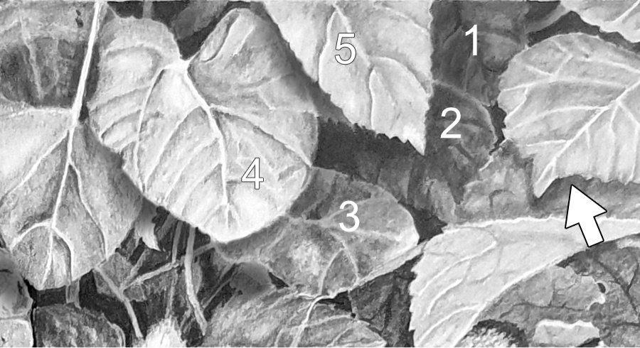 Another reason for the flat appearance is the lack of cast shadows. Again, that will improve in time, and, again, it's a result of drawing each element without reference to those surrounding it. For example, your rusty wheel doesn't cast a shadow on the wall, despite leaning against it. Or the right-hand foliage. There, you have created a natural cast shadow (arrowed), but you missed many other opportunities. I created a few (such as leaf #5 on #4, and #4 on the stems below it), so you can see how they push some leaves forwards and others back.
And think about depth too. You left foreground values in leaf #1, yet it is four layers deep - behind #2, which is behind #3, and so on to #4 and the foreground #5. At each stage, expect the forward layer to block some light reaching those further back. Leaf #4, as I mentioned, would block some light reaching the stems behind it.
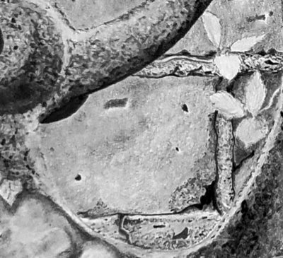 On the left side, your rusty wheel has good shaping and a lovely sense of being rusty. The bricks are simply excellent! They are sufficiently smooth to make the mortar look grainy, yet they are obviously brick. And you've invented some lovely details within them too. Your holes correctly have bottom highlights; the holes and gaps are solid black; and I love that chipped corner, that tells me you were thinking "brick" and not "drawing".
You decided to keep that awkward midground rock. It's got good structure and surface detailing, but I think you could have changed it to something more understandable, or even completely removed it. Remember, this is a composite study - none of it ever existed together in one place. The rabbit was 35 miles away from the stone it's resting on :)
Moving across to the right: I've mentioned the leaves and their shadows, but the leaves do have excellent shaping and detail. And the background behind them is dense and dark, which would have given a lot of depth to your drawing if you'd pushed your rear-most leaves back into it. Never be afraid of really pushing some elements right back into the shade. It creates a sense of mystery that is entirely natural. Take a look into a mass of foliage and you'll quickly realise that you can understand the foreground layer, maybe the layer behind that too, but any deeper and you're just guessing. That lack of understanding is what conveys a sense of realism to the viewers of your drawing.
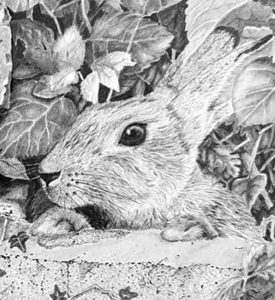 Then apply the same thinking to the rabbit, and I think you can create a lot more three-dimensional depth and clarity. Your rabbit is alert and lively, and really well-drawn. It has a good hairy texture that suggests coarseness in places and a softness in others. But, overall, it contains far too much white. I think that's a result of not pushing your foliage back into the shade, which resulted in light foliage that made it difficult for you to make the rabbit stand out.
Contact shadows beneath the paws would have more firmly placed them in contact with the stone and increase their presence. A degree of shading within the ear would have created depth that is currently missing. And the eye is super! That bright highlight gets my attention. But, if you'd banished white from within the hair, that highlight; would have glowed even more brightly and immediately grabbed my eye, drawing me into the picture.
Overall, I think this just needs cast shadows to create more depth, and more thought given to how each element will affect those around it. But, other than that, you should be very proud of yourself for creating such an accomplished drawing.
Workshops UK
Tutorials
by Mike Sibley