Transcript
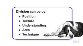
Previously we looked at ways of simplifying the drawing process. Division, we found, can be by:
- Foreground, midground, or background Position
- Differences in Texture
- Parts you understand, and those you don't
- Logical Areas
- Sections requiring different Techniques
All those allow you to concentrate on a single element, so it's easier to handle - but let's make it even easier. Any division can be broken down into smaller and smaller parts. And even the smallest area can be simplified yet again... by dividing LINE and TONE.
DIVISION BY LINE AND TONE
When you draw, it's quite probable that you subconsciously split detail from tonal shading. You might, for example, scribble the foliage of a tree and then add its shaping. Initially, your thoughts are centred on leaf shape and edges; then you add shading to give it a sense of form and reality. What I'm about to suggest, makes conscious use of that action, and turns it into a deliberate technique. It gives your mind less to do, so it will function more efficiently, and focus more clearly.
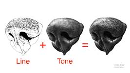
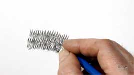
Line is used for detail - and uses sharp marks. It creates edges. They might be the pits in rusty metal, the boundaries of leaves, or the texture of leather or a dog's nose. So, line first, because without creating boundaries you have nothing to shade.
Tone is used for shaping - and uses broad, soft-edged marks. It describes the lighting, colour, and three-dimensional form. If, like me, you use a chisel point, line uses the edge; tone uses the flat face; so why mix the two? They're different operations. And, as I'll show you, line and tone can be on separate layers, which presents us with a whole new set of possibilities.
DIVIDING LINE AND TONE with LAYERS
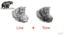
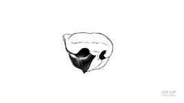
This small drawing - it's only 3 in (7.6 cm) wide - was created with 2B lines of varying length. Then the tonal shaping was applied on top. I'm not implying the whole bear was drawn in line first. But each section had its detail created, and then that was toned down to suit its position. This is Negative Drawing - the white spaces between the pencil lines represent groups of hairs; and the lines are the shade between them. Detail is often simple to comprehend, especially if viewed as a collection of abstract shapes, marks, and textures, and line is the best tool to use. Tone, which describes the light and shade of three-dimensional form, is best suited to shading with a broad, flat pencil point with a complete absence of line. Instead of trying to understand and draw both detail and shaping at the same time, the two are separated. You can concentrate on the detail alone, without any regard to light and shade. And then add lighting and shaping, without being distracted by the detail of the surface. The results might surprise you. Dividing detail and tone offers you great freedom.
Working logically, any task can be divided into two - using layers to divorce detail from shading - Line from Tone. I'll use the model for my drawing - this wet Grizzly Bear, fresh from bathing in its pool - to demonstrate a small area. And I'll draw it larger this time.
This detail layer, formed by line, describes the texture and direction of growth, and defines the edges of the layers of hair. If these hairs were parallel, the lines would also form the shadows between them. However, in this case, I'm using a V-formation - drawing damp, clinging locks, rather than individual hairs - so I'm roughly providing the shade between the locks at this stage. Just as a reminder of where the shade exists. You can see how all tone is omitted, so the hairs created by the negative drawing, remain virgin white. It's the white that will accept the tonal shading.
All I have to think about is the texture, and how the hair lays on the body - in overlapping layers. I can visualise what it would look like in real life. And I'm not, in any way, confusing my mind by thinking about light and shade, or colour. Incidentally, be aware of the white you're leaving between any marks as you make them - dark and white share equal importance. If the white gap between two lines suggests a hair-like feature, expand on it; refine it and make it live. Don't try to be exact to the reference, just recreate your mental picture of that area.
Now I'll add the tone layer on top. I'm not thinking about texture or detail -
only the tonal variations as it shifts from light to shade.
Some shading will be local, perhaps enhancing a particular hair, or establishing a cast shadow. Other shading will be global suggesting the colour, and describing the overall lighting and three-dimensional form. This area, for example, could be curving away from the light beneath the bear. I think of this creation of three-dimensional form as "sculpting", and you can sculpt it without having to think about detail at all.
DIVISION by SECTION and LAYER
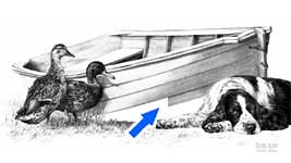
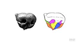
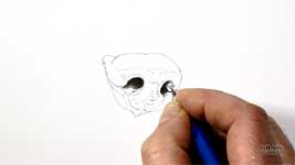
That was a rather generalised demonstration, so let's develop it further. I'll divide by both sections and layers in a more practical application. You met this dog, and its nose, in the last video. The nose of a dog - indeed the nose of most animals - is a complex structure. If you draw it as a single object, you'll most likely draw a representation that misses the refinements - the small details that give a heightened sense of reality. And it's very easy to misunderstand an area without being aware of it. Break it down. Divide it into obvious areas first. This nose has a smooth lower half with little detail, and the top has a pronounced texture. Now divide the bottom and top into small areas that you can handle. The nostrils and smooth base will divide into at least 7 sections, and the top half into at least 8. Then simplify it even more by breaking each of those sections down into Line and Tone.
Give yourself the time to understand
precisely what you're drawing. It doesn't have to be an exact copy - your interpretation is fine - but it must contain the same three-dimensional structure. So, work on one section at a time.
Begin with the area you best understand. For me, that's each nostril. They're black and devoid of detail. And once established, I have a value reference. The rest of the nose has to be between that dark value and the white of the paper.
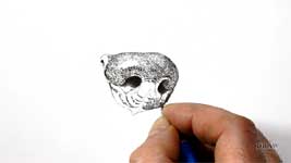
Because the lower half is easier, I usually draw that first. It gives me a feel for the nose before I embark on the top and its texture. However, this time I'll begin with the top. But, I'll create the whole nose in line and then add tone. In normal use, I'd fully complete each of these coloured sections in turn. Before I begin, let's look at parts of the structure - so we know
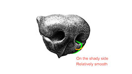
what we're drawing. Ignoring the rest of the nose, you can understand this, can't you? Of course you can. Isolated, it's easy to see it's a shelf that curves over a rounded edge, catching a highlight, to further curve away below. And, it curves out of view, around the right-hand side. It's on the shady side of the nose. And it's relatively smooth.
This area is more complex, but much easier to study when you isolate it. So let's run the same analysis: Horizontally, one edge curves into sight from around the side of the nose, and then curves into the nostril to be quickly lost in the darkness. Vertically, it curves out from inside the nostril, and up towards the top of the nose. It's also on the shady side of the nose. And it's quite heavily textured.
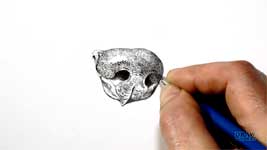
Now you've transferred that valuable information from the reference to your mind - put the reference away. Certainly, glance at it for detail, but you're free of it now. Just draw what you know and understand. Begin with the detail. I'm just suggesting it, not faithfully reproducing what I can see in the reference. If you reach a point where your understanding wanes - Stop. Move to an adjoining area and work back towards it. Your understanding will be much clearer once you've surrounded the problem.
You really should concentrate on one texture at a time. "Live" that texture and you'll inject life into it. For example, I
know this section is rounded, so I'm aware the texture will be most noticeable where it's directly facing me, and will narrow and fade as it curves away around the edges. Slow a steady is best. Don't be tempted to rush ahead, because that might result in inferior drawing. Whenever I feel the urge to take a shortcut or speed up, I remind myself that: "Any drawing is only as good as its weakest part". It
will be noticed, and it will drag the rest of the drawing down to its level. And don't be afraid to draw too dark. Blu-Tack or a kneadable eraser will allow you to adjust the intensity later. In the meantime, you have simply divided the job into yet two more parts - by first establishing the required lines with a weight that helps you to see them, and then adjusting their values until they sit comfortably in the drawing.
When you feel the time is right, add the shaping layer. That might be right now, or later - perhaps much later. There are no rules. Lightly apply layers of tone to build up the three-dimensional shape, so it conforms to the direction and quality of the light. And consider using harder grades for this. I'm using an HB because its fine-grain structure gives a smoother appearance. Close to a highlight, I'll use a 2H, because it's even smoother. If you're using a chisel point, switch from using the edge to the flat face. There are two reasons for that: The
edge of your chisel point is ideal for drawing details, because it creates sharp-edged lines that fill the tooth of the paper. The
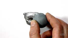
flat face skims over the surface of your paper to produce soft-edged seamless shading. And it will deposit graphite on top of the tooth; not deeply embedded. That creates two layers. Detail within the tooth - Tone on top. That's important, because, unique to this method, adjustments can be made to the top layer, with Blu-Tack (or a kneadable eraser), without affecting the bottom one - as I'll show you.
Earlier, I mentioned "drawing too dark" and "adjusting the value". To achieve a smooth fade into the main highlight, I usually extend the detail line layer too far, but
lightly. That raises it out of the tooth and up into the tone layer, combining the two. I'll add a little tonal shaping, and finally, I use my trusty Blu-Tack to fade the edge for a really subtle result. I often find repeated partial removal and re-application of tone produces wonderfully subtle results. It's almost impossible to draw with that degree of finesse - something that this system overcomes. Elsewhere, the tone layer can be gently adjusted without affecting the deeper detail layer beneath. But the fundamental benefit of dividing line and tone, is that it greatly simplifies the drawing process.
Working on a whole element, such as a nose, might work in certain situations. However, it's not ideal if you want to build in a true feeling of reality. You must give your mind the freedom it needs to concentrate on forming an understanding of the shape, texture or object you're working on. When you break it down, and become immersed in the drawing of a single section, you will recall all past experiences of it - everything you remember will automatically build itself in and guide you.
Finally, something to ponder... it's my experience that spending time on a section, and getting it right first time, is
quicker than drawing an entire area and then trying to make it look right. And it's fresh and sharp - immeasurably improved in quality. Cut out the doubt and stress. Keep it simple. Break everything down until it becomes easy - manageable - doable. Whatever the challenge, you CAN do it.
© copyright: Mike Sibley 2019