Transcript
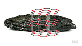
Somewhere in between soot and diamond, which are both naturally occurring forms of carbon, is another - our medium of choice - Graphite.
During the pressure required for its formation, the carbon molecules were transformed into flat plates and the bond between the plates is quite weak. That's why graphite easily flakes off your pencil point as you draw; and why graphite - with its shiny flat plates - reflects light. So, although graphite naturally draws with a black mark, it doesn't look black due to the surface sheen. Fortunately, there's a fix for that, but I'll return to that later.
As graphite naturally produces a black line, it's mixed with various amounts of fine clay to produce the different grey values - our familiar grades. More graphite : less clay : the darker it draws.
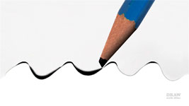
In addition, varying the weight you apply to your pencil (how hard or lightly you press) can be used to increase the variety of effects. For example, you can increase and then decrease the weight as you begin and end a line - to form tapers that fade to white. Using a light pressure when applying a broad, soft-grade point, such as 4B, will cause it to deposit graphite only on the top of the paper's tooth, giving a soft-edged, misty line. Applying a medium to heavy pressure to the same soft grade will fill the tooth of the paper, producing deep, rich tones.
Dark values and blacks benefit from being deep in the tooth of your paper, as I'll show you later.
Different grades of graphite produce differing qualities of line. A soft grade (B to 10B) draws a line with a soft edge. For really sharp lines with clean-cut edges, use HB or F, or a harder grade (H to 10H). These hard grades, with a high clay content, have increasingly finer grain structures with no detectable irregularities along their edges.
Another variable that will affect your results is your choice of paper, so choose it carefully. I prefer a very smooth, plate-finish paper (Conqueror Diamond White),
[Available
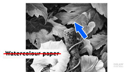
the shop] with a hard and smooth surface beneath it. Other artists have a preference for Bristol board, the Strathmore series or even watercolour paper, which I can't recommend. It has a pronounced texture that will interfere with your drawing. So, my advice is to choose a non-sized, smooth paper - preferably Hot-Pressed or Plate-finish - for best results.
This is on Strathmore 400, which looked smooth and felt smooth to the touch. It's an excellent paper - but it does have a texture that is visible after drawing. These leaves were intended to be smooth - almost glossy - but the paper imposed their velvet appearance. And notice how the pits in the tooth seriously affected the reality of the shadow. This area is in deep shade and the light values of those little dots are completely unnatural.
Despite the problems, my background darks are as intense as I could manage. At least one of those darks is established first. From then on I can balance everything in the drawing between that dark and the white of the paper.
And... I don't play around with line - or tone. A decision is made, a line or mark committed to, and it's drawn - fresh, sharp and alive.
If it's your custom to "work up" a drawing from light to dark, that implies, as a generalisation, that you don't have a full understanding of what you want to achieve; that your drawing will probably become overworked, with soft and diffused edges; ...and that it's time to try another approach.
If you were to "work up" this drawing, every part is going to be redrawn multiple times. Why? Because, every time you darken one element everything else immediately looks wrong. So, now you need to darken all the other elements to restore the balance. The problem with "working up" is that you have no idea of what your darkest value is going to be. So, you're working with an unknown palette of values.
It's guesswork based on guesswork. Until, finally, the remedial work can be done to bring it all together... but by then the drawing is overworked and the damage done.
Now, consider fixing that problem by first establishing one area of deep shade. Before I commence a drawing, I study it carefully and work out where my area of darkest value is going to be... and then I
establish that first. Not necessarily all of it, but at least a part. It might, perhaps just be a pupil in an eye... a part of the background... or even a reference in the margin. As soon as you do that, you know your darkest and lightest values and everything will naturally fall into place. And - this the essential benefit of this approach -
you only have to draw anything once, so it stays fresh and sharp.
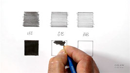
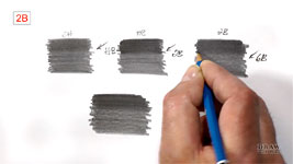
As I'm suggesting you begin by creating a sample area of intense and solid dark tone, you can test your abilities with this short exercise: On a sheet of your preferred drawing paper, draw two rows of three boxes - about 1" (25mm) square will do - then label each column 4B, 2B, and HB. We'll just concentrate on those three soft grades, because they produce the richest darks and blacks. You can extend it to include 6B or even 10B if you wish, but I find those grades too grainy, so I don't use them.
Fill the top left box with your 4B pencil - just draw as you normally do. Then progress along the line until you've completed the HB box at the right-hand end. There's no need to be tidy - just aim to get a good, even, coverage. Randomly varying the ends of your lines will help to avoid unwanted bands appearing. And tapering the ends of the lines will ensure that doesn't occur.
When you've finished, leave it, and move down to the next row. Now repeat the exercise, but this time aim to draw
as dark as you can, and remove any white spots or gaps. Your shading should be as dark, smooth and solid as possible, without causing damage to your paper. Those darks will serve you well. That's because gradations of value are used to create the illusion of depth. So, the greater the range of values, the greater the depth in your drawing. And value can be used to create an unmistakable focal point. If you're drawing an animal or human, for example, creating maximum contrast with a white key highlight in the eye, adjacent to the solid black pupil, will immediately draw the viewer's eye to it.
So, intense solid darks are important. If you need to, try pressing really hard, and if you
do damage your paper, that's OK, because knowing its limitations is invaluable.
Shading in multiple directions should help, as will circular shading. The more directions you can approach the pits in the your paper, the more likely you are to fill them. Filling those holes, and not leaving gaps, is vitally important. If you leave any light content, your eye will see the black, and the white holes or light gaps, and read an AVERAGE value based on those two. Here's the effect:
This is an area of grey tone. Well, actually, no it isn't.
It's a mix of black and grey lines that we see averaged-out to a mid-to-dark-grey value.
Now watch what happens when the grey lines are gradually darkened....
Notice how even the smallest amount of grey dilutes the strength of the black.
NOW that's black - and ONLY the grey was darkened.
Solid Blacks And Dark Values
Depending on your paper and its available tooth (the depth of the surface pits that hold the graphite), you might have to work hard and employ patience to create good blacks. A coarse paper will hold more graphite, but will more readily contain unfilled pits. They remain white and, as we've just seen, visually dilute the strength of your shading. A smooth paper will not suffer from that problem, but you'll have to work the graphite into the reduced tooth. That disadvantage is easily overcome by using a combination of grades, HB over 2B for example. It's known as "burnishing". The harder grade will smooth out the softer one, break up its grains, and spread them into the tooth.
As a rule, use a lead two grades harder to burnish. Well, I better qualify that...
I use a 2H to smooth HB.
An HB to smooth 2B.
And a 2B to smooth 4B... two grades harder, as I mentioned.
But I'd also use a 2B to burnish anything softer - right down to 10B - because you need the relative hardness of the 2B to perform the burnishing.
Using the flat face of a chisel point will ensure that you 'flow' graphite onto your paper and don't draw hard-edged lines. And if the flat face hasn't filled the entire tooth, rotate your pencil and shade again with the edge. Now burnish that with a harder grade. I'm using HB - 2 grades harder. It's smoothing the 2B very well and, despite the video lights, I hope you can see that it's visibly darker too.
My plate-finish Conqueror Diamond White will withstand a great deal of punishment without lifting a single fibre. I can safely use a lot of weight. But if your paper is less forgiving, use less pressure, and more layers and burnishing to produce solid values. What's
important is completely removing those white holes, and
how you remove them really doesn't matter.
Creating Darks And Solid Blacks
If you want to produce a really solid black, some artists recommend applying multiple layers of 8B or 9B, and that might work for you. Personally, I usually use a 2B with a lot of weight. And I shade in small tight circles that approach every pit of the tooth from every direction.
As I mentioned in Basic Techniques, the more contrast you can create in a drawing, the more values you have to work with. If you only use a part of the available tonal range your drawing will appear to be flat and rather uninteresting. But when your darks are truly dark - you open up the entire range for use. Three-dimensional information is greatly increased. And your drawing will possess far more presence and impact. It will pop right off the paper.
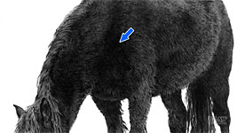
However... a word of caution to be borne in mind whatever you are drawing. If a very dark area appears to be solid black, but it is
not a hole, then it almost certainly contains a texture. DO NOT render it as a flat patch of black. Yes, you will have saved time, but you've also damaged your drawing's sense of reality. In life, there will always remain a hint of texture, however subtle, in areas of shade - no matter how deep that shade is. Always shade with lines that mimic the texture - or in the direction of the hair in this case.
Don't cut corners. Provide what the viewer expects to see - even if that's subconsciously - by creating that hint of texture. Think of the message you're sending: a black patch that contains nothing is
a hole. This is NOT a hole. So, before you render that solid black area, ask yourself "Is this a surface in deep shade?" Reserve solid blacks for holes, or areas that are receiving no light at all.
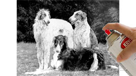
Solid Blacks And Layering
I stated that 2B is the softest grade I use, but when rendering a rich dark background I have sometimes used a 6B - but then that was burnished with 2B to smooth it out. So, if you don't achieve the value you were hoping for - try this:
I used an HB to draw around the Cockatoo - because it draws dark sharp-edged lines - and then used layers of 6B / 2B / and a workable fixative to build up the black background.
Apply your 6B
Burnish with 2B
Then lightly spray the area with a workable fixative. It dries with a matt finish, which provides an artificial tooth that will accept additional shading.
Leave it to dry
Then repeat the operation as many times as you need to - three times in this case.
Have a go yourself. Attempt to create a patch of the darkest and most solid black.
Incidentally, I masked off the bird by simply holding a piece of cardboard over it. A little overspray didn't matter, since the entire drawing was finally fixed. And, talking of fixative... if it's graphite, you should
always fix your drawing on completion.
Fixing has two major benefits:
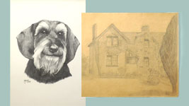
First, it applies a UV filter - one that diminishes the harm caused by the ultra-violet rays from the sun - such as prematurely ageing and yellowing the paper. This original was fixed and it's about 40 years old. The Ivorex paper is still as white as it was at that time. That it might look off-white is purely due to modern processes producing substantially whiter papers. This original was drawn by my father, about 60 years ago. It was not fixed and, unfortunately, will not survive. Sunlight and the wood pulp's high acidity will eventually destroy it.
The second reason is - quite magical :)
Use a workable fixative, applied in a few light layers, to provide a matt finish. That removes much of the graphite sheen. Contrast will increase as you watch, and
your blacks will pop, because light will no longer be readily reflected.
Remember, solid, intense, dark shading adds presence; expands three-dimensional form, and the depth in your drawings will be greatly increased.
© copyright: Mike Sibley 2020