Transcript
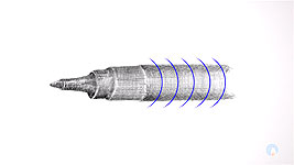
You might remember this from Linear Shading. It was drawn freehand from life and used only hatching and cross-hatching. The shading describes the three-dimensional form, and it's absence creates the highlights. But you might feel, as I do, that my use of vertical lines in the body suggest a
flat surface. The lighting suggests a rounded form, so the straight vertical lines create confusion. Wherever possible,let your hatching follow the form of the object you're drawing. This is often called Contour Hatching. Not only will that prevent you drawing sending conflicting signals, it will also help you to "feel" your way around its surface.
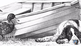
I said "contour" hatching, but all methods of hatching and cross-hatching can eventually provide solid tone. Continuous cross-hatching, for example, will result in no paper at all showing between our lines. In other words, cross-hatching is just a short step away from tonal shading. And, if you hatch using the broad flat face of a chisel point, the soft-edged lines will merge into each other, such as here in this boat. Using hatching techniques in this way, to build up areas of solid tone, will give you the ultimate in control over the final appearance.
It also gives you a constant reminder that the object you're drawing is solid and rounded, or cylindrical, and so on. Think of it as
sculpting rather than drawing, so you mentally reinforce the three-dimensional nature of the form. On a spherical surface, for example, your hatching will curve to wrap around the object, and on a flat surface your lines will be straight.
Sometimes there's a need to produce areas of flat or gradated tone. In portraiture, for example, you might have to depict the flawless complection of young children. Or it might be an overall light value in a sky, to make your true highlights shine with extra brilliance. in such cases, apply your hatching with a very light touch. Gradually build up the values in layers, using cross-hatching to darken selected areas. In Charlotte's cheeks I used 2B hatching beneath layers of HB and 2H cross-hatching. The 2B provided the darker value, and the HB smoothed it out. Then each area was lightly blended to remove all traces of line.
Conversely, this bag uses cross-hatching to suggest its coarse canvas fabric - overlaid with 2H to remove all traces of white. Whether you subject is a portrait or a bag - whatever it is - always carefully consider what you are about to draw. Identify the darkest value - it's often a good idea to draw this first, so you know the full range of values available to you - from that dark value to the white of your paper. And look for the highlights too. They'll help you to better understand and portray the three-dimensional form.
So, let's explore the mechanics involved, and the basic techniques. Follow along with this exercise, so you can put the techniques to practical use. There are six steps:
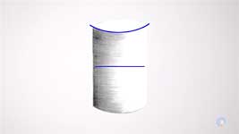
STEP 1: Draw the outline of a cylinder, about 3 by 2 inches (7.5 x 5cm).
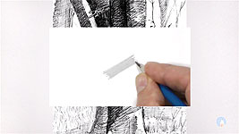
STEP 2: Begin at the left-hand edge, shading a quarter of the way around the cylinder. Gently, using the flat face of a 2B chisel point (so your lines merge), shade towards the right. Use only line, and butt your lines up so no white is visible between them. And, more importantly,
follow the contour of the cylinder. Your lines should echo the curvature of the top and bottom edges, so they conform to the perspective of the cylinder. As you draw each line, reduce the weight as you approach its end. Then smoothly fade it to white.
If you have problems drawing a downward-curving arc, turn your paper around so you can use the natural movement of your wrist. However, you should teach yourself to draw in every direction. I
never turn my paper, because I lose the reality of the subject I'm drawing.
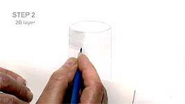
STEP 3: Now change to using your HB pencil, still using the flat face, and shade half way around the cylinder. As previously, begin at the left-hand edge and taper - fade - the ends of all your lines. You can also use this layer to fill any gaps in the 2B shading. As a bonus, your HB will smooth the 2B by filling any white holes in the tooth. Use a fairly light touch. Let your graphite sit on top of the paper, so it will blend more effectively.
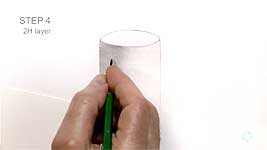
STEP 4: Begin again at the left-hand side, now with a 2H, and shade two-thirds of the way around the cylinder. Don't forget to taper the ends, and ensure you have a fairly broad flat face to work with. If your 2H is too sharp, it will get deep into the tooth and be more difficult to blend.
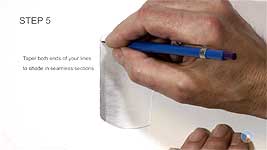
STEP 5: To make the right-hand side glow, increase the contrast by darkening the left-hand side. Do this by applying vertical hatching with your 2B - decreasing the weight as you progress right. Don't leave any gaps in your shading. Blending cannot fill them. Theoretically, this is of course unnatural. A cylinder will have a core shadow away from the left-hand edge, and that edge will be lighter due to reflected light. But this is just an exercise and I'm trying to simplify it for you.
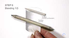
STEP 6: Now blend the result in the following three steps. First, blend the dark edge. Try using your finger wrapped in toilet tissue. You can use a tortillon or a torchon (stump) if you prefer, but my preference is for the more "tactile" approach of using my finger.
Work in very light circles down the edge. Circles ensure your blending crosses all lines from every direction, so any distracting lines will be softened or even removed. Follow this with a little light vertical blending if you feel it will improve the appearance.
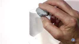
Now we'll move on to the next blending step. Renew your tissue and then blend from dark to light, following the contour. And avoid the dark left-hand band, so you don't dilute it even more. Blending
will remove graphite. Gently stroke your tissue along the lines - aiming to spread a little graphite into the white area at the right - but not right up to the right-hand edge. Leave that edge white to preserve the maximum contrast.
You can follow that with light circular blending in overlapping bands. That will catch and soften any remaining lines that are still visible. As you approach the right-hand quarter, reduce the pressure of your finger, which in any case should be very light. The goal is to gently spread the 2H graphite into the white area, in a subtle way that is very difficult to achieve by drawing alone. Don't necessarily expect the same results as I'm achieving. This is on super-smooth Conqueror Diamond White paper, which allows for very smooth blending.
The third and final blending step: now add a further subtle refinement. Blending, as I said, removes graphite, so take advantage of that. Blend light to dark but, again, stop short of the dark left-hand edge. Use strokes following the contour, and this time you can begin each stroke with more pressure, so you deliberately remove some graphite. Renew the tissue often, so you increase the amount you remove.
This layer of blending should improve the smooth transition from your lightest shading into the white area, and the other transitions too. As long as your blending was gentle and light, you can, if you choose to, strengthen the dark left-hand side with additional layers of 2B or HB. If you can't then you blended too heavily and flattened or damaged the tooth of your paper. Don't worry if your blending spreads graphite outside of the outline. You're applying almost no pressure, so the graphite will sit on top of the paper, and it can be easily removed with Blu-Tack, a kneadable eraser, or even a plastic art eraser.
What can go wrong? These are some of the common faults to look out for. The first concerns the cylinder itself. Does it look like this? An ellipse is a circle in perspective, so it obeys the rules of a circle. A circle never has angles, only curves.
Are there gaps in your 2B shading? Or blunt ends in your contour hatching? They will never blend away.
Are there visible vertical lines? You might have extended the vertical shading too far right; not sufficiently reduced its strength; or left gaps.
Did you draw lines that don't follow the contour? They send conflicting signals. Even after blending, the visible lines suggest a
flat surface, but the lighting is telling us it's curved.
Or maybe it worked out well for you? Congratulations! It should give the appearance of a smooth and curved cylinder.
Whatever curved surface you're drawing, shade with the contours - and that includes taking perspective into consideration - shade with the contour and avoid sending confusing and conflicting messages.
© copyright: Mike Sibley 2018