Transcript
INTRODUCTION
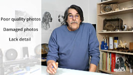
Because we graphite artists only have a pointed stylus to work with, and not a wide brush, we tend to be detail-orientated. So, we can never know too much about any subject we're about to draw. The problem might be that you have poor quality photos to work from, damaged photos, or you simply lack sources for the detail that your drawing requires.
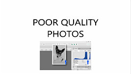
IMPROVING POOR QUALITY PHOTOS
Well, if you've watched the previous video, you'll know how to correct poor contrast and lighting in Affinity Photo (or any other image app). But let's push that a bit further. For example, you might be horrified to find yourself commissioned to reproduce this scene. But don't be dismayed - the detail is there. It just needs to be brought out.
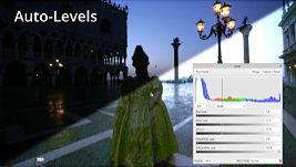
The AUTO facilities are always worth trying first. This has just had AUTO-LEVELS applied - and then AUTO-CONTRAST. Neither had much effect, but they're worth trying. Then a LEVELS adjustment - using just the white and midtone gamma sliders. Followed by an EXPOSURE adjustment, and an additional touch of LEVELS to create more contrast.
Yes, it's a mess... but half-closing your eyes removes most of the artefact problems, so you can
interpret what you see. And now we've got infinitely more information to work with than we had originally. We've also, of course, lost some information along the way. But we can pull specific data from the various stages to rebuild the scene.
For example, We could use the AUTO-LEVELS layer to determine accurate outlines. Especially for the skyline, the edges of the walls, and any other edges that will burn out as we lighten the scene. Like the distant skyline or the sculptures on the columns, which are almost unrecognisable once we've completed the brightening.
The next layer - LEVELS - permits us to pull out all the closer midground and background detail, which we can add to our previous outline, and finally, the EXPOSURE layer reveals additional foreground information. Of course, all this additional detail advice involves Affinity Photo, but it should be possible in any other graphics program, too.
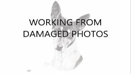
WORKING FROM DAMAGED PHOTOS
You might recall this from the previous video. It was a commission of a deceased and very much loved dog. And all the elderly gentleman had was a single photo applied to a drinks coaster, heavily-stained with multiple tea and coffee rings.
But it is a recognised breed - a BASENJI. And, apart from the colouring and minor unique features, that make it this dog... all Basenjis look the same.
This was years before the Internet existed, so in my day I'd raid my collection of books, or visit the local library to find suitable illustrations and explore the Basenji in depth.
Now, of course, you can quickly find what you need online. Some might be a close match. Ignore the colouring - and we have the hair growth patterns and directions. And the surface details and features - because they're the
same in all Basenjis. Others might help with more major features, such as the eyes, ears or nose. And a side or three-quarter view often helps you understand the shapes you're looking at in the full-face view. And also, in this case, a feeling for its mild nature.
SOLVING LACK OF DETAIL
But suppose you're working with a hybrid animal - or a hybrid
anything - and maybe your dog is a mutt. Or you can't find a Spotted Shetland Pony... or a Tartan Wombat online. There are other methods that will help you. Many things in life are essentially the same, even if the outward appearance is different.
If you can't clearly see the internal structure of an ear (cat, horse, armadillo, or human, for example)
all ears of the same species are fundamentally identical. Size might differ - and gender or race might affect the appearance - but the basic structure is the same.
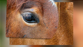
For example: suppose your horse blinked as the key photo was taken. No problem. Use another horse's eye. Position it. Scale it. Delete everything you don't need. But - this is important - DON'T JUST COPY IT. If you're using multiple images to source missing detail, it's entirely possible the lighting will be very different in each source. One lit from the right… one from the left… another from above. If you draw them
as seen, the result will be entirely unnatural. Take the detail and outlines of the shapes from the references, not the lighting.
There's a very simply solution to help you do that - When possible include the new detail in the
planning stage. Introduce it into your guideline drawing. Now your drawing will flow from element to element, and the new content is far more likely to naturally belong to the subject.
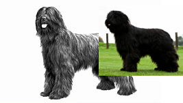
Of course, there will be areas of small detail, such as hair, that can only be added during the drawing stage. Let's assume this area of the dog's face is devoid of clearly visible detail. We can find another Staffie online to supply that missing detail. But it's not to be copied directly from the new reference.
The lighting of the two references is unlikely to match, and nor are their angles. It should only be used to recreate what is missing - and drawn as an extension to the existing drawing. And, of course, when you're only using the additional reference for detail, it doesn't matter what colour the hair is in that reference.
WORKING WITH SUBSTANDARD PHOTOS
I'm known for drawing dogs. Imagine you've accepted a commission to draw an example of each breed in a club. All twelve of them. This particular one was for the 1987 Golden Jubilee catalogue of the Working Dog Club of NSW. Buster the Briard is presenting you with problems. But you have to produce a good result. After all, these folk know
everything about their breed. The problem is... well, let's say... the available family photo left a lot to be desired.
Research the breed online - black or coloured - to gather Buster's missing detail. Each one will probably give you some useful information. And this one alone should provide everything needed to rebuild the poor one. The result should be Buster recreated from all the sources. And if Buster was a mongrel, I could find a similar dog. Because the basic structure, the direction of growth of the hair, the formation of the facial features, and so on, is fundamentally the same.
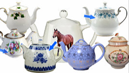
For example: You'll never find a horse with any other type of ear. A horse's ear is a horse's ear, no matter which variety of horse it's attached to. Even if you're drawing a teapot, and your reference has used flash, find photos of other teapots, and study the way natural light bounces off the glaze. Now apply what you've discovered to your problem teapot. It's not accurately copying a reference that matters, it's
understanding the way it should look to suit your drawing. So, study your sources, and work out why the reflections say "Hard Shiny Glaze". In this case, it's the bright reflection's sharp edges. Draw soft edges and it's no longer a shiny glazed surface. Understand what's required - and then draw your shiny teapot.
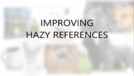
IMPROVING HAZY REFERENCES
So far we've been looking at gaining extra information in dark and poorly lit areas, and sourcing missing detail. But how about improving HAZY references? Those with a soft focus? Well, there's not much you can do to fix a badly focussed photo, but I'll briefly cover my go-to method for sharpening anything - remembering that we're not trying to produce award-winning photos, just usable references. There are a number of subtle methods in Affinity, but we need something with real grunt. So, with that in mind... let's get to work with the UNSHARP MASK.
Could you draw from this photo? I think you could, but there are layers within the hair and moustache that could be clarified for better understanding. Perhaps the eyebrows too. And the eyes themselves. So, let's copy the original for safety - that's CTRL+J - and work on that. It's quick and easy. Don't use FILTERS > SHARPEN > UNSHARP MASK, because that's non-reversible. Instead, we'll use the non-destructive LIVE FILTERS > UNSHARP MASK.
My first move is to increase the radius as I keep my eye on the hair. I usually push it up to around 7 but that's not doing much this time. So I'll increase it to around 20. Then I tend to over-increase the factor, so let's push that up about half way... and back it off a little. 1.722 looks OK. That is, it's too far, but not ridiculously far. Then back off the radius... 7.5 looks good. The eyes, eyebrows and moustache are now more clearly defined. Maybe not the hair though.
The quick remedy is to select the Unsharp Mask icon and - CTRL-J -duplicate it. WHOA! That's just madness... but never fear. Duplicate the Layer - so we can easily backtrack. Open one of the instances and dial it back a bit... taking the factor back to 1.078 looks OK. I can see the facial features and pores, if I need them, and his brown hair is much easier to understand. We're interpreting, not
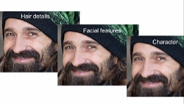
copying, so we have the detail to do that efficiently now. Even the stitches in the knitted hat are clearly defined. And those steps give us a range of references to work from.
We could, for instance, print this one out for facial features and the hat, then switch back to the previous layer and use that for rebuilding the hair. And while we're doing that, let's print out a copy of the original, to get a better feel for his character, without being distracted by detail. Now with those three to assist you, there's very little you can't achieve.
Personally, I'd base my drawing on the central copy. Then use the Character copy to dull intrusive detail. And use the Hair Detail copy to help me better understand those areas, while not drawing it as unnaturally clear. On the other hand, I do like the increased contrast and sharpness of the Hair Detail eyes. Choices... choices... but at least you'll have them available. And with all that extra data, you'll have such a better understanding of the subject you're drawing.
CONCLUSION
Of course, you still can't bring back data the camera's lost - such as badly out-of-focus areas or burnt out highlights. But you can source that missing detail with an online search, and naturally build in that detail as you work.
Next time, we'll take this a stage further and look into changing colours and lighting directions. And we'll go into some depth on combining elements from two or more references to achieve the vision you have in your mind.
© copyright: Mike Sibley 2024