Workshop Plus
WORKSHOPS 2008
US and UK workshop continuations
Grahame (Sawley, UK)
"Let me first say thanks to you and Jenny for such a great weekend at your workshop. I've been working hard on the drawings and thought I would submit this one for you comments, I'm still a long way from getting where I want to be, but practice makes perfect as they say!"
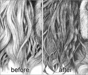
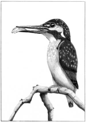 Well done, Grahame! There's a lot to be admired in this drawing. The composition has a natural balance, which is not easy to achieve with that pose - there's always a danger of leaving an uninteresting blank space at the lower left. But here the branches offset that well, and serve to lead the eye into the drawing.
You've established a good feeling of three-dimensional form by the subtle use of shadows - particularly those beneath the wing and chin. Do birds have chins? But I feel you could have made more use of those shadows by strengthening their tones. A cast shadow is a cast shadow, no matter where in the drawing it appears. The light is constant so the shadows should be too. Here, the bird does not quite belong to the same world as the branch, because the branch contains much darker shadows than the bird. If you'd incorporated the same depth of tone into the shadow beneath the wing, that would have visually pushed it away from the body and increased the three-dimensional appearance. It may also have allowed you to dull that distracting and rather unnatural bright edge to the wing.
The branches themselves are powerful examples of drawing. They possess a three-dimensionality that is almost tangible - assisted, of course, by those deep-toned shadows. And the buds, irregularities and varied diameters all serve to add a natural appearance.
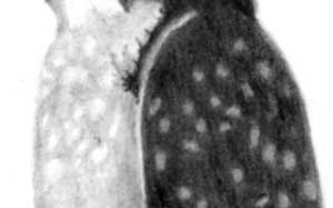 I would have liked to have seen the same understanding incorporated into the Kingfisher. While acknowledging that close-knit feathers often don't allow any to be independently visible, a certain amount of artistic licence would have permitted you to signal that they actually are feathers. You could, for example, have introduced one or two feathers that required preening - showing untidily on the body and displaying separated barbules. In brief, the Kingfisher is just a little too tidy, and the surface too even. There's little in this drawing to tell me it's covered in feathers, or relaying the texture. On close inspection I can see feather-like forms within the head and wing, but these don't extend to the spots, which appear to be laying haphazardly on top of the feathers. However they appeared in your reference source, you would have achieved a more natural appearance by feathering them (no pun intended!) in the direction of the barbules of the feathers that they are a part of.
Possibly I'm being too severe, as I don't know the size of this drawing. It's an excellent effort that could be lifted to the next level by constantly reminding yourself of exactly what it is you're drawing at any given moment. Often, while concentrating on form or shading, you can forget that you are actually drawing hair or feathers or any other physical texture. Keep that in mind as you draw and let the texture produce the markings and other surface features.
Jenny Sibley (Sawley, UK)
As Mike's wife I'm always being asked by artists at his workshops if I am an artist too, or do I draw or paint? I haven't drawn or painted since I was about twelve years old, and haven't progressed since then.
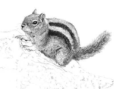
We had a spare place in the July workshop, so I decided to take it. The first day I worked my way through all the exercises alongside everyone else, and then began the main drawing of the workshop in the late afternoon. I chose to draw a Golden Mantled Ground Squirrel that Mike photographed in Yellowstone Park, when were there in June to hold a 5-day workshop.
Mike drew the guide-line drawing for me, as he does for every artist in his workshops. I don't have a lot of patience and thought I would quickly become bored but, once I began drawing, the time went so quickly! Everyone was lucky to get their lunch (my department) and cake!
The next day I really couldn't wait to get started on my drawing again. Although I've watched Mike draw for almost 30 years, I never thought I'd ever try it myself - but now I want to complete this drawing and begin planning my next one!
Update : 15.08.2008
I must admit that the hardest part was the rocks. I found the fur easier because I know what animal hair looks like, but I don't know anything about rocks. Mike told me to keep them simple, just to take my pencil for a walk, and let the eye make its own mind up about what they actually look like. I really must read that Drawing from Line to Life book :)
Mike didn't help me more than anyone else during the workshop and fortunately, unlike husbands teaching wives to drive, he had enough patience for both of us. What's next? A Donkey... because I can't persuade Mike to draw one. And, if you're planning on attending one of our UK workshops, please don't worry about having to eat Mike's rock buns - I promise I'll still do the catering!
Mike didn't help me more than anyone else during the workshop and fortunately, unlike husbands teaching wives to drive, he had enough patience for both of us. What's next? A Donkey... because I can't persuade Mike to draw one. And, if you're planning on attending one of our UK workshops, please don't worry about having to eat Mike's rock buns - I promise I'll still do the catering!
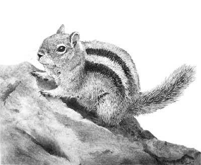 I hope you agree with me that Jenny's completed drawing is something she should be justifiably proud of - I know I am. She must listen to what I say in each workshop, because she's avoided most of the novice errors. A common error here is drawing the black stripes as if they were solid, hard-edged, glued-on decals. Obviously they are not - they are hair just like the rest of the body, and those hairs possess a length, so surrounding lighter hair will overlap the stripes' edges just as they themselves will overlap more distant hair. It's easy to forget such simple things when you're concentrating on the form or tone.
The white rim around the eye correctly draws your attention directly to it; the white stripe is obviously white without being intrusive; and the highlight in the eye gleams bright. I remember advising Jenny to "kill the white" on a few occasions, where she'd left white paper between hairs on the body and tail. By dimming those areas of white content, usually with a top layer of 2H or 4H, she achieved a unity to those areas while, at the same time, restoring the dominance of the areas that were intentionally white.
She was rather daunted by those rocks! So I advised her to just form a loose mental idea of the shape of the rocks and then to begin at the top and work down. Inevitably that first mark leads to the second, and after a while shapes begin to form themselves - some can be emphasised into features, others pushed into obscurity, where they serve to form surface detail. The overall plan was simply to place the Ground Squirrel on a rising surface that fell away to the left of the crest. All other features suggested themselves as she "took her pencil for a walk". Detail is best avoided here, as the Squirrel must remain dominant, so the suggestion of texture and form is sufficient. And I must say that I think she's succeeded wonderfully. Well done, Lass! Now I suppose I'd better get that Donkey guideline drawing done for you :o)
Annie (Sawley, UK)
Following your workshop at Sawley this July I was dead keen to try out the techniques you taught us. I have re-done a picture of Paddy and Dibble my Springer Spaniels (My Boys!)
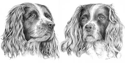
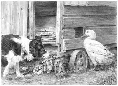
« Annie's drawings before the workshop
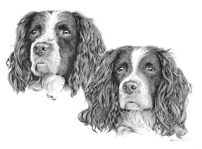
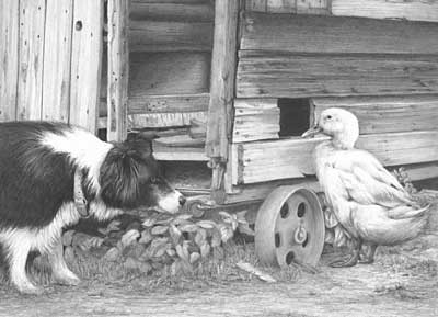
« Annie's drawing after the workshop
I'm really quite pleased with it and personally I think it's the best thing I have done to date. Thank you so much for the Workshop I feel it has made a huge difference to my work. Roll on the next one please!
Annie, you've every right to be pleased with this! I'll just critique Dibble, if I may, as he is easier to compare before and after. It was, as I recall, the ears that presented you with the biggest challenge, and they have certainly improved. But I'm also struck by the life and vitality that Dibble now possesses, and an improved, well-rounded nose.
At first sight, a Springer Spaniel's ears are always a daunting task but broken down into manageable sections, as I showed you, greatly simplifies the work involved. Just to explain to others reading this: an ear, for example, can be broken down into individual locks, those in turn can be divided into positive and negative drawing areas, and those can be further subdivided into two layers - a "detail" layer containing the line elements and a second "tone" layer describing the overall shaping and lighting.
 You've drawn the later ear with so much more understanding and confidence. It's quite obvious to me that now you know exactly what you are trying to achieve - and succeeding too. Each lock has solid form and texture, the hairs behind are correctly drawn with less detail (so they don't detract but add depth), and those out-of-place hairs give a good sense of reality.
The only additional advice I can give is to make your highlights brighter. I think you're trying too hard in the highlighted areas where the locks reach their most forward point before curving away again. Brighter and less-detailed highlighting would add sheen to the locks and boost their three-dimensional appearance. Other than that, this is an excellent drawing, and one you are right in feeling justifiably proud of!
Laurie (Yellowstone, Montana)
I'll call it done. My biggest struggles are still grass - and uh, ducks! I've never done them before.
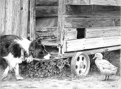
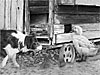
 I think you've done a superb job, Laurie - including the duck and grass. I especially like the grass you've introduced into the bottom right-hand corner - it adds balance and definitely reads well as grass. The duck is well rendered with a smooth covering of feathers. Even close up a duck's feathers lay so flat to each other that it is difficult or even impossible to detect edges between them.
You've handled the variety of textures well. The wood siding of the hen house has a lovely feeling of old weathered timber, the Collie's coat is black, sleek and glossy with just the right amount of descriptive detail. And the old wheel looks rusty, although the ellipse of the far side is slightly pointed at the top. At first I felt the leaves of the Nettle patch were too light, but on reflection, they do their job and you've correctly tucked the rear of the clump into the shade beneath the hen house. I also like the way you've subtly suggested that the visible forms inside the house extend through the hole that is attracting the duck. That's a nice refinement that adds a good touch of reality.
This is an excellent result - especially for a previously grass-challenged artist!
Read more about the Yellowstone workshop on Laurie's Blog and my own blog for photos of the event.
Karen (Whiteley Art Society)
 This is an excellent attempt considering you've haven't drawn with graphite pencil for five years and the number of problems this composition poses. You've used a broad range of tones and can obviously "feel" the three-dimensional forms that you are portraying.
You've successfully repositioned the dog's left-hand paw but had you raised it instead of planting it on the ground, I think you would have suggested the movement that helps tell the story. The foliage is believable with I a good sense of mystery and depth. And the duck has just the right amount of suggested feather - it's easy to overdo that aspect, but all who know ducks appreciate that most of the feathers lay so closely together that they are rarely seen individually.
The old hen house is depicted very well, although I'd have preferred to see a more shadowy interior - any detail in that area is bound to pull the eye back away from the action.
I must congratulate you on achieving a very pleasing and well-executed drawing.
Andrea (Whiteley Art Society)
 A good drawing, which I'll attempt to critique from the top down. First, you need to think about what you're actually drawing. Although I like the rustic look of the gaps in the boards of the door, there is no reason why the gaps should be the same thickness along their whole lengths. Drawing a single line just won't suffice, as you're implying that each board exactly fits the one next to it. In reality the gap will be wider in parts and narrow in others, as the two board are independently warped. Try to experience them as old boards in your mind as you work, and you'll realise that each will warp independently.
You've made a good attempt at the Border Collie - I particularly like the sharp divisions between black and white hair. And your rendering shows a good understanding of the structure of the hair and body. You've also solved the problem of that awkward raised foot quite successfully.
I would have liked to have seen less detail and more shadow with the hen house. I think you've tried too hard to understand what was going on in that area and have become trapped by depicting the detail. As a result the interior lacks depth and mystery, both of which are important - playing down this area would have forced the viewer to focus on the dog and duck action instead of being distracted.
You have a similar problem with foliage - attempting to draw each leaf, which damages the reality you were after. In real life, very little is understandable behind the foremost leaves. You may recall the exercise you did involving status elements. That would have served you well here. Try isolating the foreground status leaves (the one's that tell us they are Nettles), and then drawing representations and suggestions of nettle-like shapes behind them before finally and carefully rendering the status leaves. Just as in Nature, those status leaves would send the "these are Nettles" signal and the viewer would automatically assume all that lies behind them is Nettle also.
The duck is drawn very well - although I seem to have given you a problem, for which I apologise. Somehow you were given a rogue line drawing with a diminutive duck. But you've overcome that well by steering the dog's gaze lower, achieving that all-important connection. You've emphasised the Collie's eye perfectly, and that hint of a smile in the corner of the mouth removes any threat of impending doom for the duck. A very creditable drawing.
Workshops UK
Tutorials
by Mike Sibley