The Pencil Artist’s view of Negative Space

Jay emailed me to say that at recent art show:

One artist commented that drawing is vastly different than painting. If I was being judged by brush wielders they might see my work as incomplete. Pencil artists see white or negative space differently. These differences in perception influence lighting. Trying to apply painting criteria to drawing breaks down over issues of negative space.

I totally agree. You can perhaps best compare drawing to watercolour painting, since both have only the white of the paper available. In my workshops and online I try my hardest to get the artists to see the negative space positively. Two pencil strokes can leave a very usable white shape between them, and we pencil artists need to be constantly aware of the white spaces we are creating. I often find those spaces suggest something that I wouldn’t perhaps have consciously thought of, yet the space works well – especially when refined to become a specific positive element.

Jay continued:

I remember your lesson about negative space, focused on drawing grass. I’m trying to work through how to apply this lesson to contrasts between different foreground/background values like the shell of a terrapin and a stick he is under from a bush nearby. Shadows help with separation. At the same time, exaggerating the value differences between the stick and the light grey of the shell creates an artificial contrast making for greater separation of objects.

Your thinking is 100% accurate. Never be afraid of exaggeration. I do it all the time. False atmospheric perspective, for example, that exaggerates depth. I see drawing as a collection of visual clues that we supply to our viewers. If a little subtle exaggeration is required to add clarity to the clues, then I’ll apply it. We don’t have colour – we can’t add blue to create recession – so I use diminishing detail, softening edges, and lighter values that are often lighter than would naturally occur. Ultimately, all that matters is that the drawing is “read” correctly.

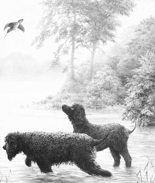
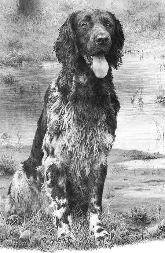
Here are two examples within one drawing “Early Morn at Witton Marsh”.

Early Morn at Witton Marsh by Mike Sibley
Early Morn at Witton Marsh

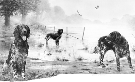
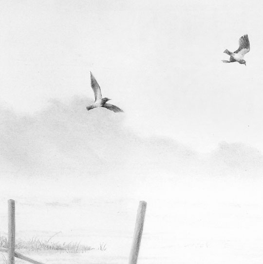
The atmospheric perspective has been stretched to create more recession, and the two birds are deliberately placed to enhance the gap between background and midground – contrasting their relative sharpness against the soft, misty trees and sky.

Detail from Early Morn at Witton Marsh by Mike Sibley

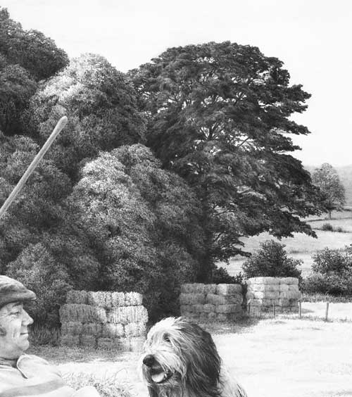
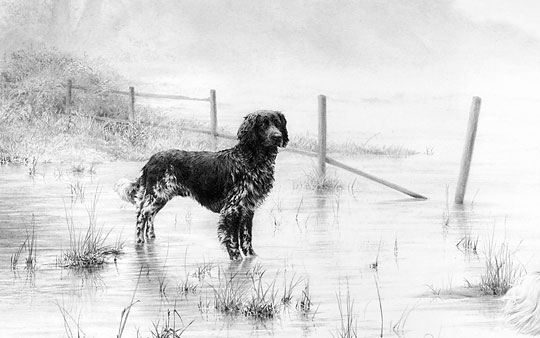
Lower down, the central dog is larger than it should be. It was sized for balance and presence rather than natural accuracy. To overcome that, the fence behind it has a false perspective – it recedes more quickly than it should. But it provides scale alongside the dog and then seamlessly connects that to the scale of the brush and trees behind it.

Detail from Early Morn at Witton Marsh by Mike Sibley

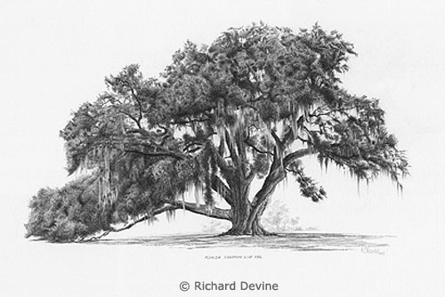
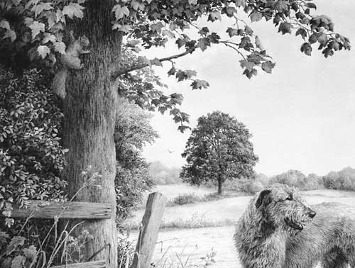
And to return to Jay’s original point, all the hair depends entirely on negative drawing – all white hair is purely negative space. The adjacent drawing defines the edge

Early Morn at Witton Marsh by Mike Sibley
detail – “Early Morn at Witton Marsh” by Mike Sibley

You can read the story behind this drawing at
https://sibleyfineart.com/gallery_LE.htm?mnst&171–munsterlander

Thanks for your question, Jay.

DRAWING MIDGROUND TREES

DRAWING TREES with midground mystery

Artist Richard Devine submitted a query on my website to ask:

I thoroughly read all I could find both in your book “Drawing from Line to Life” and on the web about drawing trees. Then I tried to capture the beauty of Florida’s Champion Live Oak, the Cellon Oak. I would appreciate your honest critique of my work and how I could improve it. The suggestion of leaves was done with irregular squiggles, for the leaves are about 2″ long and 1/2″ wide. If I was to render a maple tree at the same distance, would I use a different size or shape squiggle? Perhaps angular shapes?

Richard's Cellon Oak drawing
Richard’s Cellon Oak drawing

This critique won’t take long 🙂 For a midground tree, it does its job admirably. It has believable form, suggestions of detail, and an excellent sense of reality. Personally, I think the beauty of working with squiggles and circles is that it allows you to explore an area without a break in concentration, unlike line that has to be continuously restarted. So you very quickly slip into working directly from your mind and sculpt what you expect to see.

If I was to render a maple tree at the same distance, would I use a different size or shape squiggle? Perhaps angular shapes?

Exactly that. Consider why you know it’s a Maple from that distance and then adapt your squiggles to reflect that knowledge. In the case of the Maple, or my preference for Sycamore, the visual clue lies with the angular shapes of the leaves. Build in that clue and you send the intended message. Very often, I find, using that clue around the perimeters of each foliage mass is all that’s required. When you create the shaded side of a mass and use that to negatively create the lighter edge of the adjoining mass, use that shade to create angular “maple-like” shapes. Edges are what most attract the viewer’s attention.

The other equally important area is the outside edge of the tree itself. Here you can be quite explicit about the leaf shape. Although you described your Oak’s leaf to me, I was already aware of that, based on the shapes around the extremity of your drawing. Those are the only clues my brain needs to understand the species of the tree, the leaf size and shape, and that all suggested foliage within it should be read as being identical.

Creating midground recession

Here, no actual leaves exist, only suggestions of leaves. But the outer edge of the right-hand bush is deliberately sharp-edged and intended to suggest the scale of its foliage. The outer leaves were not drawn, or even planned, but created as negative white shapes as I drew the shaded area behind them.

Midground trees drawn with clarity

Behind these trees is a lake with morning mist rising from it. To increase the depth, these midground trees were drawn with exaggerated sharpness and contrast. Most contain very little internal “detail” so attention is thrown onto the outer edges, which suggest the species (usually imaginary!) and its leaf shape and size.

Midground secondary element trees

These trees are merely a backdrop – something to contain the viewer, and to suggest locality and strength of light. Again, most of the work was concentrated on the negatively drawn edges. The interiors are simply squiggles, circles and random meandering of my pencil as it sought to reproduce the three-dimensional form and lighting that was in my mind.

I had references to assist with the drawing of the central dark tree but all the others were imaginary and created without any prior planning. The only conscious goal was to clearly differentiate between the two species.

Foreground, midground and background trees

Both the midground and background trees were drawn in the same manner applied by Richard – squiggles that sculpted what I was imagining. The distant background trees were lightly blended to soften any hard edges.

The foreground tree and bushes employ a similar approach with one exception. Here the extreme foreground leaves were outlined first to isolate them. Then the midground “leaves” were established by spontaneously and negatively creating the solid dark background between them, resulting in white silhouettes of random, partial leaf shapes. They were then darkened to variously push them back into the shade. Finally, the foreground leaves (the visual clues) were carefully drawn to make you believe that everything behind them is also foliage.

Don’t over-plan or over-think foliage. Take a long look at the Nature around you and you’ll quickly realise that it is full of mystery. Very little is clearly understandable. Even close up, you may understand the foreground leaves on a tree, but one or two layers back you simply assume that what you are seeing are more leaves. To achieve a sense of realism you need to emulate Nature and allow mystery to exist.

Then stand back at look at the overall internal shaping – the way the rounded masses of foliage form. Combine that knowledge with your feeling for the local foliage and you’ll create a tree with a true sense of reality – even if your interpretation is more abstractly suggested.

Thanks for letting me see your tree, Richard – it’s excellent in both composition and implied texture.

You can view more of Richard’s work at : RichardDevineFineArt.com.

SAN ANTONIO and LOS ANGELES 2011 Workshops

With only a little over a month before we leave the UK to fly to the US there are still places available in the SAN ANTONIO, TX, and LOS ANGELES, CA, workshops. And, incidentally, in the Yellowstone 6-day workshop too.

The San Antonio and LA workshops are both 3-day, Friday to Sunday events:

San Antonio
     June 3rd to 5th        –    Full workshop details

Los Angeles
     June 24th to 26th    –    Full workshop details

I fervently believe drawing should be FUN! So we run friendly and informal workshops, designed for artists of all abilities. If you have a desire to take your drawing to a new level of realism, these workshops were designed for you!

Over the three days I’ll show you how you can break down any drawing, however complex, into easily manageable parts, and apply simple step-by-step techniques to draw them believably.

You’ll travel from the basics right through to a final drawing, covering a variety of techniques along the way. And no lectures! I prefer to work with you individually as you draw.

All you need do is bring yourself – all paper, pencils and other necessary supplies are included in the cost. And on my website you’ll find lists of local accommodation, travel assistance, Things To Do in the area, and information on the venue itself.

Complete the simple Mailing List box and you’ll receive the Workshop Newsletter to keep you up to date with developments, and I’ll personally warn you when places are beginning to be scarce.

I hope you decide to join us – my wife Jenny and I will love to meet and work with you.

A Very Special Workshop

We fancied doing something SPECIAL as a workshop in 2011. Jacksons Hole was mentioned but the cost was prohibitive and then the idea slowly dawned… let’s go back to YELLOWSTONE! But this time, instead of a 5-day workshop, let’s make it six days, make it affordable, and include everything in the price – that’s:

  • Illustrated talk by a Park Ranger so we know what to expect and look out for during our visit to…
  • A full day in the Park with assistance on photography, taking that unusual but useful shot, and looking for elements that can be combined into a useful setting. And we provide transport and lunch.
  • Improve your photography – late afternoon sessions by talented Artist and Photographer Rich Adams beginning with the basic uses of compact cameras.
  • Visits to the nearby Grizzly & Wolf Discovery Center to get those photographs that eluded you in the Park.
  • Five days of uninterrupted drawing covering drawing from the basics up to advanced.
  • AND all tools and paper will be provided. Just bring yourself.

YELLOWSTONE USA 6-day SPECIAL WORKSHOP

Dates     : 12th -17th June 2011
Duration : 6 days, 10 am to 5 pm
Location : Holiday Inn, West Yellowstone, Montana

Our busy 2008 Yellowstone 5-day workshop

Novice or advanced, you’ll travel from the basics right through to a final drawing, covering a variety of techniques along the way, including the use of references and how to use them for composition, how to use Negative Drawing effectively, and the benefits of seeing and using Negative Space. And no lectures! I prefer to work with you individually so you can learn and explore by drawing.

And I’ll show you how you can break down any drawing, however complex, into easily manageable parts, and apply simple step-by-step techniques to draw them believably.

You’ll learn both the “HOW” and the more important “WHY” – the one that adds understanding to the other. Whatever your present ability, you will leave with a new-found knowledge of how to draw effectively, and how to remove stress from your drawing projects.

WORKSHOP DETAILS

We’re doing everything we can to make this special workshop affordable – including reserving rooms in two hotels to give you a cheaper option. And we scouted for local RV and campsites as well as B&Bs. They’re all listed on my website.

Let’s make this a workshop to remember! Or, as Rich said, something to tell your grandchildren about   🙂

Negative Drawing – Tiger’s ear

Alexandra emailed me to ask:

I was wondering if you would be able to give me some tips on a tiger’s ear I am drawing at the moment. The fur is really wiry and thin, and I’ve tried breaking it all down, but am not sure whether I should use the indenting technique or negative technique or both. Do I try and draw individual strands of fur, or not worry about drawing exactly what’s there?

Tiger's ear reference

First, don’t concern yourself with copying the photo. A split second after the photo was taken that area probably changed. Instead get an overall feeling for it, study it until you know it well, and then draw your interpretation.

Indenting works best in areas of high contrast, so you could use it where the hair is in front of the dark depths of the ear. Either use a fine needle or, as this is not white hair, use a hard sharp pencil, such as a 6H or even 8H. But don’t overdo the indenting, because it produces a very mechanical line that does not blend easily into surrounding drawn lines.

Personally, I’d use negative drawing for almost all of this with just a few narrow indented lines where those lines directly cross over others or where the background is dark.

Don’t be daunted by the seemingly complex task – split the job up into many stages, so you can more easily concentrate on each one. Start with the shadows between the hairs so you leave a network of white hairs. The next step is to begin working on those hairs one hair at a time. Tone each down as you think fit, to give it shaping and form, and decide at each junction or crossover if your hair is beneath or in front of the other hairs. Have fun! Seriously, don’t stress about it – take it in easy stages and just watch it grow.

Finally, you can use layers of overall tone if you need to push any areas further back, or lighten with Blu-Tack or a kneadable eraser to bring it forwards.

I hope that helps. It looks like a great project!

You can view Alexandra’s work at:
alexandra-riley.artistwebsites.com/index.html