Why don’t you use colour? That’s much more beautiful!

Chris emailed to ask:

Dear Mike, Drawing with graphite pencil gives me a lot of pleasure and happiness. In the past using color made me more and more feel like I was losing contact with my work and the pleasure disappeared. But since I removed color from my drawings people keep saying: “Why don’t you use color? You have to use color, that’s much more beautiful” and so on. Probably you have had these comments too. Could you please give me any advice what to say to these people so they stop nagging?

Leaning against one wall of my studio are two pristine stretched canvasses. One drawer of the unit containing my drawing materials is full of unused oil paints, palette knives and brushes. They’ve been there for fifteen years, awaiting the day I feel the urge to paint.

That they are there is a result of my dealers telling me I’d sell more work if I painted. However, I believe they mean they better understand, and can more easily sell, paintings.

One drawer above holds acrylic paints. I once spent half a day using those and thoroughly enjoyed it – but I too felt a loss of connection with the work. I don’t paint. It’s not the way I see the world. I see and enjoy colour but prefer to look beyond and behind. It’s an attractive veneer that hides the real world – the tactile world I prefer to inhabit.

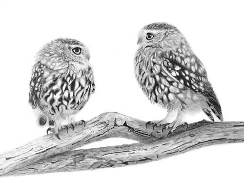
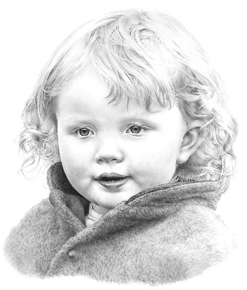
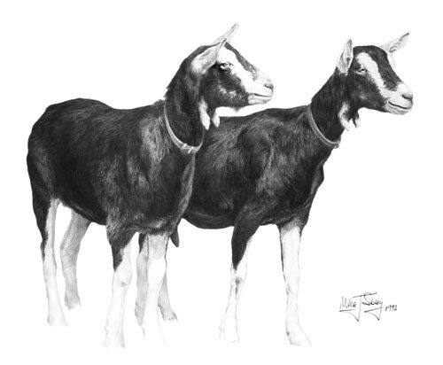
Pencil does everything that I ask of it. I am not a fan of colour. I believe the lack of colour in pencil work forces the eye to look deeper into the image. The eye can scan over a painting and quickly pick up sufficient information to satisfy it just from the shapes, tones and hues of the colour alone.

Pencil, by stripping away the familiar outer covering, demands a much closer inspection. In short, colour can get in the way of real perception.

There’s another important difference between painting and graphite pencil drawing too – spontaneous creation. I think this explains your “losing contact” with your work.

Consider the following:

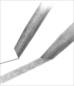
  • We graphite artists only have two “colours” at our disposal – texture and contrast
  • We work with a thin, pointed stylus so we tend to become detail orientated.
  • By controlling the pressure applied to that stylus we can control the value it produces
  • The use of a chisel point means we can switch between a broad face and sharp edge by simply rotating the pencil

Combine those points and they add up to a medium that offers instant and spontaneous creativity.

At this point I should mention that, in my opinion, there are subjects that demand the use of colour and are therefore not suitable candidates for monochrome rendering in pencil. A sunset was my first obvious thought. My next was brightly coloured fishing boats under a Mediterranean sky – but then I realised that’s not true. In fact, pencil would be ideal for that subject. Why? Because almost all viewers will see only the colour. Remove the colour and they are forced to look at the boats – the chipped and peeling paintwork, the old frayed ropes, the sinuous weave of old wickerwork creels… all the textures previously hiding behind colour. The essence of the boats exposed; not just their superficial appearance.

Of course the two elicit completely different reactions – both equally valid. The first generates feelings of warmth and beauty. The second exposes the viewer to the intricacies and beauty of the real world beneath.

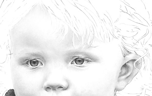
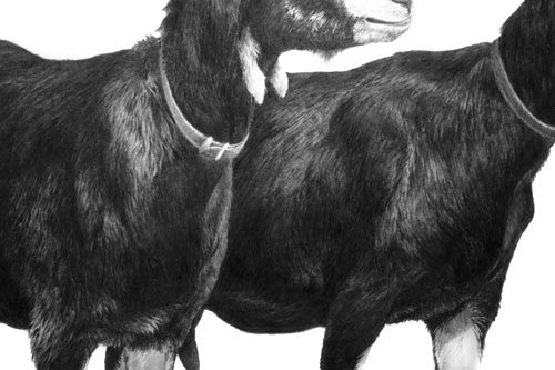
Personally I begin each drawing with a set of guidelines within which I work. I then draw one small section at a time. And I rarely return to that section – it is complete and, because I don’t work on it again, it remains sharp and fresh.

It’s the immediacy offered by pencil that attracts me to it. My thoughts travel down my arm, and my pencil translates them into drawing. There are no colours to mix, no drying times, no complex layers to apply. Nothing breaks my concentration. I can create and complete an area in a single unbroken session. I become deeply immersed in it. The work exists in my mind – I can see it; it’s alive – and it’s transferred effortlessly to my paper. I often become so engrossed, and disconnected from the world around me, that it is not uncommon for me to look at the work I’ve just produced and to have difficulty in believing I drew it.

Finally, have you noticed that most “high art” photographs employ black and white film? Again, I’m certain that’s because the viewer is forced to look directly at the beauty of the subject. Composition, balance, contrast, emotion, texture; all are now fully exposed – they occupy primary positions, no longer secondary to colour.

The viewers of our work live in a world of colour and expect to see colour in images. When someone says “You have to use colour, that’s much more beautiful” I think they are really saying “Make my life easier. Don’t make me work to gain enjoyment.” By removing colour we are forcing them to look deeper for understanding, but if they accept the challenge, I believe their enjoyment will be much enhanced. And that necessity to look in depth gives us the ideal opportunity to draw them into the work.

Personally, I try to subtly exaggerate texture, and emphasise contrast – as if to say, “Do you see this? Do you really see this? Isn’t it beautiful, this marvel of Nature.” And if I feel just one person has finally been encouraged to “see” instead of look, I’ll have done my job.

"Owls" by Chris Strijthagen
“Owls” by Chris Strijthagen
"Owl & Mouse" by Chris Strijthagen
“Owl & Mouse” by Chris Strijthagen
Artwork by Chris Strijthagen
extract -
extract – “Spinney Lane End” by Mike Sibley

The “Universal” Chisel Pencil Point

Julian emailed to ask:

I’ve always been told to keep my pencil sharp but in your book in the ‘Charlotte-portrait’ chapter you mention in stage 4 using a ‘flat’ tip. I’m not quite sure what ‘flat’ means.

The universal chisel point

I always use a chisel point, which has many advantages.

To achieve that point, sharpen your lead as usual and then, holding it at your normal drawing angle, rub the point off on a piece of scrap paper. Now you’ll have a flat face surrounded by a sharp edge.

  • Use the edge whenever you usually use a point – except the edge lasts a lot longer. Unlike a sharp point that wears very quickly, a usable edge extends half way around the flat face. Turn the pencil as you draw to maintain that narrow width of line.
  • Use the flat face for shading. It cannot draw hard edged or thin lines so the coverage is smoother and more even. And there’s an added bonus…
  • Every time you use the flat face you automatically sharpen the edge.

I sharpen my pencils every morning and probably don’t have to do it again for the rest of the day. If you’re not using the flat face and need to sharpen the edge, restore it by quickly scrubbing the face on scrap paper again. It’s almost an ever-lasting “point”; there is no constant pencil sharpening to break your concentration; and there’s one more major benefit…

You can switch from a broad flat face to a sharp point with a half turn of your pencil. Imagine being able to draw sharp linear detail and then applying a layer of tone to create the three-dimensional shaping without having to change pencils or reform the point. It leads to very spontaneous and intuitive drawing.

I’m aware I need to build the layers thru several applications and blending. Any advice?

Use the flat face of your chisel point and I think your problems will disappear. You can seamlessly build up layers of tone and blend at any stage. I would add that I personally work from dark to light. Hard grades tend to quickly fill the tooth with clay so soft grades won’t always successfully layer on top – but a hard grade will layer over a soft one. So, to build up a darker area of skin tone I first lightly apply 2B to the darkest areas and then build up the whole area with HB or, more usually, 2H. The 2H will burnish the 2B; it breaks up the graphite grains, spreads them more evenly and polishes the result. Result: seamless and flawless skin tones.

2B and 2H flat-face shading

The completed drawing of Charlotte

USA – CANADA Workshops

Last-minute bookings still being accepted….

All the workshop supplies have been shipped to the venues and we fly to the US next Monday BUT I sent extra supplies, so we can still accommodate you.

WISCONSIN
Eau Claire – EC Centre’s Sun Room
only 2 seats available
June 27-29

TOTONTO
Mississauga – Novotel’s Amsterdam A room
July 4-6

FLORIDA
Clearwater – Pinellas Park Art Center
July 11-13

We’ll accept bookings right up to the first day of each workshop. The workshops are friendly and informal and designed for artists of all abilities and ages (we’ve had artists attend from age 12 to 92!). From novice to advanced, all you need is a desire to take your drawing to a new level of realism.

Paper, pencils and all other necessary supplies are included, and you’ll have ready-prepared guideline drawings, so you can concentrate on the techniques and not have to draw by eye. I strongly recommend you bring a table-top drawing board with you. This can be a manufactured board or as simple as a sheet of MDF or Masonite. Our paper size will be 12″ × 18″, so it need not be large.

For full details visit: Workshop Central

hickory1-300

My wife Jenny and I are looking forward to working with you.

WHAT SHOULD I DRAW TO PRACTICE?

As you may know, I’ve been teaching drawing at Drawspace.com for a few years, and one of my students has just asked:

“Mike, I think I would benefit from more practice of drawing things outside the realms of the course for further practice of actually looking at things. Have you got any ideas, please, as to what I could practice to try to improve my understanding?”

That’s an excellent idea! I firmly believe that you cannot successfully draw what you do not understand, so all opportunities to sketch from life, or even from photographs, are always worthwhile.

We graphite artists only have a pointed stylus to work with – no 1″ wide brushes for broad sweeps of colour – so we tend to be detail-orientated. In order for that to work well, we need a mental store of images we can draw on. Fortunately the more you draw, the more you cannot help looking closely at everything around you, and so your store grows ever larger. And we don’t have colour at our disposal – we only have texture and contrast to work with – so again we tend to study the detail in everything. As a by-product, we begin to see the world in a wonderful way that escapes almost everyone else.

When the average person sees a brown horse in a green field, they scan quickly across it and notice “horse” and “field”. But, as we don’t have colour and brown and green are tonally similar, we begin to try to work how we could make one stand out from the other. And we pick up information about the details of both at the same time, including the way, for example, we could use the light shining on its back to separate it from the darker grass behind.

Go and get a coffee…. this could be a long read 🙂

As I was saying… the more we draw, the more we store, appreciate and understand. So draw whatever you can, whenever you can.

Begin with things that are both simple and of interest to you. If you like plants, draw a leaf or two, but not the whole plant. You’ll learn more from one leaf than you will by repeating it over and over as you reproduce the plant, because you’ll be looking at a broad overview instead of concentrating on the understanding of one small part. If you like dogs, draw its collar – preferably not on the dog. And while you’re drawing it, look at the way the light helps us to understand its three-dimensional form.

I suspect you can draw a good resemblance of something but have problems making it look three-dimensional? That’s very common. The answers are there right in front of you once you tune yourself into looking at it in the way an artist does. Photos are excellent “frozen moments in time” in that respect too. Let’s take that collar as an example. Place it on a table and draw it, concentrating on its outline. Now you have a line drawing, hopefully fairly accurate, but line does not exist in Nature so we have to describe its edges in ways that Nature uses.

Begin to shade it and use that to describe its three-dimensional form – one small area at time, so you have time to work out and understand what that little area requires. You can see the collar and understand its shape, and see that it is not a part of the table, yet it has no line around it. The reason you can see it is due to light and shade. The way it catches the light, the areas that are hidden from the light, and the way it casts its own shadow on the table. Use those changes in tonal value to describe the edges instead of line – because that’s how we see them. And if you need to exaggerate to make it clear, do that. We’re artists, not photographers; we don’t copy, we interpret – we bend the world to suit our aims 😉

If you do that, you’ll quickly begin to understand how to construct three-dimensional believable objects in your drawing. And you’ll be storing all that knowledge so you can draw on it the next time you encounter a similar situation.

Just draw. If it interest you, that helps, but it doesn’t matter if it’s your coffee cup, the neighbour’s washing on the line, leaves from your garden, your phone, a crumpled sheet of paper… anything and everything is suitable. But, for now, steer clear of the cat on the mat… or anything else that is complex or heavily textured.

One final thought…

If you have a small camera, or a camera in your phone, carry it around with you and photograph whatever interests or pleases you. You can study it at length later, and that too will add to your store of mental images and textures. What you photograph is up to you, but I have packets full of photos of lovely old bricks and rocks, trees and weeds, old boats and tractors, rock pools and seaweed, tree bark, old weathered wood, and many many more.

Applying Soft Graphite Over Hard?

John emailed to ask:

As I understand it, the layering of graphite is a major part in order to achieve the desired effect of tone and texture. But what I cannot understand is, after reading somewhere that it is almost impossible to build up tone from light to dark and that it must be done from dark to light, I believe it has something to do with hard graphite filling in the hollows of the tooth and then preventing softer grades from staying on the paper. Is this understanding somewhere near the mark, or I am totally way off the mark?

As with all things in Art there are no rules, which means I agree with your understanding and observation but I also know excellent artists who work light to dark. Personally, I belong to the dark to light camp, and here’s why…

First, you must understand the properties of graphite and the manufacture of pencils.

The crystalline structure of graphite is layers of flat plates. That’s why graphite reflects light while the irregular grains of charcoal and carbon don’t, and why graphite is an excellent dry lubricant. It also helps to explain why erasers are usually ineffectual at removing graphite – because once the erasing surface becomes graphite coated it simply slides plates over plates.

Raw graphite produces a black mark. In order to create differing grades – degree of hardness or softness – the graphite is mixed with clay. Imagine that an 8B is almost pure graphite and an 8H contains mainly clay and little graphite. Clay does not possess the plate-like structure of graphite, so the flat-plate structure is diluted as the clay content increases and the grades become harder.

The more clay added to the mix, the harder the grade and the lighter the achievable tones. For example, 6B has a far greater graphite content than 6H, which contains much more clay. This means 6H has a very fine composition and draws smoothly and light, but the softer 6B draws darker with a much grainier appearance.

Of course, this is a general description. In reality, the process varies between manufacturers and the quality they set out to achieve. A manufacturer of cheap pencils, apart from using inferior graphite, might also use inferior clays, which may be ground for less time – possibly just a few hours instead of days. Personally, I use Staedtler leads that are wonderfully consistent and impurities are almost never encountered.

There are more variables to consider too. For example, papers differ greatly, so what works on my ultra-smooth Conqueror Diamond White might not work on a more textured paper, and vice versa. It’s the tooth (the pits and crests in the paper’s surface) that causes the graphite to flake off the pencil’s lead, and some papers possess much more tooth than others.

If you use a soft grade (B to 8B) its minimal clay content means the individual graphite grains are large and won’t fill the pits of the tooth entirely. This leaves flecks of white paper showing through it, but that can be solved by burnishing with a harder grade – HB over 2B, for example – so the harder grade breaks up the softer one and fills the remaining tooth.

Because the soft grades always leave some tooth unfilled, you can always layer a hard grade over a soft one.

Conversely, hard grades (H to 8H) fill the tooth completely with a mix of clay and fine graphite particles, leaving insufficient tooth to accept the soft grades. Their large flat plates simply slide over the top and won’t hold. Remember, graphite is a dry lubricant, so it’s simply doing what it knows best. You can feel this in use, as the soft grade skates effortlessly over the harder grade. It’s much harder to get that soft graphite to stick to the harder underlying layer, and often impossible.

Hard over Soft – HB over 6B
Soft over Hard – 6B over 6H

TURNING DRAWBACKS INTO BENEFITS
There is a technique that I’ve sometimes used that turns this problem into a benefit. You can create your own “masks” – like acid resist in etching. It works best in areas of high contrast, such as highlights on hairs within a black coat. Simply draw your highlights first, with a 4H or harder grade applied with some weight, and then apply a layer of soft grade over it, perhaps 2B or 6B. As the soft grade slides over the lines of hard grade, those lines turn from visible, comparatively dark lines into light highlights. It gives quick results but is not entirely controllable.

Minty and Bramble
Highlights drawn first with 4H then layered with 6B

THE IMPORTANCE OF DARKS
Personally, I feel the often-taught method of building up dark values from a lighter base is simply an admission that no firm decision has been made about the value required. Instead, I advocate the immediate application of the desired value. It produces the freshest drawing and, because it requires a confident approach, the result is sharp and clear. And, perhaps more importantly, as soon as the darkest value is established in a drawing, the entire palette of available greys is known and all midtones automatically fall into place.

If the initial dark value is too light, the entire drawing will be based around a restricted palette of greys. It will lose depth, vitality and impact.

I know I often repeat myself when promoting the use of dense and solid blacks and darks but they really are important. It’s light and shadow that make a drawing, not middle values. If you want your subjects to appear three dimensional, you must have light and shade. Look at the drawings of Ingres or the paintings of Rembrandt for clear lights and darks. And if you work from photographic references, try to find high contrast ones and not ones with almost all middle values – although with practice you should be able to interpret mid-value photos as though they were high contrast.

When someone looks at your drawing their brain will register the darkest value, however small, and then read the white of your paper as being pure white. From those check points it will compare the two extremes and understand all the mid values. The wider the overall tonal range the more three-dimensional information you can impart.

FINALLY…
When you’ve completed your drawing, or a completed section of it, lightly shade with a 2H, or 4H, over everything, avoiding only the highlights. That will remove all non-intentional white from your drawing and your highlights will shine with an increased brilliance.