Colour Shapers

Kevin emailed me to ask:

I read in your book (Line to Life) yesterday that you use colour shapers sometimes for blending. I would like to buy a set but I was not aware that they came in different sizes. Could you please advise me as to which size to buy. The ones I have seen are size 0, 2 and 6. Many thanks and I love the book.

Colour Shaper varieties

When I see a tool, however far removed from drawing, and it looks useful I just have to try it 🙂

Colour Shapers are intended for painters but I find then ideal for blending in tight spots. Unlike tortillons or stumps, they don’t absorb much graphite, so they lighten less. And they’re easily cleaned by screwing the business end into a lump of Blu-Tack.

They come in different sizes and profiles, as you mentioned, and in two types – stiff and flexible. I know a couple of artists who prefer the stiff variety but I find the flexible more appealing.

I have three:

Flat chisel – size 6 (rarely used)
Taper point – size 1 (I think – it’s rubbed off!)
Taper point – size 2

Of the three I mainly use the size 1 Taper Point. I find it’s ideal for blending when I’m drawing remarques. Because I remarque on the coated surface of the (offset-litho) printing paper, I’m restricted to using 2B and 2H, and I achieve the half tones by establishing the line element of each area with the 2B and then dragging the graphite over the lighter areas.

If you don’t have one you won’t miss it. But if you do, you’ll find unique uses for it. In my case, I very rarely blend anything, apart from skies and dirt floors, so blenders are not my most popular tool. But the Colour Shapers certainly fulfil a need at times.

Drawing Workshop co-organisers wanted

Following a successful workshop tour of the USA this year it’s time to begin planning for next year. Nothing beats local knowledge, so I’m always grateful to receive assistance from my local co-organisers and in return I offer a free workshop.

USA & CANADA 2010

I’m planning to visit the US twice in 2010 – in May/June and October. I hope the first trip will include Canada, where I have had two tentative invitations, but more are welcome.

The second trip will probably include California (Solvang) and possibly a north California venue.

If you have suggestions for a venue in any state or province I’ll be happy to consider including it.

UK 2010

As well as running workshops locally in North Yorkshire I also try to run at least one elsewhere in the country each year – in 2009 it was Glastonbury and the year before I was in Hampshire. I’m looking for a co-organiser and a suitable venue in any other part of the country (or even near a past venue). Could you, or your local Art Society, help?

AUSTRALIA 2011

I am currently considering a trip to Australia in 2011, visiting as many locations to hold workshops as I can. More than one workshop may be held in the Melbourne area but I’m looking for suitable venues in other locations and states too. See below for details.

?
Co-Organiser details

The requirements are quite simple: a suitable venue, about 20 attendees, and a base to which I can ship supplies (workshop packs, pre-prepared line drawing etc — you could fit the whole lot into a suitcase!).

The venue need not be any art-related place. I use a village hall here in the North Yorkshire that has good light, a kitchen, plentiful parking, disabled access and toilets, and sufficient tables and chairs. A church hall or community hall would do too, or a hotel with a conference room (although they can be expensive).

Workshops would be either 2-day or 3-day, probably 10am – 5pm.

I need about 20 (maximum 25) attendees to make the workshop viable. Maybe you belong to a local art group and know of other groups you can approach? Would your local newspaper be interested in running an editorial piece on the event? This local knowledge is invaluable – you know things I cannot possibly find out from the UK.

I’m not expecting anyone to have to spend money – if, for example, posters or flyers are required for display in local art stores, I’ll arrange that from here or pay for you to do it locally. I’ll give all the support you need, such as circulating the workshop through my mailing lists, advertising on my websites and blog, paying venue deposits and so on. I will also advertise the workshop on other websites, such as the SAA website where I’m a Professional Associate, which has quite a few American and other foreign members, and on my own Starving-Artists site and at ArtPapa.com (both of which have an international membership). In brief, I’ll do everything I can to attract attendees and help in all other respects too.

If you’re interested, please email me to let me know.

To find out more visit my website’s Workshop Central.

Negative Drawing – part 2

NEGATIVE DRAWING
Negative drawing enables you to perform tasks easily. We previously saw:

  • How we can control separation of background, midground and foreground elements.
  • How we can isolate those areas we don’t yet understand.
  • How Negative Drawing protect our virgin whites.

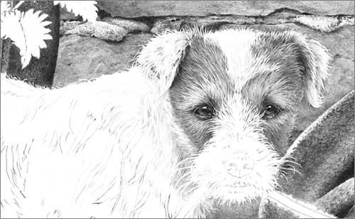
Negative drawing involves the creation (or isolation) of an element within your drawing by simply drawing around it. To return to our dog example, by completing the background first, you have an established setting in which your dog can exist. Because you are drawing this dog as a part of its world, the two will become unified and possess an enhanced feeling of reality.

RECESSION
Up until now I’ve been referring to background and foreground. But in reality our dog is more likely to be situated in the midground. So by “background” I’m really referring to the major part of the setting – that area BEHIND the dog, and not the foreground, which is on a level with and below the dog.

We will have created enough of the dog’s world to give us an understanding on the environment – a ‘feeling’ for that world. Because we cannot avoid taking that world into account as we draw, the dog will inevitably become a part of it.

In practice, you might choose to partially draw the background to get a feel for it, then to begin drawing the dog, establishing the tones required for the background around its outline. That’s OK if that appears to be the logical way to work.

LOGIC
Logic, as I explained earlier, plays a major role in this way of working. Logic in this case is mainly dictated by understanding. You draw what you understand then, when that understanding wanes, you logically move to another area of understanding. This is difficult to describe but easy to understand in practice.

Let’s take one small area again – the junction of the dog’s coat along its back with the background. If you want that topline to be obvious to the viewer you cannot draw the dog first. Without a background, you have nothing to balance your tones to. So we draw that section of the background first, right down to the dog’s back. There we have two choices – if we fully understand the outline of the dog, we can draw around the hairs along its back, leaving them pristine white. Or we can stop short of the dog and make the junction a job in its own right. This gives you all the control you need. Finally you can concentrate on the dog, engineering the tones used within the coat to make it stand out from the background – to whatever extent you wish. It’s a logical progression that puts you in control.

Below you will see that I drew the brickwork down to but short of the dog’s back. Why? Because I was immersed in brick, not hair. Now I can concentrate on defining the dog’s outline while blending new drawing back up into the brickwork – I’m thinking “hair”, not “brick”.

Detail from Parson Russell terrier pup study 'What?'
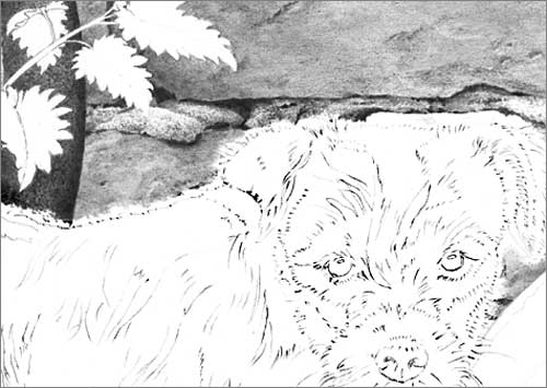
Brickwork stopped short of dog. Now I can concentrate on defining the dog’s outline while blending new drawing back up into the brickwork. I was thinking “brick”, now I’m thinking “hair”.

Note that I didn’t attempt to draw the dog while defining its outline. My concentration was purely on the creation of the hairs around its extremity.

CONCENTRATION
A drawing, any drawing, can be broken down and simplified in this way. If you’re drawing the wooden side of a barn, just draw wood. If grass overlaps it at the base, draw around it. You’re drawing wood – your concentration is on wood – you’re living wood! And, as a bonus, when you begin to draw grass, you’ll have full control over those negatively drawn stalks that overlap the barn door, so you can highlight them, push them into shade, or make them as dominant or subtle as you wish.

WHICH IS DOMINANT?
Where any two textures meet, ask yourself which is dominant. Which will logically control the tones of the other. If we draw the grass first, the tones used within the blades will control and limit the tones available for our barn door. If we draw the barn door first, its tonal values will control those available for the grass. Which is logically dominant from the point of view of physically drawing them? Which is easier to engineer to overcome the limitation imposed by the other? No contest, in my mind, the barn door wins on all counts. It’s so much easier to engineer the blades of grass to stand out from, or blend into, the barn door.

As a bonus, Negative Drawing prevents you from polluting the virgin white within your drawing. Erasing graphite from a spot that should be a pristine white highlight will rarely achieve a good result.