All the workshop supplies have been shipped to the venues and we fly to the US next Monday BUT I sent extra supplies, so we can still accommodate you.
WISCONSIN
Eau Claire – EC Centre’s Sun Room only 2 seats available
June 27-29
TOTONTO
Mississauga – Novotel’s Amsterdam A room
July 4-6
FLORIDA
Clearwater – Pinellas Park Art Center
July 11-13
We’ll accept bookings right up to the first day of each workshop. The workshops are friendly and informal and designed for artists of all abilities and ages (we’ve had artists attend from age 12 to 92!). From novice to advanced, all you need is a desire to take your drawing to a new level of realism.
Paper, pencils and all other necessary supplies are included, and you’ll have ready-prepared guideline drawings, so you can concentrate on the techniques and not have to draw by eye. I strongly recommend you bring a table-top drawing board with you. This can be a manufactured board or as simple as a sheet of MDF or Masonite. Our paper size will be 12″ × 18″, so it need not be large.
Jason, who has recently joined TheDrawingForum.com, jointly run by myself and JD Hillberry, emailed to ask:
Just a very quick question, I am thinking of taking my drawings a bit more serious to supplement my wildlife oil paintings, so I have been reading both yours and JD Hillberry’s books, websites etc so I don’t make too many novice mistakes, and I wondered why you don’t appear to have gone down the same road as JD, regarding using charcoal pencils to get the non-reflective, VERY darks that seem impossible with standard soft graphite.
A quick question but the answer might take longer 🙂
First, JD and I work in completely different ways. JD’s work is more planned and controlled, such as using frisket to blank out selected areas. That requires a very accurate initial drawing that probably cannot be readily altered during the drawing process. However, I love working in graphite because it offers that direct mind-to-hand-to-paper connection – you think, you draw. So I begin with a very loose set of guidelines (except where accuracy is vital) and I constantly alter or even ignore them as I draw each section. I also begin top left and work down to the bottom right-hand corner (as a generalisation). Nothing is blanked out.
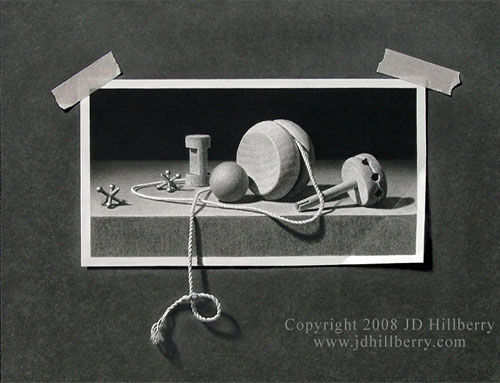
“A String of Memories” by JD Hillberry The entire image is drawn including the background, tape, and string.
When I first began drawing seriously I did use carbon pencils for a while (never charcoal) to achieve more intense blacks. But they always looked false because they lacked the sheen of graphite. At some point I realised I had to be a graphite purist in order for my work to have the unity I wanted, and to allow the mind-to-paper flow that I so enjoy.
I also found ways around the problem of weak darks – which isn’t a problem where prints are concerned because they can be corrected. If I need very intense blacks, I complete the drawing and spray with a matt fixative – that allows me to add further layers of soft grade graphite, and I can repeat that process as many times as required. In more general use, I found that 2B would give reasonable blacks (if applied with pressure – and my Mellotex paper can withstand a lot of punishment) but I could increase the intensity by layering with a harder grade – usually HB over 2B. The harder grade breaks up and smooths the courser grains of the soft graphite and fills the tooth that the softer grade left exposed. I also discarded all grades softer than 2B, because they are too grainy and leave a lot of tooth exposed (tiny white pits that visually dilute the intended dark value).
Finally, spraying a graphite drawing on completion with a matt fixative removes much of the sheen. With the reflective surface dulled, blacks increase in intensity, three-dimensional form becomes more solid, and the drawing has more visual impact. With practice, I draw in the knowledge that the value I’m creating will later darken and increase in intensity.
This morning I received an email, and a separate enquiry through my Art Query page, from John asking:
Hi Mike, I have researched your book, “Drawing from Line to Life”, and the feedback that I have gained, is that it is the bible of drawing techniques. But would you tell me if it is geared towards the technique of drawing animals or would it help me with any aspects of drawing landscapes which is my personal preference.
I went to great pains to NOT write a book only about drawing animals – especially as that’s what I’m known for – and I fervently believe that if you can draw, you can draw anything. That’s one reason I included a chapter on the drawing of my granddaughter Charlotte – my one and only portrait.
The book itself features a chapter on trees and foliage, and it alludes to landscapes throughout – for example, the techniques required for shading a sky are the same as those for skin tones.
Incidentally, I also planned from the outset to always include the WHY as well as the HOW. I find too many books tells you how to do something but never explain when or why you should use it. I believe you need the WHY to fully understand the HOW. It’s like memorising a poem without understanding the meaning of the words.
The most useful of these is the good old Bostik Blue Tack, which is a truly magic piece of kit.
That features throughout the book – I even supply it worldwide now – and I personally couldn’t work without it. Once you cease thinking of it as an eraser, it opens up a whole host of possibilities. In my view, in one hand I hold a tool that can apply graphite and in the other is one that can remove it – brutally, gently, or by very subtle degrees with a simple light stroke of the surface.
I find converting the photos to monochrome and manipulating them within Photoshop gives me a more realistic idea of the tones and shades.
I absolutely don’t do that and never recommend it. The outcome can too easily be a copy of the photograph when it should be an interpretation that includes your feelings, emotions, and exaggerations of what is important. In any case, my compositions are almost always composites of a number of photographs held together by invention. Working from colour photos allows me to decide the tonal range and, as I said, to emphasise the importance of each element. Working from black and white tends to defeat that. And if I see someone at one of my workshops take out a B&W photo and a value chart, I shudder! There has to be invention and interpretation – otherwise the drawing will tell me no more than I can already gather from the photograph. And it will tell me nothing about the artist’s feelings for the scene.
I hope that helps answer your questions – and some that you didn’t ask 🙂
As Owen The Pencilneck remninded me below, you can lose a great deal of information if you convert colour to B&W. For example, if I’m drawing a black and tan dog (such as a Rottweiler) I lose the ability to tell a light patch of tan hair from a highlight in the black hair; following such a colour division through a patch of shade creates even more problems; and it interferes with my job as an artist to clearly differentiate for the viewer, using only tonal variations, between areas of tan and black.
I have at times used B&W photos because the detail can be studied more clearly – but that clarity is the result of removing the colour and most of the three-dimensional form that it describes.
But, as I said, the greatest problem with working from B&W photos is that they exert control over the tonal values that you use for your drawing – it’s almost inescapable. They stifle creativity and interpretation which, unlike copying, are what create art.
Donna commented to ask “…on the forum I hang out on, using Photoshop to greyscale a colour picture in order to better see values when using coloured pencil is considered the thing to do. Does your caution only apply to photos for graphite/monochrome work, or coloured work as well?”
I know many artists who use greyscale in Photoshop and the result can be very helpful in understanding the relative values within an image. But, personally, I think that’s as far as that strategy should be taken. Once understood, that knowledge should be used to aid interpretation, but the temptation is to use those relative values as requirements rather than suggestions.
My strategy is to first establish the darkest value in the drawing, so I now have the darkest and lightest (the white of the paper) values exposed, and all intermediate values should automatically fall into place. That puts me in control and not the greyscale image.
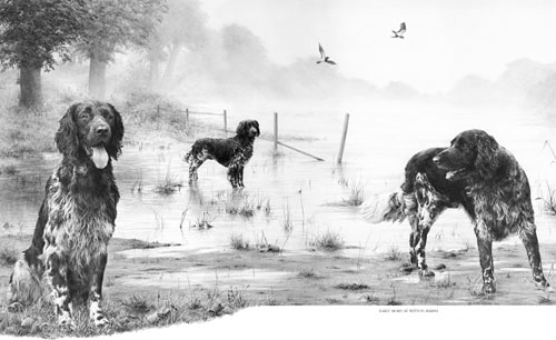
The following image is a composite one – Tom never stood in that water or even saw it.
Tom ~ Greyscale and Colour versions
Viewing the B&W version: on the plus side: detail can be sharper – Tom’s winter coat and ear, the ivy on the tree, detail within the dead grass. On the minus side: the foreground dead grass is difficult to separate from the water, the misty background appears to be closer and too sharply detailed, and the grass on the far bank cannot be distinguished from the green grass above it.
Both versions have plus and minus points, but attempting to draw from the B&W version is more likely to stifle artistic creativity. Would a lighter fence improve recession and push Tom further forwards? Would a more diffuse background give a better impression of mist and further aid recession and mood? I think both treatments would. The colour photo represents the way we actually see things so it possesses a “fence” that can more easily be engineered to suit the artist’s intention, where the B&W version (because it presents itself as a tonal study) tends to dictate the tones that should be used. It doesn’t contain a fence as we know it but a tonal representation of a fence, and it’s more difficult to engineer because it lacks the reality of the coloured version. Likewise, the lack of background detail in the coloured version invites interpretation, but the more sharply-defined B&W image almost demands an exact copy.
Whether working in colour or monochrome I would personally recommend using the B&W image for assistance in initial understanding, and for occasional viewing where sharper detail might be sought. But work with the colour version. That’s “with” and not “from” – to work with the assistance of the colour version to offer the maximum opportunity for artistic interpretation.
I have been drawing portraits for a couple months but am still having a hard time with proportions. I’ve gone through websites, books and watched tons of tutorials, but I’m finding angled faces hard to draw. I always end up distorting them into looking straight ahead and it looks wrong. I was wondering if you have any tips to help me.
I think “looking straight ahead” might give me a clue to the problem. You haven’t yet taught yourself to see what is really there and you are drawing what you think is there. That’s a very common problem and one that you have to work at to overcome.
First, I suggest you try using the grid method to produce an accurate set of guidelines. I’m not suggesting that as a permanent answer but because it’s an excellent way of teaching your brain to stop interfering and to accept that what you see is actually correct. Take a look at my tutorial, which takes gridding a stage further: www.SibleyFineArt.com/tutorial–gridding-art.htm
This is a very involved subject so briefly: your brain is wired to store quickly-recognised features as a part of its defence mechanism. If you see a large face with huge teeth and a woolly mane, you need to recognise it instantly and get out of the way of the lion! All detail is discarded, only salient features are stored, and only those with hard edges, such as eyes and mouth. That’s why children usually omit the nose from drawings of people – it has no hard edges or clearly defined boundaries. Also everything is stored as a “straight on” image – when speed of recognition is paramount, simple is best.
Here’s an illustration from my book (discovered behind wallpaper in our bedroom):
A child's interpretation of an airplane
The propeller is round and at the front. The wings are wing-shaped and correctly placed at each side. The pilot is inside the fuselage but can see out above it… it’s all logically correct but each element is seen straight on because that best describes its shape.
Try gridding first, because that removes three-dimensional form, textures, lighting, and detail and it reduces your subject to pure line. And by concentrating on just one square at a time, it divides each feature into unrecognisable shapes – shapes that the brain cannot recognise. Recognised shapes invoke the “I know all about that” response and the naming of parts. “That’s a ‘mouth’ and I know a mouth looks like this…” But that’s a generic stored-image mouth and not THIS mouth. It’s that naming and recognition you have to overcome and when you have, you’ll finally be able to see and draw what you are looking at – and not what you think you can see.
We fancied doing something SPECIAL as a workshop in 2011. Jacksons Hole was mentioned but the cost was prohibitive and then the idea slowly dawned… let’s go back to YELLOWSTONE! But this time, instead of a 5-day workshop, let’s make it six days, make it affordable, and include everything in the price – that’s:
Illustrated talk by a Park Ranger so we know what to expect and look out for during our visit to…
A full day in the Park with assistance on photography, taking that unusual but useful shot, and looking for elements that can be combined into a useful setting. And we provide transport and lunch.
Improve your photography – late afternoon sessions by talented Artist and Photographer Rich Adams beginning with the basic uses of compact cameras.
Visits to the nearby Grizzly & Wolf Discovery Center to get those photographs that eluded you in the Park.
Five days of uninterrupted drawing covering drawing from the basics up to advanced.
AND all tools and paper will be provided. Just bring yourself.
YELLOWSTONE USA 6-day SPECIAL WORKSHOP
Dates : 12th -17th June 2011
Duration : 6 days, 10 am to 5 pm
Location : Holiday Inn, West Yellowstone, Montana
Our busy 2008 Yellowstone 5-day workshop
Novice or advanced, you’ll travel from the basics right through to a final drawing, covering a variety of techniques along the way, including the use of references and how to use them for composition, how to use Negative Drawing effectively, and the benefits of seeing and using Negative Space. And no lectures! I prefer to work with you individually so you can learn and explore by drawing.
And I’ll show you how you can break down any drawing, however complex, into easily manageable parts, and apply simple step-by-step techniques to draw them believably.
You’ll learn both the “HOW” and the more important “WHY” – the one that adds understanding to the other. Whatever your present ability, you will leave with a new-found knowledge of how to draw effectively, and how to remove stress from your drawing projects.
WORKSHOP DETAILS
We’re doing everything we can to make this special workshop affordable – including reserving rooms in two hotels to give you a cheaper option. And we scouted for local RV and campsites as well as B&Bs. They’re all listed on my website.
Let’s make this a workshop to remember! Or, as Rich said, something to tell your grandchildren about 🙂