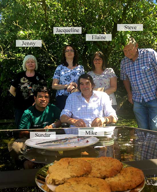
What a wonderful weekend we had here in my studio… running the Drawing Animals workshop for the first time. To find out when I’m running it again (UK/USA/CANADA) read on…
Really lovely company and weather too, and lunch in the garden on both days. All the cake’s gone, but I’ve still got cookies for supper! 🙂
June 2018 DRAWING ANIMALS workshop
I’ll be running this workshop in my studio again in October (20-21) and, as a 3-day workshop, in:
OTTAWA, ON – August 17-19 Limited places now available
and
CLEARWATER, FL – August 24-26 Only ONE seat remaining!
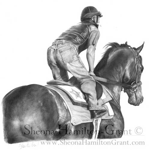
How far do I take the “detail” of short hair, when the horse’s coat is so very smooth? I feel I’m losing the “sense” of shape if no detail. in the very smooth areas. So detail or not?
It depends on what you think the major features are – the main message you want to convey. In this case it’s probably the smooth and glossy appearance, so I’d concentrate on that, and then add just enough texture to maintain the feeling of hair.
Coincidentally, my friend Sheona (who is currently taking my Drawspace Advanced course) submitted a drawing that might help you.
“Racing Ready” by Sheona Hamilton-Grant
The horse is definitely glossy but not so smooth that it looks unnatural. In this case, it was an exercise on recession, so you wouldn’t expect to see hair detail on the head and neck, but I think the mottled rump sends the “hair” signal that you then subconsciously apply to the rest of the horse.
Personally, I went through a “Detail is King” stage and I believe it is a necessary step before you learn which detail to enhance and which to merely suggest.
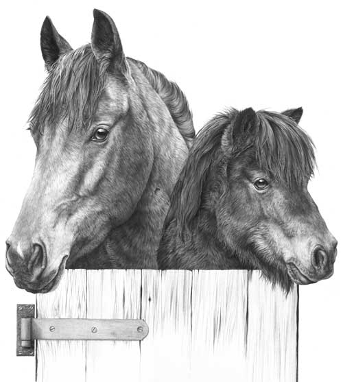
Duvet design
Here’s an old drawing of mine from around 1987:
Section of Duvet design by Mike Sibley, 1987
It is deliberately high contrast with few areas of flat midtone shading because it was designed to be printed onto fabric, but if I’d intended it to be a print or sold as an original, I’d consider it to be over-detailed.
The dark eyes do attract attention but the horse’s mane is so sharp that it drags my eye back – it’s more primary than secondary in importance. The same applies to the base of the neck – it contains detail with a strength that defeats any attempt at creating recession. Softer detail in that area would have increased the perceived depth. It’s also of little or no importance to our understanding of the horse. The Shetland Pony contains less physical depth so I can probably get away with the globally-applied tight detail it contains.
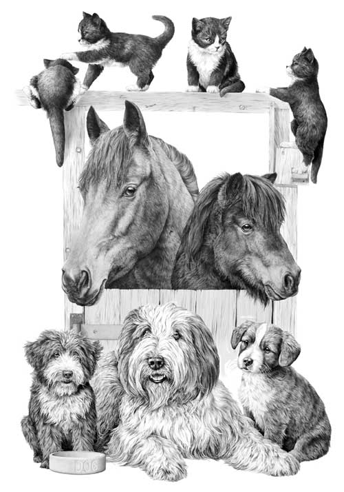
Incidentally, this was part of a duvet design. The rest of the stable and other featured animals are on a series of separate drawings:
Complete Duvet design by Mike Sibley
The kittens appear to be black and white, have glossy coats, and are obviously hairy. Again, if this was not intended for printing onto fabric, I would have softened the detail in the hair.
Finally…
Think of the message you want to send to viewers of your artwork; maybe look into your reference and extract the visuals clues that are working for you; then use what works and, to avoid visual confusion, discard the superfluous.
John emailed to ask about indenting – a technique that isn’t working too well for him:
I tried to draw the cat in the ‘Cat Food Advert’ as an exercise but it never really came off. I’m happy with the drawing as such but my indenting never really worked and I gave up trying to draw the chest area fur.
My drawing of our Clarrie produced for Burns Pet Foods cat food packaging
The chest fur of our lovely tortoiseshell cat is all negative drawing, which is quite easy once you get used to seeing white shapes on white paper and using the shadows to make them appear.
I’m happy with the drawing as such but my indenting never really worked… The width of the whiskers looked to vary due, I think, to not having even pressure of lines crossing the indentation.
Indenting, in my experience, has to be applied with as much pressure as your paper will stand – and the pressure has to be consistent, except for the final taper of course. It works best on a smooth surface – my Mellotex takes it like a dream – and ( this is important) you must have a hard, smooth surface beneath your paper. My drawing board is both hard and smooth, but if you’re using a wooden board or like to work with additional sheets below the one you’re working on, it won’t work effectively.
There always seems to be minute gaps between it crossing!, if that makes sense.
I’m not certain what you mean, unless your indent is throwing up a burr on each side? My Mellotex does that and I like it – it gives a very sharply defined edge. Also I don’t find it to be a problem, so I don’t think I have a ready answer for you.
Then there is a problem when the underlying fur runs in the same direct as the indentation. I keep getting stuck in the ‘tram lines’!
Often I divide the drawing of an area into line and tone – line detail first and then shaping tone on top – but if I meet an indent, I’ll sometimes reverse that. By applying tone with the flat face of a chisel point, I avoid dropping into the indent. That tone clearly displays the indent, and then it’s just a question of drawing the line content carefully so each stops at the indent and continues on the other side. If the hair direction is the same as the indent, that procedure works just as well, although more care has to be taking with lines that cross “underneath” the indent.
I have tried practicing but I’m not sure what I really should be doing about the above, even having read the book. Is there an ultimate width for the tip of the inscriber and can one use different widths. I think of the difference between the main whiskers and those round the mouth area of the cat. Does one use a broad one for the whiskers and a narrower one for the mouth area.
I have two indenting tools, both mounted into old clutch pencils. The one for whiskers is a darning needle that has a rounded point, ideal for indenting. For the smaller hairs of the top lip that extend over the darker mouth below, I have a smaller needle that has had the sharp point blunted on an oil stone.
If you’re trying to indent hairs to either side of the nose, or below it, I would never do that. Indenting works best in areas of high contrast – where the indent runs over black or very dark areas – but it produces a very mechanical line. I overcome that to some extent by drawing into the root of the indent to merge it into the surrounding drawing. For all areas above the fringe on the top lip, I always use negative drawing. The results are far more natural, and more controllable.
However, if you meant you indent thinner short whiskers on your cat’s muzzle, by all means use a thinner needle, but do ensure it does not have a sharp point that might tear the fibres of your paper. If you try to use a thick needle to indent thin lines, your pressure will not be great enough to indent deeply and cleanly. A little light flat-face shading with 2B will display their positions, and it can be removed or faded with Blu-Tack as you reach each area.
I e-mailed you a few weeks ago, about doing another course next year if you are doing some. What I really want to get to grips with is draw long fur, like a Spaniels ears and the throat ruff of the cat (as above). If you do another course, is it possible to be there but do my own thing!!
You certainly can do your own thing! 🙂 I have an new Intermediate course on April 12-14, 2013, which I haven’t written yet, but it will be based around my Drawspace 8-week course. That includes a week on drawing hair, and another partial week, so I can virtually guarantee the workshop will also include long tresses and curls.
There are three exercises in the Drawspace course that between them virtually cover the drawing of all types of hair and at any distance and they will undoubtedly be included. Other subjects will be negative space, negative drawing, advanced and creative shading techniques, using contrasts and drawing weeds and grass (the latter uses very similar techniques to hair).
Oh, my picture from the course this year; my wife framed it and actually has it in the lounge on the book cabinet for all to see!!
A wife with a refined artistic eye – what could be better! 🙂 There’s so much to fit into the 3-day Intermediate course there may not be a final drawing, but at least you’ll have the opportunity to work on your own. I hope you can join us.
I sent you a few of my pet portraits a few years ago and you were kind enough to give me a free critique. I purchased your book and have studied it, but still am struggling with my drawings. I was wondering if you would have the time to give me a quick critique on my more recent drawings so I can see how I have improved.
I would like to attend your workshop in Yellowstone, hopefully it will work out for me to attend this year.
Molly's livestock drawing
You sent me five images, Molly, but I’m going to concentrate on just one, because I think they all contain the same approach.
Molly's Rottweiler drawing
You’ve developed a good eye, Molly, and you show a good understanding of what you are attempting to draw. The Rottweiler’s nose, for example, is perfectly shaped – and you’ve certainly captured the character of this lovely dog!
However (you could see that coming, couldn’t you 🙂 ), I think you’re too focussed on the reference, and drawing without really being aware of the three-dimensional shape that you’re depicting. You are very accurate with the growth direction of the hair but reacting, I think, to the tones you see before you without asking yourself what they represent. You’re drawing the two-dimensional content very well, but losing sight of the three-dimensionality – and the finer detail that adds that sense of reality.
Eye with tonal range altered
Decide on a lighting direction before you begin. It doesn’t have to be the same one as seen in your reference – in fact, it will benefit you if it is different, because when you are forced to impose your own lighting, you HAVE to understand each element in three-dimensions. It’s this lack of three-dimensional lighting that is making your drawings appear to be flat – as is your shyness in using bold blacks.
For example, you’ve used good solid blacks for the pupils, but then not used them in the shadow beneath the top eyelid. As a result the eyeball and lid appear to be on the same plane. Think about where the structure you’re drawing recedes or protrudes and then light it accordingly. With a little practice you can then begin to manipulate elements of your drawing to bring out or emphasise the three-dimensional nature. I would, for example, be planning to introduce deep shade between the ear and head so the difference in planes was obvious. And I’d darken the neck beneath the chin too for the same reason.
The ear forced to stand away from the head
The ear now stands proud of the face and adds a definite three-dimensional sense for the viewer. Never be afraid of going dark – you can always later reduce the intensity of the tone with Blu-Tack or similar.
Now you are much more comfortable with your pencils begin to look deeper into the reference. Understand the exact make-up in greater detail and then build that into your work. The Rottie’s nose, for instance, looks good but in reality it has a leathery texture of pits and islands. You have a good idea of its construction – now slow down, focus more on that single element and add the texture. Treat it as a drawing in its own right so you’re not tempted to move on to other areas too quickly.
You’re definitely heading in the right direction! I do hope you can make it to the Yellowstone workshop in June. There’s so much I can show you more easily – and I can look over your shoulder too 🙂
I was wondering if you would be able to give me some tips on a tiger’s ear I am drawing at the moment. The fur is really wiry and thin, and I’ve tried breaking it all down, but am not sure whether I should use the indenting technique or negative technique or both. Do I try and draw individual strands of fur, or not worry about drawing exactly what’s there?
Tiger's ear reference
First, don’t concern yourself with copying the photo. A split second after the photo was taken that area probably changed. Instead get an overall feeling for it, study it until you know it well, and then draw your interpretation.
Indenting works best in areas of high contrast, so you could use it where the hair is in front of the dark depths of the ear. Either use a fine needle or, as this is not white hair, use a hard sharp pencil, such as a 6H or even 8H. But don’t overdo the indenting, because it produces a very mechanical line that does not blend easily into surrounding drawn lines.
Personally, I’d use negative drawing for almost all of this with just a few narrow indented lines where those lines directly cross over others or where the background is dark.
Don’t be daunted by the seemingly complex task – split the job up into many stages, so you can more easily concentrate on each one. Start with the shadows between the hairs so you leave a network of white hairs. The next step is to begin working on those hairs one hair at a time. Tone each down as you think fit, to give it shaping and form, and decide at each junction or crossover if your hair is beneath or in front of the other hairs. Have fun! Seriously, don’t stress about it – take it in easy stages and just watch it grow.
Finally, you can use layers of overall tone if you need to push any areas further back, or lighten with Blu-Tack or a kneadable eraser to bring it forwards.