Photographing Artwork

Terri wrote to ask:

I was just wondering, do you take pictures of your drawings with your camera? If so, could you please tell me the settings you have set on? Some of the drawings I do are too big for me to run thru my scanner and I’d like to take photos of them to post on my website. The photos of my drawings I have on there already don’t look very good – so I need to find a way to make them better.

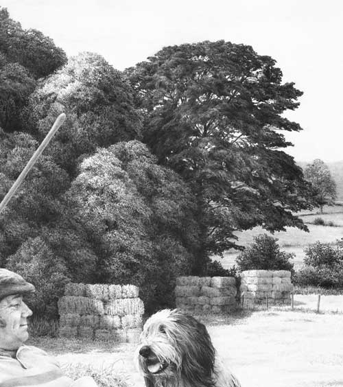
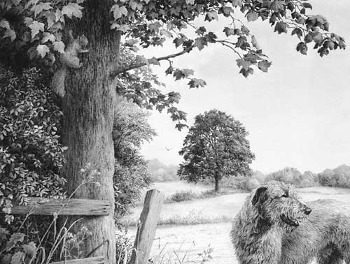
I photographed my drawings for many years before I purchased my first scanner, and there are inherent problems with photography. I’ll probably go into this in more depth than you were expecting but I’m trying to fit it all into one post 🙂

First, I always had the best results from photographing my drawings in natural daylight. If you place your drawing so it’s facing the sun you’ll avoid the light being darker at one side than other. Preferably choose an overcast day so the light is softened and diffused.

Second, graphite is made up flat plates so it’s reflective. The easiest way to minimise that sheen is to use a polarized filter. Fit it to your lens, look through the viewfinder (SLR camera’s only), and rotate it until you reach the optimum position where the glare disappears.

THE 18% GREY PROBLEM

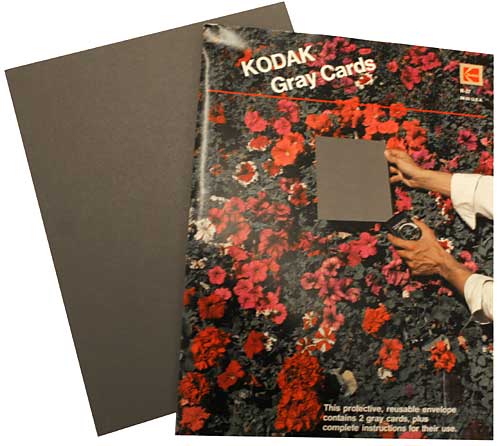
The main problem encountered when photographing artwork with an SLR camera – digital or film – is that the camera’s internal meter (and that of most handheld light meters) is set to read white as an 18% grey – it aims for an average overall value. You can combat this in two ways.

If you know how to set the white balance on your camera, zoom in until the viewfinder is filled with white and set the balance. A better solution is to buy a GREY CARD, also known as a ‘Neutral Test Card’. Mine are 8″ x 10″ and were made by Kodak in the US.

These cards are the exactly 18% grey that cameras convert white to.
These cards are the exact 18% grey that cameras convert white to.
  1. Pin up your artwork – preferably outside in natural light.
  2. Place your camera on a tripod – do not attempt to hand-hold unless you have a very steady hand or the light is bright enough to guarantee a fast shutter speed.
  3. Position your camera so the lens (and body) are exactly square with the drawing. If the drawing is hanging on the wall, try zooming in and out (or move the tripod) until the image just fills the viewfinder with a small border around it. Now check that all four sides of the drawing are perfectly parallel with the edges of the viewfinder.
  4. With the camera on “auto”, hold your Grey Card immediately in front of your drawing (zoom in if necessary to fill the viewfinder with card) and note the camera’s readings.
  5. Put your camera on ‘manual’ and set it to those readings.
  6. If you have a remote control for your camera, use it to take the photograph. If not, use the timer, if it has one. This minimises any shake as you press the shutter.

Some cameras can take multiple bracketed photos too. If yours will, use it so you have the photograph as set up and a few more with exposures to either side of that setting.

This method worked well for me for years, and it certainly helped me with my book because I used it extensively when taking the photographs for it (with an Olympus digital camera in that case – nothing fancy).

Of course you could correct the 18% grey problem in Photoshop but the best results are obtained from solving it during the photography itself.

THE PROBLEM OF FILE TYPE

Most digital cameras will save your pictures in JPEG format, which is a “lossy” format. The compression applied causes the image to lose detail and clarity every time the image is saved. There are a few ways to avoid this loss in quality:

  • Perform as many edits as possible in one session so you’re not repeatedly saving it as a JPEG.
  • Convert your JPEG to your editor’s native format – PSD in Photoshop. Or convert it to the universally useful TIFF format, which is free of compression.
  • Leave the images in the native lossless format throughout the editing process.
  • Save your images in the native format to an archives folder, because you never know if you’ll need to edit it again for another purpose in the future.
  • On completion of editing convert your image back to JPEG before putting it on your website.
REDUCING THE FILE SIZE FOR WEB USE

I was once asked by someone else:

In explicit detail, please guide me in the process of reducing the file size so I can manage it!!

In this case it was a scan from a Cruse scanner but the same applies to all image files. This one was in TIF format, and in RGB colour (Red/Green/Blue) or possibly in CYMK (Cyan/Yellow/Magenta/Black), and high resolution (probably 300 pixels per inch or greater).

Pixels are the squares that your image is made up of – they are too small to see with the naked eye so they visually blend together. Each pixel will have colour and value information stored for it.

Images as shown on websites are low resolution – typically 72 pixels per inch (ppi), which is the monitor resolution. Because the monitor resolution is 72 (or 96) ppi an image will not be any clearer if you post it at a higher resolution – but it will take a lot longer to load – and be commercially useful to any fraudulent printer!

The first thing you should do is lower the physical size. Your current scanned image will probably be the actual size of the original – let’s say 20″ x 16″.

20 x 16 @ 300ppi = 6000 x 4800 pixels
20 x 16 @ 300ppi = 50.8 x 40.6 cm
20 x 16 @ 300ppi = 20″ x 16″

This is much larger than you require to fit on a monitor or web page. Methods vary, but all software will allow you to reduce the actual size. If you reduce it by 75% it will now measure 5″ x 4″, and the file size will have decreased accordingly. 20″x16″ at 300ppi = 28.8 million pixels. 5″x4″ at 300ppi = 1.8 million pixels.

Now your file is only storing information for those 1.8 million pixels, not 28.8 million.

Now reduce the resolution from 300 pixels per inch (ppi) to 72.
5″x4″ @ 300ppi = 1.8 million pixels
5″x4″ @ 72ppi = 104 thousand pixels

The storage space required for your image has now been reduced from that required to hold 28.8 million pieces of information to just 104 thousand pieces. That’s a file size reduction of 27,692%. If your original file size was 100MB, it will now only be 361KB.

At any stage you can also do the following… Your drawing is essentially in a black and white medium. Scanners pick up more information in colour, which is why your scan is in RGB. But that requires 24 bits of information per pixel. Black and white (or “Greyscale”) requires only 8 bits per pixel. By changing your image from RGB to Greyscale you further reduce the file size by 66%. That lowers your 361KB to 123KB.

NB: Greyscale is NOT the same as desaturating the image, which maintains the 24-bit data. In Photoshop go to image > mode > greyscale.

Now save your TIF, or PSD, as a JPG, which will compress the data. Depending on your software, you may be asked to set the compression. This might be 50% or “medium” etc. I choose “medium” in Photoshop for web use. Choosing a medium setting may give you a final file size of about 35KB – which is an 823,000% reduction of your original file.

Or, to put it another way, it will download in your website in about 4 milliseconds instead of 4 minutes! 🙂

WATERMARKING

Finally, if you think there’s any possibility of fraudulent copying of your image, especially for commercial gain, watermark it! In Photoshop:

1 – Open a new file (CTRL+N), set it to 72ppi.

2 – Type the text you want for your watermark. If it’s white text, it helps to fill the background layer with a colour. To get the “copyright” symbol hold down your ALT key and (you MUST use the numpad) type 0169.

3 – Add any bevels or other fancy doo-dahs you might want.

4 – If you haven’t got the Layers palette open go to Window in the top menu and choose “Show Layers”. Just below the tabs in the Layers palette you’ll see a box labelled “opacity”. It will be set to 100%. Click the little arrow to the right of “100%” and play around with the slider. I find a setting of about 45% works well. That will show a semi-transparent watermark that allows the image to be viewed through it.

5 – Save the image as “Watermark” or whatever you prefer.

Whenever you need to watermark an image, open both the image to be watermarked and the “watermark” file. Make sure you have the Layers palette open and that you can see both images in your workspace. Click on the watermark image to make it the active image (if it isn’t already). Go to the Layers palette, click on the watermark text and drag it onto the image that you want to watermark. Press V on your keyboard to select the Move tool and you can move the watermark wherever you want it to appear. Then save the newly watermarked image.

Here’s an alternative – the method I use:

Repeat steps 1 and 2 above.
3 – Add an outer bevel – try a size of about 3-5. Add a 1px stroke too if it aids legibility.

4 – In the Layers palette double-click the text layer (or use the top menu – Layers > Layer style > Blending options).

5 – Under “Advanced blending” find “Fill opacity”. Set Fill opacity to 0%. That will remove all the colour from the text so now all you see is the bevel and/or stroke.

6 – Save the image as “Watermark” or whatever you prefer.

That’s how I created the MSFA watermarks on my own site:

Watermarked image
Watermarked image

The intention is to make copying and removal of the watermark as difficult as possible.

I hope that helps 🙂

USA – CANADA Workshops

Last-minute bookings still being accepted….

All the workshop supplies have been shipped to the venues and we fly to the US next Monday BUT I sent extra supplies, so we can still accommodate you.

WISCONSIN
Eau Claire – EC Centre’s Sun Room
only 2 seats available
June 27-29

TOTONTO
Mississauga – Novotel’s Amsterdam A room
July 4-6

FLORIDA
Clearwater – Pinellas Park Art Center
July 11-13

We’ll accept bookings right up to the first day of each workshop. The workshops are friendly and informal and designed for artists of all abilities and ages (we’ve had artists attend from age 12 to 92!). From novice to advanced, all you need is a desire to take your drawing to a new level of realism.

Paper, pencils and all other necessary supplies are included, and you’ll have ready-prepared guideline drawings, so you can concentrate on the techniques and not have to draw by eye. I strongly recommend you bring a table-top drawing board with you. This can be a manufactured board or as simple as a sheet of MDF or Masonite. Our paper size will be 12″ × 18″, so it need not be large.

For full details visit: Workshop Central

hickory1-300

My wife Jenny and I are looking forward to working with you.

WHAT SHOULD I DRAW TO PRACTICE?

As you may know, I’ve been teaching drawing at Drawspace.com for a few years, and one of my students has just asked:

“Mike, I think I would benefit from more practice of drawing things outside the realms of the course for further practice of actually looking at things. Have you got any ideas, please, as to what I could practice to try to improve my understanding?”

That’s an excellent idea! I firmly believe that you cannot successfully draw what you do not understand, so all opportunities to sketch from life, or even from photographs, are always worthwhile.

We graphite artists only have a pointed stylus to work with – no 1″ wide brushes for broad sweeps of colour – so we tend to be detail-orientated. In order for that to work well, we need a mental store of images we can draw on. Fortunately the more you draw, the more you cannot help looking closely at everything around you, and so your store grows ever larger. And we don’t have colour at our disposal – we only have texture and contrast to work with – so again we tend to study the detail in everything. As a by-product, we begin to see the world in a wonderful way that escapes almost everyone else.

When the average person sees a brown horse in a green field, they scan quickly across it and notice “horse” and “field”. But, as we don’t have colour and brown and green are tonally similar, we begin to try to work how we could make one stand out from the other. And we pick up information about the details of both at the same time, including the way, for example, we could use the light shining on its back to separate it from the darker grass behind.

Go and get a coffee…. this could be a long read 🙂

As I was saying… the more we draw, the more we store, appreciate and understand. So draw whatever you can, whenever you can.

Begin with things that are both simple and of interest to you. If you like plants, draw a leaf or two, but not the whole plant. You’ll learn more from one leaf than you will by repeating it over and over as you reproduce the plant, because you’ll be looking at a broad overview instead of concentrating on the understanding of one small part. If you like dogs, draw its collar – preferably not on the dog. And while you’re drawing it, look at the way the light helps us to understand its three-dimensional form.

I suspect you can draw a good resemblance of something but have problems making it look three-dimensional? That’s very common. The answers are there right in front of you once you tune yourself into looking at it in the way an artist does. Photos are excellent “frozen moments in time” in that respect too. Let’s take that collar as an example. Place it on a table and draw it, concentrating on its outline. Now you have a line drawing, hopefully fairly accurate, but line does not exist in Nature so we have to describe its edges in ways that Nature uses.

Begin to shade it and use that to describe its three-dimensional form – one small area at time, so you have time to work out and understand what that little area requires. You can see the collar and understand its shape, and see that it is not a part of the table, yet it has no line around it. The reason you can see it is due to light and shade. The way it catches the light, the areas that are hidden from the light, and the way it casts its own shadow on the table. Use those changes in tonal value to describe the edges instead of line – because that’s how we see them. And if you need to exaggerate to make it clear, do that. We’re artists, not photographers; we don’t copy, we interpret – we bend the world to suit our aims 😉

If you do that, you’ll quickly begin to understand how to construct three-dimensional believable objects in your drawing. And you’ll be storing all that knowledge so you can draw on it the next time you encounter a similar situation.

Just draw. If it interest you, that helps, but it doesn’t matter if it’s your coffee cup, the neighbour’s washing on the line, leaves from your garden, your phone, a crumpled sheet of paper… anything and everything is suitable. But, for now, steer clear of the cat on the mat… or anything else that is complex or heavily textured.

One final thought…

If you have a small camera, or a camera in your phone, carry it around with you and photograph whatever interests or pleases you. You can study it at length later, and that too will add to your store of mental images and textures. What you photograph is up to you, but I have packets full of photos of lovely old bricks and rocks, trees and weeds, old boats and tractors, rock pools and seaweed, tree bark, old weathered wood, and many many more.

DRAWING MIDGROUND TREES

DRAWING TREES with midground mystery

Artist Richard Devine submitted a query on my website to ask:

I thoroughly read all I could find both in your book “Drawing from Line to Life” and on the web about drawing trees. Then I tried to capture the beauty of Florida’s Champion Live Oak, the Cellon Oak. I would appreciate your honest critique of my work and how I could improve it. The suggestion of leaves was done with irregular squiggles, for the leaves are about 2″ long and 1/2″ wide. If I was to render a maple tree at the same distance, would I use a different size or shape squiggle? Perhaps angular shapes?

Richard's Cellon Oak drawing
Richard’s Cellon Oak drawing

This critique won’t take long 🙂 For a midground tree, it does its job admirably. It has believable form, suggestions of detail, and an excellent sense of reality. Personally, I think the beauty of working with squiggles and circles is that it allows you to explore an area without a break in concentration, unlike line that has to be continuously restarted. So you very quickly slip into working directly from your mind and sculpt what you expect to see.

If I was to render a maple tree at the same distance, would I use a different size or shape squiggle? Perhaps angular shapes?

Exactly that. Consider why you know it’s a Maple from that distance and then adapt your squiggles to reflect that knowledge. In the case of the Maple, or my preference for Sycamore, the visual clue lies with the angular shapes of the leaves. Build in that clue and you send the intended message. Very often, I find, using that clue around the perimeters of each foliage mass is all that’s required. When you create the shaded side of a mass and use that to negatively create the lighter edge of the adjoining mass, use that shade to create angular “maple-like” shapes. Edges are what most attract the viewer’s attention.

The other equally important area is the outside edge of the tree itself. Here you can be quite explicit about the leaf shape. Although you described your Oak’s leaf to me, I was already aware of that, based on the shapes around the extremity of your drawing. Those are the only clues my brain needs to understand the species of the tree, the leaf size and shape, and that all suggested foliage within it should be read as being identical.

Creating midground recession

Here, no actual leaves exist, only suggestions of leaves. But the outer edge of the right-hand bush is deliberately sharp-edged and intended to suggest the scale of its foliage. The outer leaves were not drawn, or even planned, but created as negative white shapes as I drew the shaded area behind them.

Midground trees drawn with clarity

Behind these trees is a lake with morning mist rising from it. To increase the depth, these midground trees were drawn with exaggerated sharpness and contrast. Most contain very little internal “detail” so attention is thrown onto the outer edges, which suggest the species (usually imaginary!) and its leaf shape and size.

Midground secondary element trees

These trees are merely a backdrop – something to contain the viewer, and to suggest locality and strength of light. Again, most of the work was concentrated on the negatively drawn edges. The interiors are simply squiggles, circles and random meandering of my pencil as it sought to reproduce the three-dimensional form and lighting that was in my mind.

I had references to assist with the drawing of the central dark tree but all the others were imaginary and created without any prior planning. The only conscious goal was to clearly differentiate between the two species.

Foreground, midground and background trees

Both the midground and background trees were drawn in the same manner applied by Richard – squiggles that sculpted what I was imagining. The distant background trees were lightly blended to soften any hard edges.

The foreground tree and bushes employ a similar approach with one exception. Here the extreme foreground leaves were outlined first to isolate them. Then the midground “leaves” were established by spontaneously and negatively creating the solid dark background between them, resulting in white silhouettes of random, partial leaf shapes. They were then darkened to variously push them back into the shade. Finally, the foreground leaves (the visual clues) were carefully drawn to make you believe that everything behind them is also foliage.

Don’t over-plan or over-think foliage. Take a long look at the Nature around you and you’ll quickly realise that it is full of mystery. Very little is clearly understandable. Even close up, you may understand the foreground leaves on a tree, but one or two layers back you simply assume that what you are seeing are more leaves. To achieve a sense of realism you need to emulate Nature and allow mystery to exist.

Then stand back at look at the overall internal shaping – the way the rounded masses of foliage form. Combine that knowledge with your feeling for the local foliage and you’ll create a tree with a true sense of reality – even if your interpretation is more abstractly suggested.

Thanks for letting me see your tree, Richard – it’s excellent in both composition and implied texture.

You can view more of Richard’s work at : RichardDevineFineArt.com.

ARTOGRAPH DB300 – BULBS and MODIFICATIONS

ARTOGRAPH DB300 REPLACEMENT BULBS

I’m a great fan of Artograph and I’ve been using my Artograph DB300 for over 25 years. Alex Dow of Artograph Customer Services contacted me unexpectedly, as a result of one of my Artograph posts, and has generously posted links to my website, “Drawing from Line to Life” book, and my Starving Artists website on Artograph’s Facebook page. Thanks Alex!

It also reminded me that I have a Post-It note (one of many!) stuck to my monitor as a reminder to pass on the news about replacement bulbs. My DB300 use two 150 watt photofloods in screw-fitting holders. Although my bulbs very rarely fail (more about this later) one inevitably did and, of course, at just the wrong time. I Googled for a replacement only to find the screw-fitting version is no longer available. So I had to either find an alternative or source ceramic bayonet sockets to fit the available bulbs.

Fortuitously, as is often the case, I received an email from Lesley Brown who told me “It’s my husband who is the creative genius. Chris has been an illustrator for the past 30 years or so. I just get lovely jobs like searching for bulbs.” 🙂 She needed the bulb’s code number, which I know (Phillips Photocresenta PF 605 E/51), but I warned her about the availability problem. Within a short time Lesley replied to say she’d found a possible replacement. She says “I emailed the company who say they ‘use this product to replace the old Philips code P3-4 which was the PF605E’. And I have ordered a couple to try.”

I ordered a couple too, and they work! They’re halogen, so a little cheaper to run, indistinguishable from the old E/51’s light output, and – I’m getting ahead of myself here – they’re fully dimmable.

The link you need at Easy Lightbulbs is:
www.easy-lightbulbs.com/light-bulbs/halogen-lighting/

View Chris Brown’s amazing artwork: www.ChrisBrownArtist.com

and his excellent illustrations: www.ChrisBrownIllustrator.com

ARTOGRAPH DB300 MODIFICATIONS

Lesley was pleased to report that the replacement halogen bulbs have a life of 2000 hours. That sounds good… but mine last for years! And here’s why…

I fitted my Artograph with twin dimmers because sometimes, if my source entirely covers the 10″ x 8″ copyboard, I need to reduce glare on one or even both sides. That glare can severely reduce visibility of crucial detail. For a while I would unscrew the bulb on the offending side, but that reduced the light output by a full 50%. The solution? I altered my DB300’s wring, and moved the on/off switch to make way for a pair of domestic lighting dimmers.

The re-sited on/off switch can just be seen above the dimmer box

This allows me to control the lighting on one or both sides simultaneously. As a bonus, I always run both bulbs at 90% power – the reduction in light is barely noticeable and it greatly increases the lifespan of the bulbs. I’m also pleased to report that the dimmers work with the new halogen bulbs! I knew halogen bulbs are dimmable but I believed they needed dedicated dimmers – not so!

You can view and copy the original and modified wiring diagram here:
www.SibleyFineArt.com/artograph-wiring.jpg

And I’m asked so often for details of the Artograph DB300 that I put together a PDF version of the manual. You can download a copy here:
www.SibleyFineArt.com/artograph-manual.zip (2.6MB)

If you make the modification, encounter any problems, or have installed any other interesting modification, I’d be delighted to hear from you.

Thanks again Alex. Thanks Lesley for finding the bulb source for us.