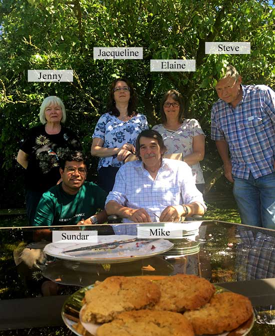
What a wonderful weekend we had here in my studio… running the Drawing Animals workshop for the first time. To find out when I’m running it again (UK/USA/CANADA) read on…
Really lovely company and weather too, and lunch in the garden on both days. All the cake’s gone, but I’ve still got cookies for supper! 🙂
June 2018 DRAWING ANIMALS workshop
I’ll be running this workshop in my studio again in October (20-21) and, as a 3-day workshop, in:
OTTAWA, ON – August 17-19 Limited places now available
and
CLEARWATER, FL – August 24-26 Only ONE seat remaining!
Dear Mike, Drawing with graphite pencil gives me a lot of pleasure and happiness. In the past using color made me more and more feel like I was losing contact with my work and the pleasure disappeared. But since I removed color from my drawings people keep saying: “Why don’t you use color? You have to use color, that’s much more beautiful” and so on. Probably you have had these comments too. Could you please give me any advice what to say to these people so they stop nagging?
Leaning against one wall of my studio are two pristine stretched canvasses. One drawer of the unit containing my drawing materials is full of unused oil paints, palette knives and brushes. They’ve been there for fifteen years, awaiting the day I feel the urge to paint.
That they are there is a result of my dealers telling me I’d sell more work if I painted. However, I believe they mean they better understand, and can more easily sell, paintings.
One drawer above holds acrylic paints. I once spent half a day using those and thoroughly enjoyed it – but I too felt a loss of connection with the work. I don’t paint. It’s not the way I see the world. I see and enjoy colour but prefer to look beyond and behind. It’s an attractive veneer that hides the real world – the tactile world I prefer to inhabit.
Pencil does everything that I ask of it. I am not a fan of colour. I believe the lack of colour in pencil work forces the eye to look deeper into the image. The eye can scan over a painting and quickly pick up sufficient information to satisfy it just from the shapes, tones and hues of the colour alone.
Pencil, by stripping away the familiar outer covering, demands a much closer inspection. In short, colour can get in the way of real perception.
There’s another important difference between painting and graphite pencil drawing too – spontaneous creation. I think this explains your “losing contact” with your work.
Consider the following:
We graphite artists only have two “colours” at our disposal – texture and contrast
We work with a thin, pointed stylus so we tend to become detail orientated.
By controlling the pressure applied to that stylus we can control the value it produces
The use of a chisel point means we can switch between a broad face and sharp edge by simply rotating the pencil
Combine those points and they add up to a medium that offers instant and spontaneous creativity.
At this point I should mention that, in my opinion, there are subjects that demand the use of colour and are therefore not suitable candidates for monochrome rendering in pencil. A sunset was my first obvious thought. My next was brightly coloured fishing boats under a Mediterranean sky – but then I realised that’s not true. In fact, pencil would be ideal for that subject. Why? Because almost all viewers will see only the colour. Remove the colour and they are forced to look at the boats – the chipped and peeling paintwork, the old frayed ropes, the sinuous weave of old wickerwork creels… all the textures previously hiding behind colour. The essence of the boats exposed; not just their superficial appearance.
Of course the two elicit completely different reactions – both equally valid. The first generates feelings of warmth and beauty. The second exposes the viewer to the intricacies and beauty of the real world beneath.
Personally I begin each drawing with a set of guidelines within which I work. I then draw one small section at a time. And I rarely return to that section – it is complete and, because I don’t work on it again, it remains sharp and fresh.
It’s the immediacy offered by pencil that attracts me to it. My thoughts travel down my arm, and my pencil translates them into drawing. There are no colours to mix, no drying times, no complex layers to apply. Nothing breaks my concentration. I can create and complete an area in a single unbroken session. I become deeply immersed in it. The work exists in my mind – I can see it; it’s alive – and it’s transferred effortlessly to my paper. I often become so engrossed, and disconnected from the world around me, that it is not uncommon for me to look at the work I’ve just produced and to have difficulty in believing I drew it.
Finally, have you noticed that most “high art” photographs employ black and white film? Again, I’m certain that’s because the viewer is forced to look directly at the beauty of the subject. Composition, balance, contrast, emotion, texture; all are now fully exposed – they occupy primary positions, no longer secondary to colour.
The viewers of our work live in a world of colour and expect to see colour in images. When someone says “You have to use colour, that’s much more beautiful” I think they are really saying “Make my life easier. Don’t make me work to gain enjoyment.” By removing colour we are forcing them to look deeper for understanding, but if they accept the challenge, I believe their enjoyment will be much enhanced. And that necessity to look in depth gives us the ideal opportunity to draw them into the work.
Personally, I try to subtly exaggerate texture, and emphasise contrast – as if to say, “Do you see this? Do you really see this? Isn’t it beautiful, this marvel of Nature.” And if I feel just one person has finally been encouraged to “see” instead of look, I’ll have done my job.
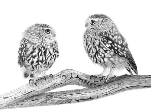
“Owls” by Chris Strijthagen“Owl & Mouse” by Chris StrijthagenArtwork by Chris Strijthagenextract – “Spinney Lane End” by Mike Sibley
John emailed to ask about indenting – a technique that isn’t working too well for him:
I tried to draw the cat in the ‘Cat Food Advert’ as an exercise but it never really came off. I’m happy with the drawing as such but my indenting never really worked and I gave up trying to draw the chest area fur.
My drawing of our Clarrie produced for Burns Pet Foods cat food packaging
The chest fur of our lovely tortoiseshell cat is all negative drawing, which is quite easy once you get used to seeing white shapes on white paper and using the shadows to make them appear.
I’m happy with the drawing as such but my indenting never really worked… The width of the whiskers looked to vary due, I think, to not having even pressure of lines crossing the indentation.
Indenting, in my experience, has to be applied with as much pressure as your paper will stand – and the pressure has to be consistent, except for the final taper of course. It works best on a smooth surface – my Mellotex takes it like a dream – and ( this is important) you must have a hard, smooth surface beneath your paper. My drawing board is both hard and smooth, but if you’re using a wooden board or like to work with additional sheets below the one you’re working on, it won’t work effectively.
There always seems to be minute gaps between it crossing!, if that makes sense.
I’m not certain what you mean, unless your indent is throwing up a burr on each side? My Mellotex does that and I like it – it gives a very sharply defined edge. Also I don’t find it to be a problem, so I don’t think I have a ready answer for you.
Then there is a problem when the underlying fur runs in the same direct as the indentation. I keep getting stuck in the ‘tram lines’!
Often I divide the drawing of an area into line and tone – line detail first and then shaping tone on top – but if I meet an indent, I’ll sometimes reverse that. By applying tone with the flat face of a chisel point, I avoid dropping into the indent. That tone clearly displays the indent, and then it’s just a question of drawing the line content carefully so each stops at the indent and continues on the other side. If the hair direction is the same as the indent, that procedure works just as well, although more care has to be taking with lines that cross “underneath” the indent.
I have tried practicing but I’m not sure what I really should be doing about the above, even having read the book. Is there an ultimate width for the tip of the inscriber and can one use different widths. I think of the difference between the main whiskers and those round the mouth area of the cat. Does one use a broad one for the whiskers and a narrower one for the mouth area.
I have two indenting tools, both mounted into old clutch pencils. The one for whiskers is a darning needle that has a rounded point, ideal for indenting. For the smaller hairs of the top lip that extend over the darker mouth below, I have a smaller needle that has had the sharp point blunted on an oil stone.
If you’re trying to indent hairs to either side of the nose, or below it, I would never do that. Indenting works best in areas of high contrast – where the indent runs over black or very dark areas – but it produces a very mechanical line. I overcome that to some extent by drawing into the root of the indent to merge it into the surrounding drawing. For all areas above the fringe on the top lip, I always use negative drawing. The results are far more natural, and more controllable.
However, if you meant you indent thinner short whiskers on your cat’s muzzle, by all means use a thinner needle, but do ensure it does not have a sharp point that might tear the fibres of your paper. If you try to use a thick needle to indent thin lines, your pressure will not be great enough to indent deeply and cleanly. A little light flat-face shading with 2B will display their positions, and it can be removed or faded with Blu-Tack as you reach each area.
I e-mailed you a few weeks ago, about doing another course next year if you are doing some. What I really want to get to grips with is draw long fur, like a Spaniels ears and the throat ruff of the cat (as above). If you do another course, is it possible to be there but do my own thing!!
You certainly can do your own thing! 🙂 I have an new Intermediate course on April 12-14, 2013, which I haven’t written yet, but it will be based around my Drawspace 8-week course. That includes a week on drawing hair, and another partial week, so I can virtually guarantee the workshop will also include long tresses and curls.
There are three exercises in the Drawspace course that between them virtually cover the drawing of all types of hair and at any distance and they will undoubtedly be included. Other subjects will be negative space, negative drawing, advanced and creative shading techniques, using contrasts and drawing weeds and grass (the latter uses very similar techniques to hair).
Oh, my picture from the course this year; my wife framed it and actually has it in the lounge on the book cabinet for all to see!!
A wife with a refined artistic eye – what could be better! 🙂 There’s so much to fit into the 3-day Intermediate course there may not be a final drawing, but at least you’ll have the opportunity to work on your own. I hope you can join us.
I won’t bore you to tears with acres of explanation, I’ll let the images tell the story – except to say… the new studio is FINISHED! Well, all except a few minor jobs.
One vital job, that I forgot to mention earlier, was that our fields are easily waterlogged and our buildings have no drains to accept water from their roofs. That was then – but now we have had the drainage boys in!
They laid a 6″ drain the full length of the field, ran off a spur to connect to four more spurs that drain the worst areas, AND the main drain continues behind all of the buildings to collect the roof run-off! In the meantime I spent a week moving a mountain of sand to fill in the old duck pond (no ducks, no geese, so no need for the pond).
Filling the duck pond and the drainage is underwayThe new studio sits at the back of the yard as viewed from our laneThe furniture restored and paintedThe laying of the carpet tiles is almost complete - at 1:20 am!The new chairs have arrived......and the sturdy tables. My 1.0 x 1.2 metre A0 drawing board is installed
Almost finished now. My massively heavy drawing board was dismantled, dragged from the old studio (Heck, was I feeling my age!) and reassembled. It can be moved but it’s not something you’d want to do often!
Artograph DB300 graphics projector
My 30 year-old faithful Artograph was moved into the new studio. I don’t use it often these days but sometimes it’s invaluable.
Set up and ready to teach!
And finally, all I need is workshop attendees – which we had (a full house!)… except that I was so engrossed in teaching I forgot to take any photos! 🙁
Oh well! Next time I WILL take photos! And you haven’t long to wait because we’re holding another Weekend Workshop on October 1st and 2nd. It’s already 50% booked so if you want to join us (and be royally fed by Jenny!) head over to my website for the full details: www.SibleyFineArt.com/_workshop_uk_yorks.htm
Thanks for following the progress over the past year, and for all your good wishes along the way – I really do appreciate them.
I had every intention of keeping you up to date on progress but the progress took so much time there wasn’t any to spare. Sorry! Well, today we emptied three B&Qs of carpet tiles – and we had to change plans half way through due to a shortage and settled on two colours instead of one.
Having returned from the Maidstone 3-day workshop on Monday, tomorrow the final work begins in earnest. It has to! We’re holding our first 2-day workshop here on September 17/18. Incidentally, it’s fully booked, so we’re running another two weeks later on October 1/2, and even that’s filling – just six places currently available.
OK, back to the studio…
The walls and ceiling are lined with plywood. I would have preferred plasterboard but the builder persuaded me that the wooden building would move and plywood would be a better choice. I’m still not convinced – especially after hours of filling and levelling all the joints. They’ll never be perfect but at least they look a lot flatter.
That job done, the paper hanging began with heavy weight liner paper. Now, I hate papering ceilings – and this one is 20′ by 22′! There’s nothing more likely to frustrate than trying to handle a 22 foot long piece of gooey paper above your head and paste it accurately.
I actually enjoy hanging paper – vertical paper! – and it took only three days to complete the four walls. By then I also had the skirting boards and architraves in place and gloss painted.
So, what are the two donkeys doing in the centre of the room? An extra and unexpected job 🙂 Jenny was raising funds for “Walk with Donkeys” in Crete and needed a collection box. The two donkeys have now been completed and fixed either side of a central box.
Donkey Charity Collection Box
Back in the studio, the ceiling received three coats of paint and I was ably assisted by my good friend Chris Howlett, who had come up from Cambridge to help. While staying in US hotels I had noticed the wall coverings and set out to find the same in the UK. If they’re good enough to take the punishment meted out in hotel rooms, I knew they’d suit me too. I finally found a source of commercial vinyl “extra scrubbable” wallpaper in a warm off-white – and 56″ wide! That really speeded the job up… until disaster struck!
The wallpaper paste soaked through the lining paper and “blew” the plaster that was smoothing the bad joint between two of the wall boards – where it mattered on the main wall I’ve earmarked for filming DVDs. We tried a couple of fixes but eventually realised that only complete renewal would suffice.
Eventually, I managed to turn back the edge of the vinyl paper, removed a section of lining paper, and re-plastered the entire joint. Finally, I succeeded in inlaying a new section of lining paper and left it for two days to dry throughly. With a lot of trepidation I set about hanging the next section of wide vinyl, knowing that I only had an inch of overlap to trim to a accurate joint. I should have mentioned that this commercial paper is not butt jointed, instead it has two selvedge and you overlap adjacent sheets by 2″. Then you cut through both sheets with a knife and smooth the cut edges together. It can (honestly!) give an almost undetectable join – when it’s done by a professional 🙂 Fortunately, the joint went well and the last wall was quickly completed.
As if I didn’t have enough to do, Pete Hogg arrived to begin work on the nearby toilet, which is good – except that I have the door frame and door to fit and install all the electrics. And all Pete has to do is convert a 100+ year-old former earth closet into a state-of-the-art restroom! He’s doing an absolutely splendid job and, as I write, should have installed the hand basin and water heater, and completed the floor tiling, tomorrow.
Pete Hogg happily working on the 'luxury restroom'
In the meantime, I’ve completed the electrics and installed the lighting. And I’m furiously completing the plan chest work table, painting the print rack, dresser and associated shelves, and this morning I installed the outdoor half of the HVAC air conditioning system. The chairs have been delivered, we have one table and will order the remainder on Monday, and… it looks as though we will be ready for the inaugural workshop 🙂
Tomorrow I’ll begin work on the interior half of the air conditioning, in between adding coats of paint to the furniture. More updates as soon as I have time… if any can be found!