How far do I take the “detail” of short hair, when the horse’s coat is so very smooth? I feel I’m losing the “sense” of shape if no detail. in the very smooth areas. So detail or not?
It depends on what you think the major features are – the main message you want to convey. In this case it’s probably the smooth and glossy appearance, so I’d concentrate on that, and then add just enough texture to maintain the feeling of hair.
Coincidentally, my friend Sheona (who is currently taking my Drawspace Advanced course) submitted a drawing that might help you.
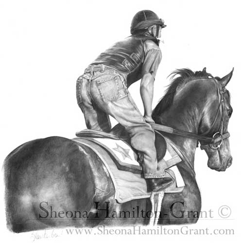
“Racing Ready” by Sheona Hamilton-Grant
The horse is definitely glossy but not so smooth that it looks unnatural. In this case, it was an exercise on recession, so you wouldn’t expect to see hair detail on the head and neck, but I think the mottled rump sends the “hair” signal that you then subconsciously apply to the rest of the horse.
Personally, I went through a “Detail is King” stage and I believe it is a necessary step before you learn which detail to enhance and which to merely suggest.
Duvet design
Here’s an old drawing of mine from around 1987:
Section of Duvet design by Mike Sibley, 1987
It is deliberately high contrast with few areas of flat midtone shading because it was designed to be printed onto fabric, but if I’d intended it to be a print or sold as an original, I’d consider it to be over-detailed.
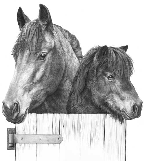
The dark eyes do attract attention but the horse’s mane is so sharp that it drags my eye back – it’s more primary than secondary in importance. The same applies to the base of the neck – it contains detail with a strength that defeats any attempt at creating recession. Softer detail in that area would have increased the perceived depth. It’s also of little or no importance to our understanding of the horse. The Shetland Pony contains less physical depth so I can probably get away with the globally-applied tight detail it contains.
Incidentally, this was part of a duvet design. The rest of the stable and other featured animals are on a series of separate drawings:
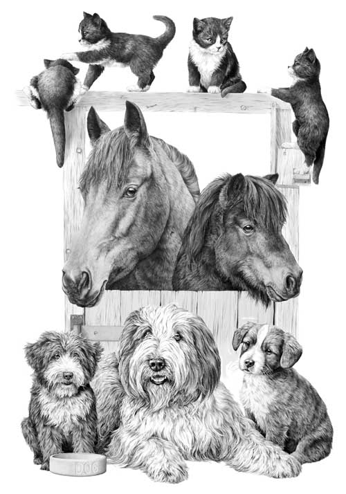
Complete Duvet design by Mike Sibley
The kittens appear to be black and white, have glossy coats, and are obviously hairy. Again, if this was not intended for printing onto fabric, I would have softened the detail in the hair.
Finally…
Think of the message you want to send to viewers of your artwork; maybe look into your reference and extract the visuals clues that are working for you; then use what works and, to avoid visual confusion, discard the superfluous.
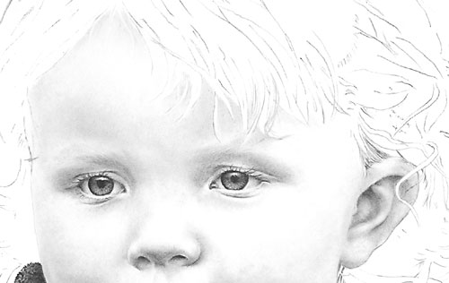
I’ve always been told to keep my pencil sharp but in your book in the ‘Charlotte-portrait’ chapter you mention in stage 4 using a ‘flat’ tip. I’m not quite sure what ‘flat’ means.
The universal chisel point
I always use a chisel point, which has many advantages.
To achieve that point, sharpen your lead as usual and then, holding it at your normal drawing angle, rub the point off on a piece of scrap paper. Now you’ll have a flat face surrounded by a sharp edge.
Use the edge whenever you usually use a point – except the edge lasts a lot longer. Unlike a sharp point that wears very quickly, a usable edge extends half way around the flat face. Turn the pencil as you draw to maintain that narrow width of line.
Use the flat face for shading. It cannot draw hard edged or thin lines so the coverage is smoother and more even. And there’s an added bonus…
Every time you use the flat face you automatically sharpen the edge.
I sharpen my pencils every morning and probably don’t have to do it again for the rest of the day. If you’re not using the flat face and need to sharpen the edge, restore it by quickly scrubbing the face on scrap paper again. It’s almost an ever-lasting “point”; there is no constant pencil sharpening to break your concentration; and there’s one more major benefit…
You can switch from a broad flat face to a sharp point with a half turn of your pencil. Imagine being able to draw sharp linear detail and then applying a layer of tone to create the three-dimensional shaping without having to change pencils or reform the point. It leads to very spontaneous and intuitive drawing.
I’m aware I need to build the layers thru several applications and blending. Any advice?
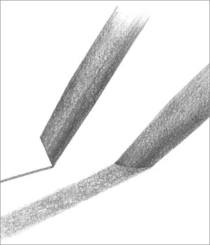
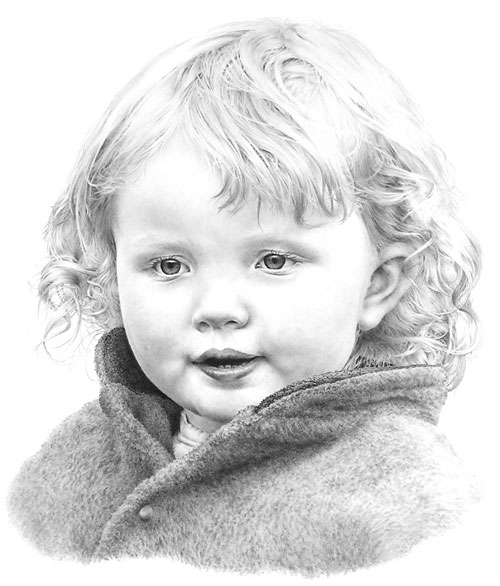
Use the flat face of your chisel point and I think your problems will disappear. You can seamlessly build up layers of tone and blend at any stage. I would add that I personally work from dark to light. Hard grades tend to quickly fill the tooth with clay so soft grades won’t always successfully layer on top – but a hard grade will layer over a soft one. So, to build up a darker area of skin tone I first lightly apply 2B to the darkest areas and then build up the whole area with HB or, more usually, 2H. The 2H will burnish the 2B; it breaks up the graphite grains, spreads them more evenly and polishes the result. Result: seamless and flawless skin tones. 2B and 2H flat-face shading The completed drawing of Charlotte
I was just wondering, do you take pictures of your drawings with your camera? If so, could you please tell me the settings you have set on? Some of the drawings I do are too big for me to run thru my scanner and I’d like to take photos of them to post on my website. The photos of my drawings I have on there already don’t look very good – so I need to find a way to make them better.
I photographed my drawings for many years before I purchased my first scanner, and there are inherent problems with photography. I’ll probably go into this in more depth than you were expecting but I’m trying to fit it all into one post 🙂
First, I always had the best results from photographing my drawings in natural daylight. If you place your drawing so it’s facing the sun you’ll avoid the light being darker at one side than other. Preferably choose an overcast day so the light is softened and diffused.
Second, graphite is made up flat plates so it’s reflective. The easiest way to minimise that sheen is to use a polarized filter. Fit it to your lens, look through the viewfinder (SLR camera’s only), and rotate it until you reach the optimum position where the glare disappears.
THE 18% GREY PROBLEM
The main problem encountered when photographing artwork with an SLR camera – digital or film – is that the camera’s internal meter (and that of most handheld light meters) is set to read white as an 18% grey – it aims for an average overall value. You can combat this in two ways.
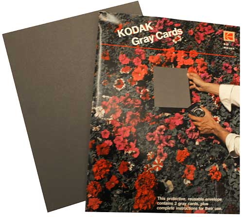
If you know how to set the white balance on your camera, zoom in until the viewfinder is filled with white and set the balance. A better solution is to buy a GREY CARD, also known as a ‘Neutral Test Card’. Mine are 8″ x 10″ and were made by Kodak in the US.
These cards are the exact 18% grey that cameras convert white to.
Pin up your artwork – preferably outside in natural light.
Place your camera on a tripod – do not attempt to hand-hold unless you have a very steady hand or the light is bright enough to guarantee a fast shutter speed.
Position your camera so the lens (and body) are exactly square with the drawing. If the drawing is hanging on the wall, try zooming in and out (or move the tripod) until the image just fills the viewfinder with a small border around it. Now check that all four sides of the drawing are perfectly parallel with the edges of the viewfinder.
With the camera on “auto”, hold your Grey Card immediately in front of your drawing (zoom in if necessary to fill the viewfinder with card) and note the camera’s readings.
Put your camera on ‘manual’ and set it to those readings.
If you have a remote control for your camera, use it to take the photograph. If not, use the timer, if it has one. This minimises any shake as you press the shutter.
Some cameras can take multiple bracketed photos too. If yours will, use it so you have the photograph as set up and a few more with exposures to either side of that setting.
This method worked well for me for years, and it certainly helped me with my book because I used it extensively when taking the photographs for it (with an Olympus digital camera in that case – nothing fancy).
Of course you could correct the 18% grey problem in Photoshop but the best results are obtained from solving it during the photography itself.
THE PROBLEM OF FILE TYPE
Most digital cameras will save your pictures in JPEG format, which is a “lossy” format. The compression applied causes the image to lose detail and clarity every time the image is saved. There are a few ways to avoid this loss in quality:
Perform as many edits as possible in one session so you’re not repeatedly saving it as a JPEG.
Convert your JPEG to your editor’s native format – PSD in Photoshop. Or convert it to the universally useful TIFF format, which is free of compression.
Leave the images in the native lossless format throughout the editing process.
Save your images in the native format to an archives folder, because you never know if you’ll need to edit it again for another purpose in the future.
On completion of editing convert your image back to JPEG before putting it on your website.
REDUCING THE FILE SIZE FOR WEB USE
I was once asked by someone else:
In explicit detail, please guide me in the process of reducing the file size so I can manage it!!
In this case it was a scan from a Cruse scanner but the same applies to all image files. This one was in TIF format, and in RGB colour (Red/Green/Blue) or possibly in CYMK (Cyan/Yellow/Magenta/Black), and high resolution (probably 300 pixels per inch or greater).
Pixels are the squares that your image is made up of – they are too small to see with the naked eye so they visually blend together. Each pixel will have colour and value information stored for it.
Images as shown on websites are low resolution – typically 72 pixels per inch (ppi), which is the monitor resolution. Because the monitor resolution is 72 (or 96) ppi an image will not be any clearer if you post it at a higher resolution – but it will take a lot longer to load – and be commercially useful to any fraudulent printer!
The first thing you should do is lower the physical size. Your current scanned image will probably be the actual size of the original – let’s say 20″ x 16″.
20 x 16 @ 300ppi = 6000 x 4800 pixels
20 x 16 @ 300ppi = 50.8 x 40.6 cm
20 x 16 @ 300ppi = 20″ x 16″
This is much larger than you require to fit on a monitor or web page. Methods vary, but all software will allow you to reduce the actual size. If you reduce it by 75% it will now measure 5″ x 4″, and the file size will have decreased accordingly. 20″x16″ at 300ppi = 28.8 million pixels. 5″x4″ at 300ppi = 1.8 million pixels.
Now your file is only storing information for those 1.8 million pixels, not 28.8 million.
Now reduce the resolution from 300 pixels per inch (ppi) to 72.
5″x4″ @ 300ppi = 1.8 million pixels
5″x4″ @ 72ppi = 104 thousand pixels
The storage space required for your image has now been reduced from that required to hold 28.8 million pieces of information to just 104 thousand pieces. That’s a file size reduction of 27,692%. If your original file size was 100MB, it will now only be 361KB.
At any stage you can also do the following… Your drawing is essentially in a black and white medium. Scanners pick up more information in colour, which is why your scan is in RGB. But that requires 24 bits of information per pixel. Black and white (or “Greyscale”) requires only 8 bits per pixel. By changing your image from RGB to Greyscale you further reduce the file size by 66%. That lowers your 361KB to 123KB.
NB: Greyscale is NOT the same as desaturating the image, which maintains the 24-bit data. In Photoshop go to image > mode > greyscale.
Now save your TIF, or PSD, as a JPG, which will compress the data. Depending on your software, you may be asked to set the compression. This might be 50% or “medium” etc. I choose “medium” in Photoshop for web use. Choosing a medium setting may give you a final file size of about 35KB – which is an 823,000% reduction of your original file.
Or, to put it another way, it will download in your website in about 4 milliseconds instead of 4 minutes! 🙂
WATERMARKING
Finally, if you think there’s any possibility of fraudulent copying of your image, especially for commercial gain, watermark it! In Photoshop:
1 – Open a new file (CTRL+N), set it to 72ppi.
2 – Type the text you want for your watermark. If it’s white text, it helps to fill the background layer with a colour. To get the “copyright” symbol hold down your ALT key and (you MUST use the numpad) type 0169.
3 – Add any bevels or other fancy doo-dahs you might want.
4 – If you haven’t got the Layers palette open go to Window in the top menu and choose “Show Layers”. Just below the tabs in the Layers palette you’ll see a box labelled “opacity”. It will be set to 100%. Click the little arrow to the right of “100%” and play around with the slider. I find a setting of about 45% works well. That will show a semi-transparent watermark that allows the image to be viewed through it.
5 – Save the image as “Watermark” or whatever you prefer.
Whenever you need to watermark an image, open both the image to be watermarked and the “watermark” file. Make sure you have the Layers palette open and that you can see both images in your workspace. Click on the watermark image to make it the active image (if it isn’t already). Go to the Layers palette, click on the watermark text and drag it onto the image that you want to watermark. Press V on your keyboard to select the Move tool and you can move the watermark wherever you want it to appear. Then save the newly watermarked image.
Here’s an alternative – the method I use:
Repeat steps 1 and 2 above.
3 – Add an outer bevel – try a size of about 3-5. Add a 1px stroke too if it aids legibility.
4 – In the Layers palette double-click the text layer (or use the top menu – Layers > Layer style > Blending options).
5 – Under “Advanced blending” find “Fill opacity”. Set Fill opacity to 0%. That will remove all the colour from the text so now all you see is the bevel and/or stroke.
6 – Save the image as “Watermark” or whatever you prefer.
That’s how I created the MSFA watermarks on my own site: Watermarked image
The intention is to make copying and removal of the watermark as difficult as possible.
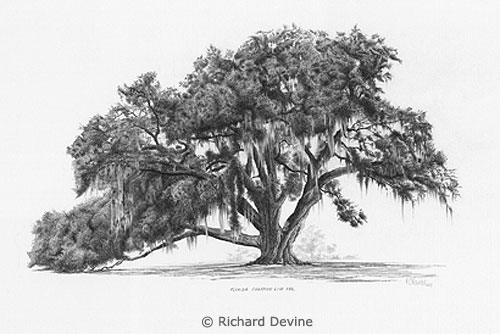
Artist Richard Devine submitted a query on my website to ask:
I thoroughly read all I could find both in your book “Drawing from Line to Life” and on the web about drawing trees. Then I tried to capture the beauty of Florida’s Champion Live Oak, the Cellon Oak. I would appreciate your honest critique of my work and how I could improve it. The suggestion of leaves was done with irregular squiggles, for the leaves are about 2″ long and 1/2″ wide. If I was to render a maple tree at the same distance, would I use a different size or shape squiggle? Perhaps angular shapes?
Richard’s Cellon Oak drawing
This critique won’t take long 🙂 For a midground tree, it does its job admirably. It has believable form, suggestions of detail, and an excellent sense of reality. Personally, I think the beauty of working with squiggles and circles is that it allows you to explore an area without a break in concentration, unlike line that has to be continuously restarted. So you very quickly slip into working directly from your mind and sculpt what you expect to see.
If I was to render a maple tree at the same distance, would I use a different size or shape squiggle? Perhaps angular shapes?
Exactly that. Consider why you know it’s a Maple from that distance and then adapt your squiggles to reflect that knowledge. In the case of the Maple, or my preference for Sycamore, the visual clue lies with the angular shapes of the leaves. Build in that clue and you send the intended message. Very often, I find, using that clue around the perimeters of each foliage mass is all that’s required. When you create the shaded side of a mass and use that to negatively create the lighter edge of the adjoining mass, use that shade to create angular “maple-like” shapes. Edges are what most attract the viewer’s attention.
The other equally important area is the outside edge of the tree itself. Here you can be quite explicit about the leaf shape. Although you described your Oak’s leaf to me, I was already aware of that, based on the shapes around the extremity of your drawing. Those are the only clues my brain needs to understand the species of the tree, the leaf size and shape, and that all suggested foliage within it should be read as being identical.
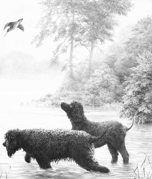
Creating midground recession
Here, no actual leaves exist, only suggestions of leaves. But the outer edge of the right-hand bush is deliberately sharp-edged and intended to suggest the scale of its foliage. The outer leaves were not drawn, or even planned, but created as negative white shapes as I drew the shaded area behind them.
Midground trees drawn with clarity
Behind these trees is a lake with morning mist rising from it. To increase the depth, these midground trees were drawn with exaggerated sharpness and contrast. Most contain very little internal “detail” so attention is thrown onto the outer edges, which suggest the species (usually imaginary!) and its leaf shape and size.
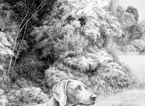
Midground secondary element trees
These trees are merely a backdrop – something to contain the viewer, and to suggest locality and strength of light. Again, most of the work was concentrated on the negatively drawn edges. The interiors are simply squiggles, circles and random meandering of my pencil as it sought to reproduce the three-dimensional form and lighting that was in my mind.
I had references to assist with the drawing of the central dark tree but all the others were imaginary and created without any prior planning. The only conscious goal was to clearly differentiate between the two species.
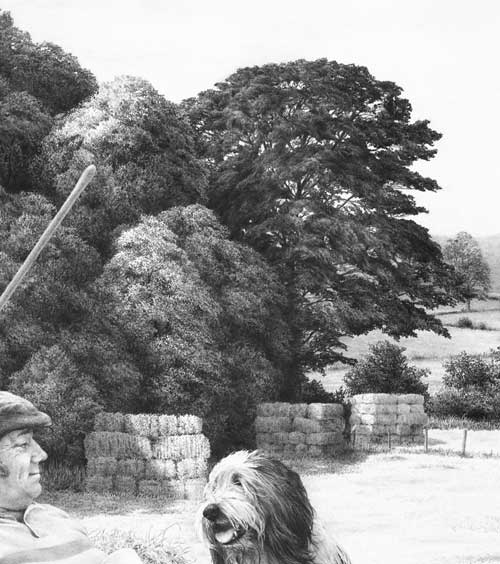
Foreground, midground and background trees
Both the midground and background trees were drawn in the same manner applied by Richard – squiggles that sculpted what I was imagining. The distant background trees were lightly blended to soften any hard edges.
The foreground tree and bushes employ a similar approach with one exception. Here the extreme foreground leaves were outlined first to isolate them. Then the midground “leaves” were established by spontaneously and negatively creating the solid dark background between them, resulting in white silhouettes of random, partial leaf shapes. They were then darkened to variously push them back into the shade. Finally, the foreground leaves (the visual clues) were carefully drawn to make you believe that everything behind them is also foliage.
Don’t over-plan or over-think foliage. Take a long look at the Nature around you and you’ll quickly realise that it is full of mystery. Very little is clearly understandable. Even close up, you may understand the foreground leaves on a tree, but one or two layers back you simply assume that what you are seeing are more leaves. To achieve a sense of realism you need to emulate Nature and allow mystery to exist.
Then stand back at look at the overall internal shaping – the way the rounded masses of foliage form. Combine that knowledge with your feeling for the local foliage and you’ll create a tree with a true sense of reality – even if your interpretation is more abstractly suggested.
Thanks for letting me see your tree, Richard – it’s excellent in both composition and implied texture.
Jason, who has recently joined TheDrawingForum.com, jointly run by myself and JD Hillberry, emailed to ask:
Just a very quick question, I am thinking of taking my drawings a bit more serious to supplement my wildlife oil paintings, so I have been reading both yours and JD Hillberry’s books, websites etc so I don’t make too many novice mistakes, and I wondered why you don’t appear to have gone down the same road as JD, regarding using charcoal pencils to get the non-reflective, VERY darks that seem impossible with standard soft graphite.
A quick question but the answer might take longer 🙂
First, JD and I work in completely different ways. JD’s work is more planned and controlled, such as using frisket to blank out selected areas. That requires a very accurate initial drawing that probably cannot be readily altered during the drawing process. However, I love working in graphite because it offers that direct mind-to-hand-to-paper connection – you think, you draw. So I begin with a very loose set of guidelines (except where accuracy is vital) and I constantly alter or even ignore them as I draw each section. I also begin top left and work down to the bottom right-hand corner (as a generalisation). Nothing is blanked out.
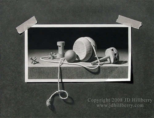
“A String of Memories” by JD Hillberry The entire image is drawn including the background, tape, and string.
When I first began drawing seriously I did use carbon pencils for a while (never charcoal) to achieve more intense blacks. But they always looked false because they lacked the sheen of graphite. At some point I realised I had to be a graphite purist in order for my work to have the unity I wanted, and to allow the mind-to-paper flow that I so enjoy.
I also found ways around the problem of weak darks – which isn’t a problem where prints are concerned because they can be corrected. If I need very intense blacks, I complete the drawing and spray with a matt fixative – that allows me to add further layers of soft grade graphite, and I can repeat that process as many times as required. In more general use, I found that 2B would give reasonable blacks (if applied with pressure – and my Mellotex paper can withstand a lot of punishment) but I could increase the intensity by layering with a harder grade – usually HB over 2B. The harder grade breaks up and smooths the courser grains of the soft graphite and fills the tooth that the softer grade left exposed. I also discarded all grades softer than 2B, because they are too grainy and leave a lot of tooth exposed (tiny white pits that visually dilute the intended dark value).
Finally, spraying a graphite drawing on completion with a matt fixative removes much of the sheen. With the reflective surface dulled, blacks increase in intensity, three-dimensional form becomes more solid, and the drawing has more visual impact. With practice, I draw in the knowledge that the value I’m creating will later darken and increase in intensity.